

Product Design
Designed in 4-week design sprints, from ideation to a fully functional high-fidelity prototype.
The aim of this app is to solve the communication and coordination issues that arise when traveling in a group, for business or pleasure.
Without a comprehensive tool prompting everyone to actively participate in the planning, all of the decision making and logistical work often falls to a few. Plannr provides users with a means to impartially reach decisions, centralize travel information, track spending, plan an itinerary, share media, stay on time and solve problems efficiently.
This idea was born of a group of friends on vacation who needed help utilizing our time and making sure everyone had a say. I didn’t make what people theoretically need, I made what WE needed.
Plannr
Clarity
The goal of this app is to simplify finding skincare products that meet our specific needs within our personal lifestyle, access and cost constraints.
People often experience choice overload when searching for skincare solutions, and either do what they’ve always done or rely on recommendations. But what works for some will not work for others, and good enough isn’t the best!
Clarity asks users to complete a quick survey and then recommends a few straightforward products from sustainable brands. Users can also scan their existing products for its benefits, ingredients in layman’s terms, and safety and packaging ratings. The homepage design includes assistive features and quick educational videos to keep users progressing on their skincare journey.
Adopt-A-Pet
Adopt-A-Pet is a small no-kill animal shelter servicing IL since 1981. Heuristic evaluation of the website revealed large bodies of text, outdated pet profiles, and unclear adoption information.
To address the issue of returned animals, most commonly due to lack of information, we focused on introducing fun, detailed and honest pet pages that outline the unique cost, care and adoption timeline expectations for each pet.
To remain competitive with larger shelters, we integrated a ton of new resources for pet parents, ensured the new design is readily adaptable and shows users how current the information is.
The priority is the safety and success of each pet, but hopefully with these changes Adopt-A-Pet can be more pets adopted and adored!
Fill a Heart 4 Kids is a Chicagoland non-profit that helps house homeless children, as well as support foster children. They organize essential services, gifts, events, and many other important childhood experiences for the kids; all with the goal of ensuring no child feels isolated, nor ashamed of their situation.
Many rounds of user testing revealed to us that with heavy blocks of text, overly bright colors, and an IA structure that was hard to follow: people were wary to get involved and especially donate.
So we redesigned the content to focus on the organization’s directives, history and credibility, as well as made getting involved as easy as possible. To reflect the fantastic work FH4K’s does, the website should readily gain the trust of new donors, engage volunteers and ultimately aid FH4K’s in accomplishing their goals!
Fill a Heart 4 Kids
The goal of this project was simply to identify an issue with the DOE’s website and solve it. As such, it became an exercise in evaluating heuristics and information architecture, as well as a lesson in the importance of user feedback and branding.
In this project I additionally focused on responsive and accessible design, while completely redesigning the site’s navigation structure and homepage.
The U.S. Department of Energy
UI/UX Projects
Collaborated with Chicago shelters to redesign their website, and solve heuristic, typography, IA and hierarchy issues.
Information Architecture Project
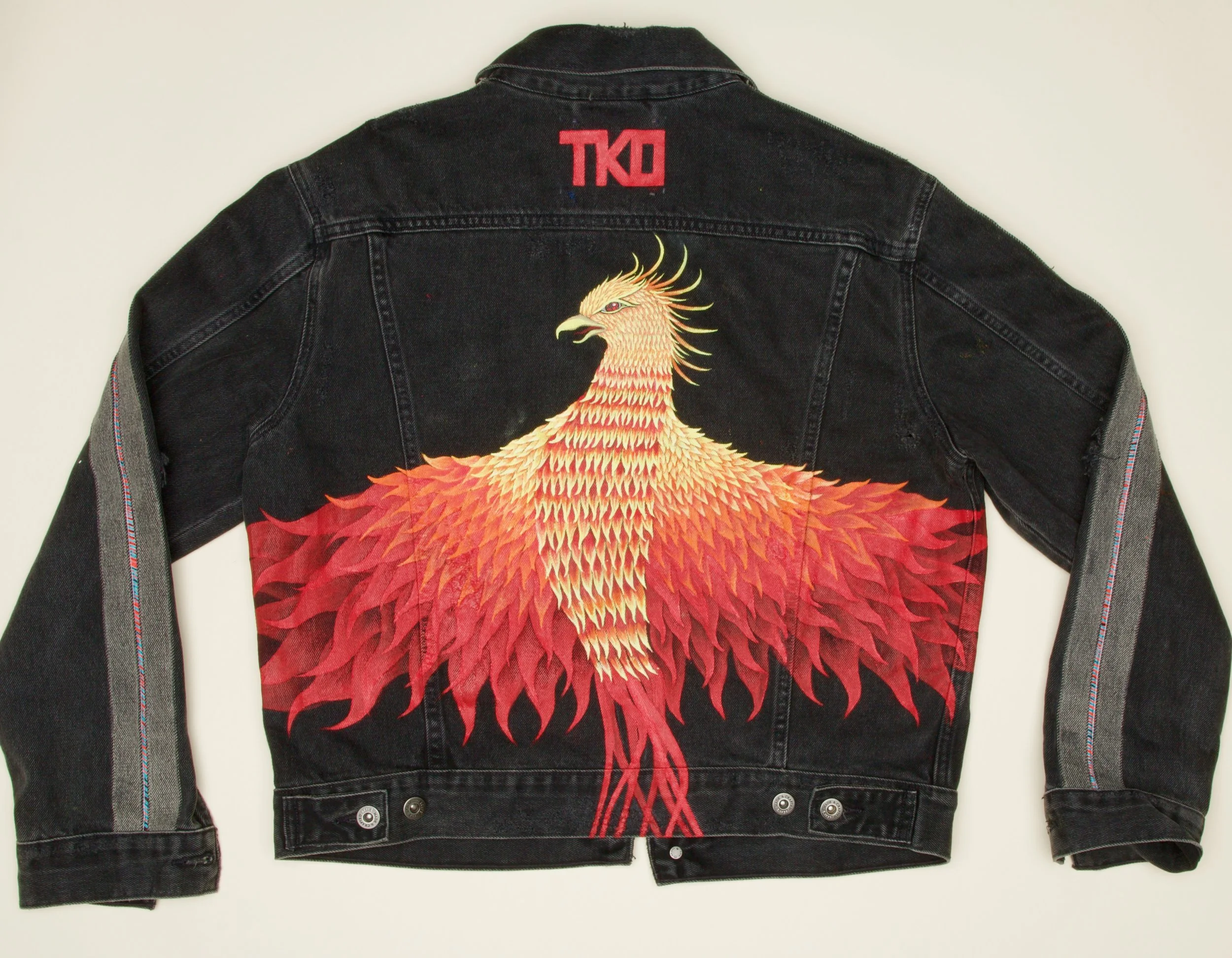
ARTWORK


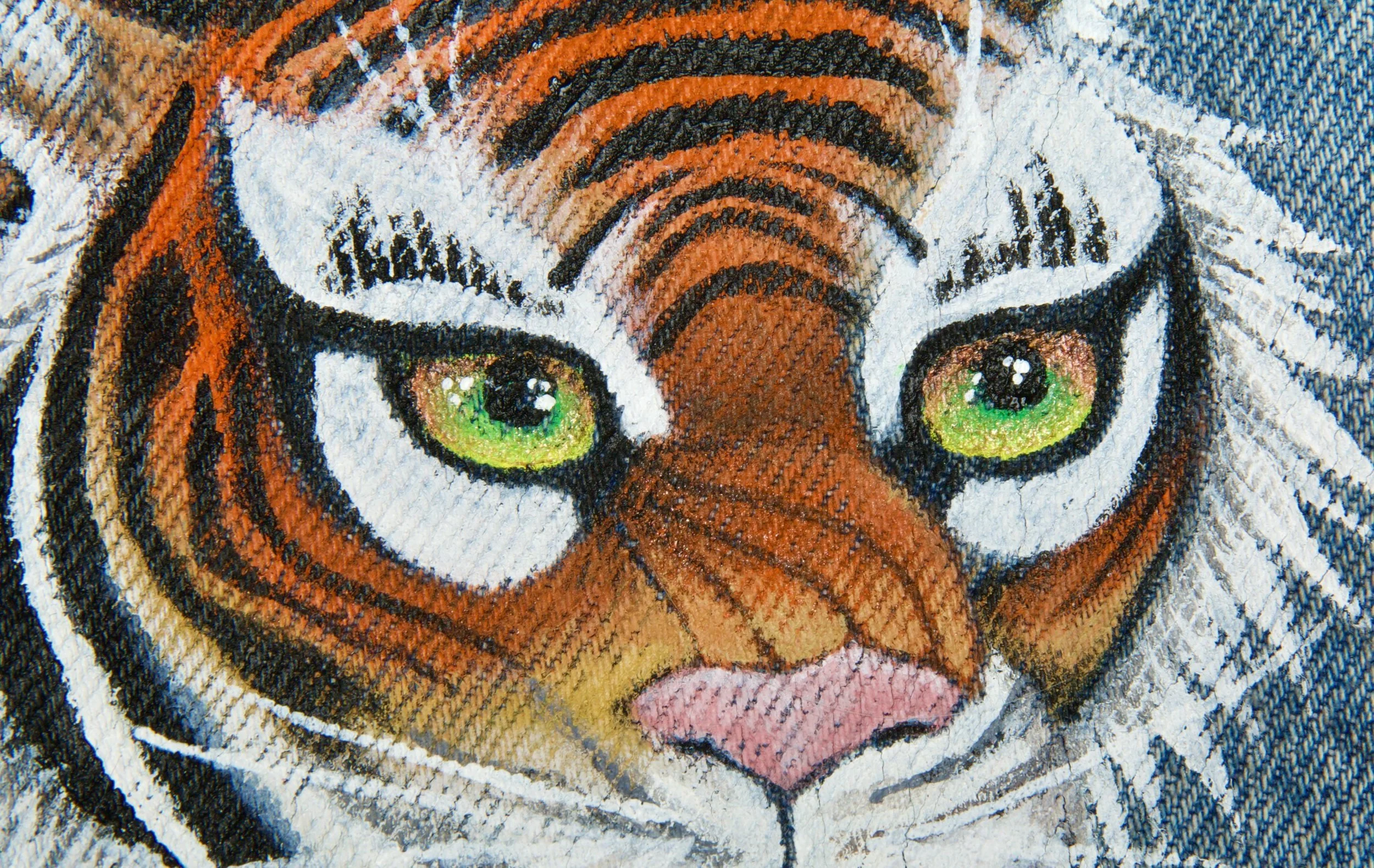

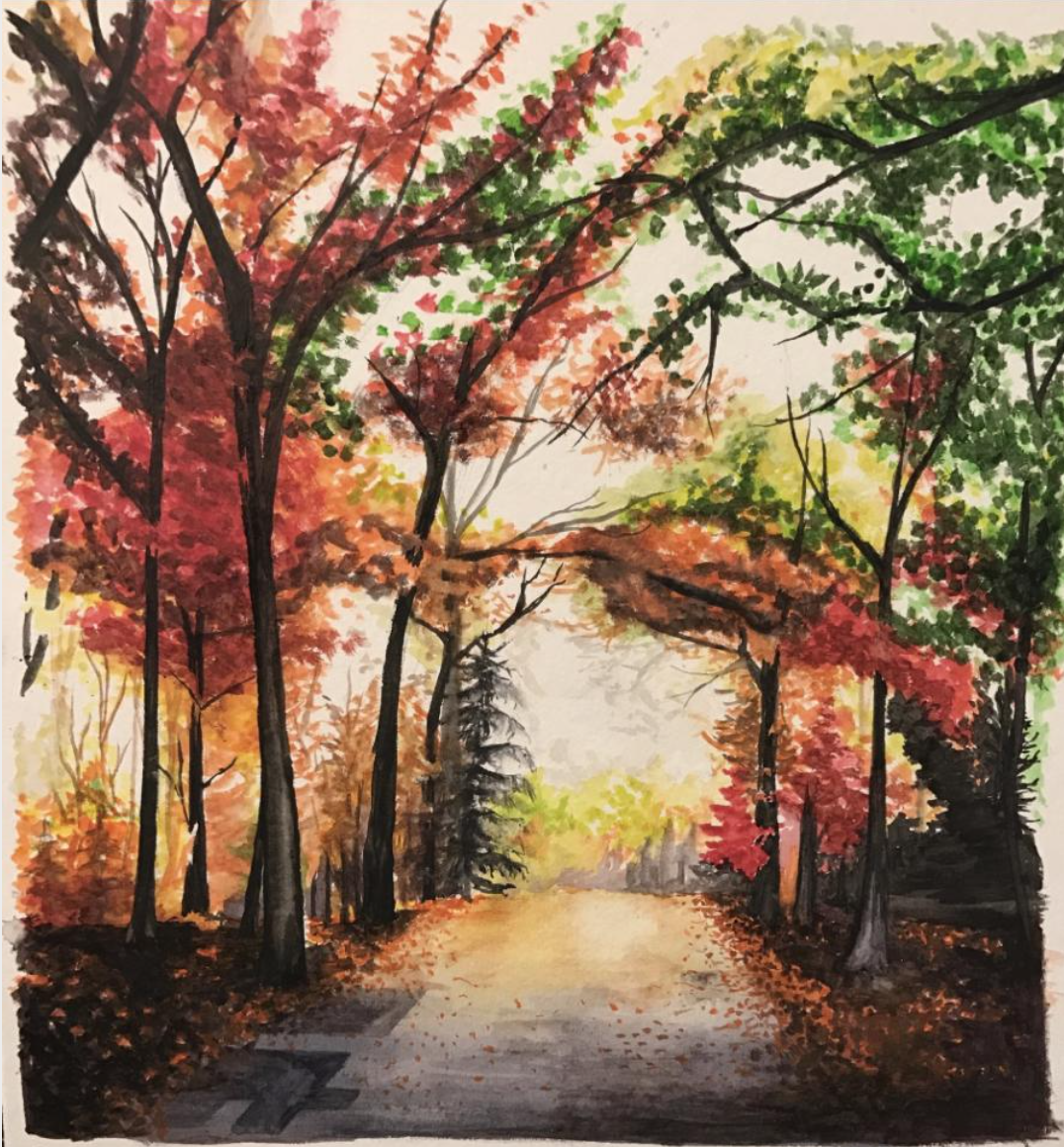
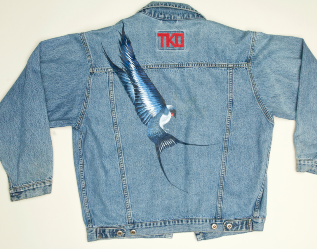
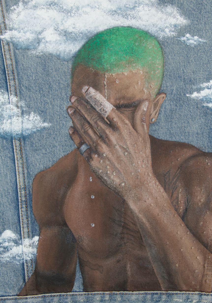
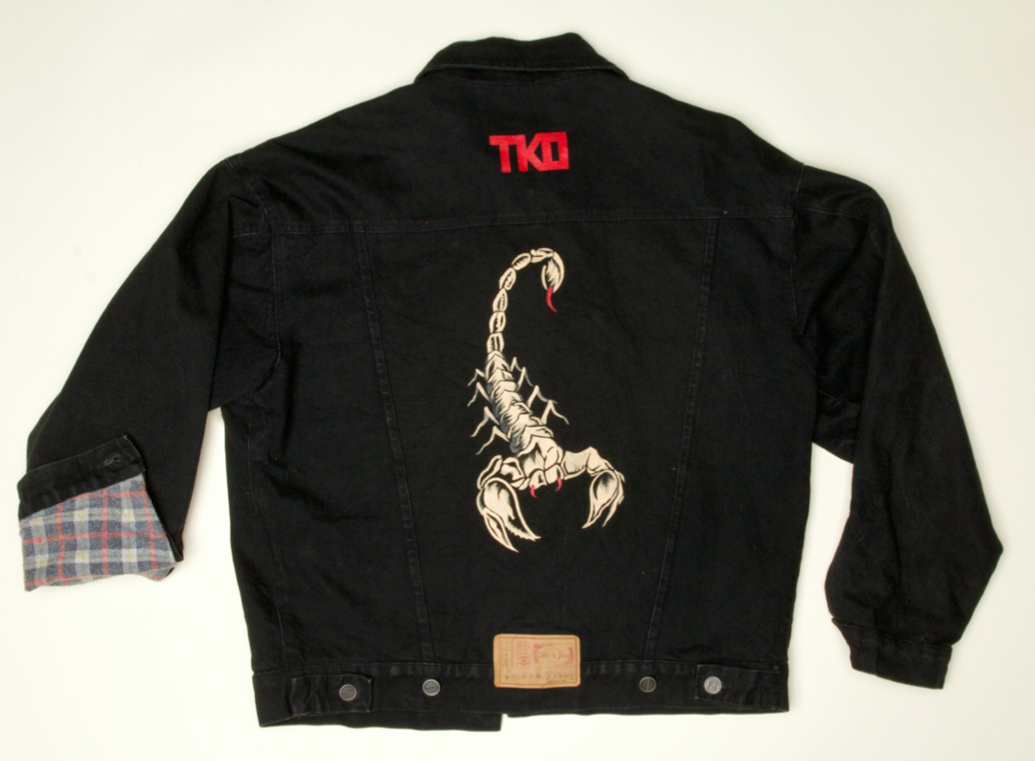

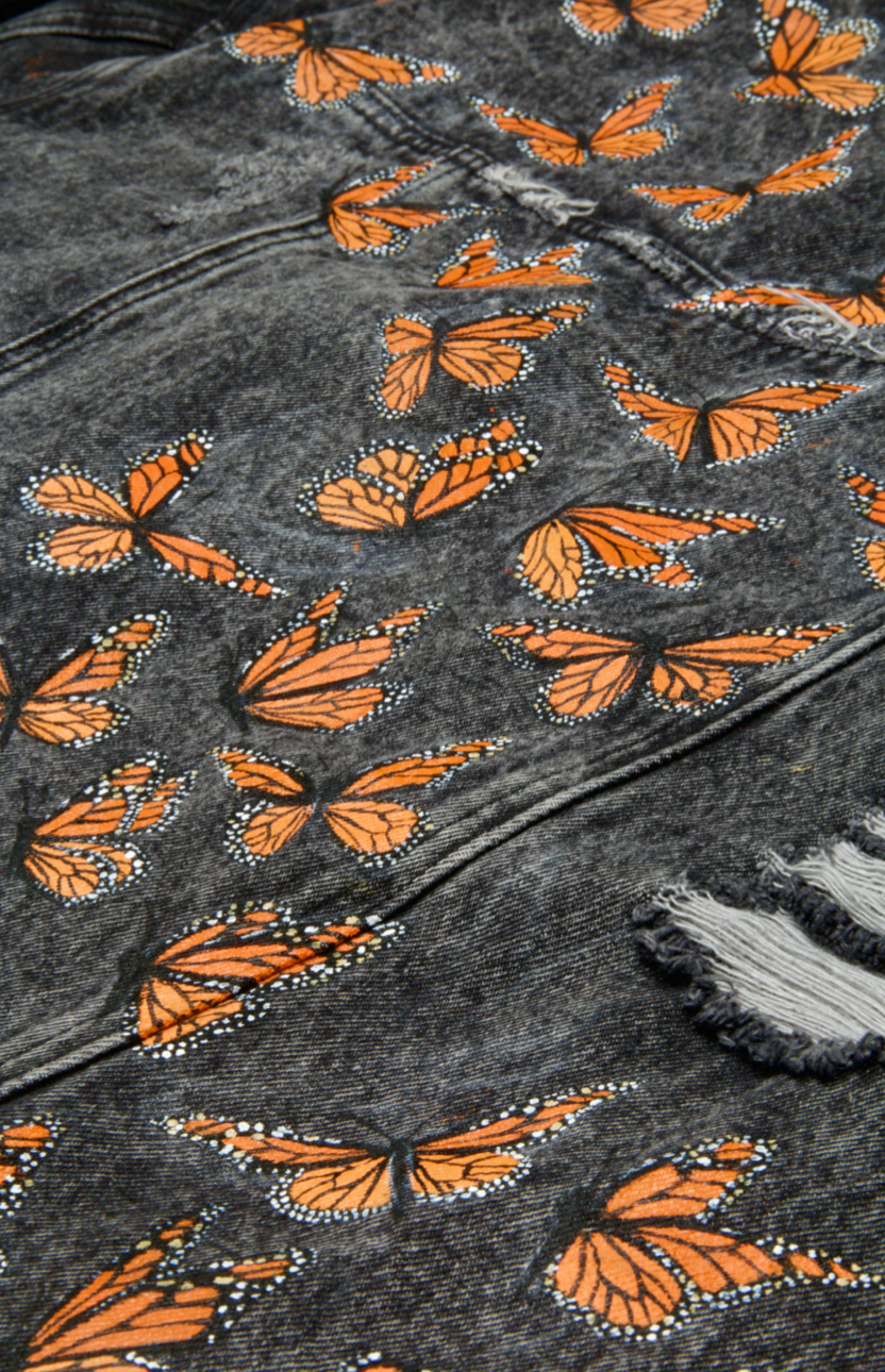
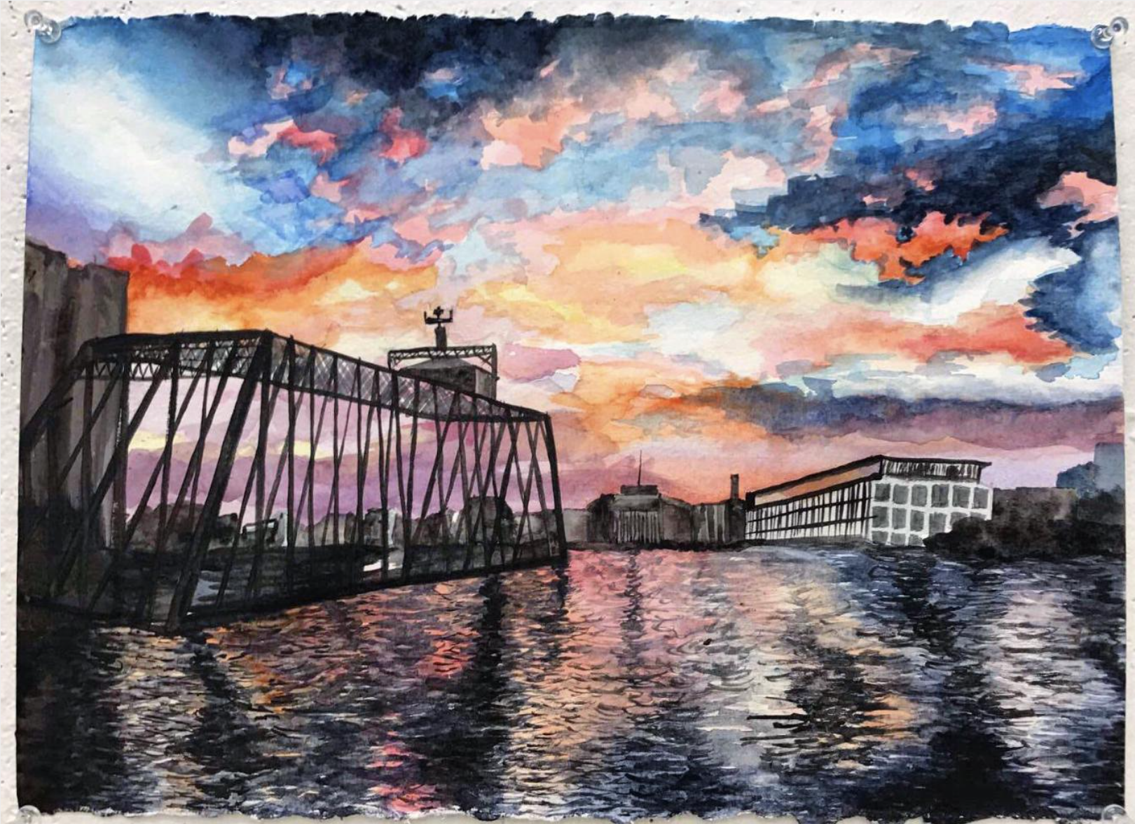


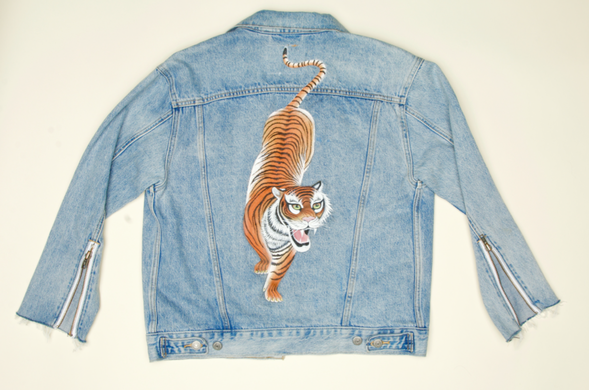

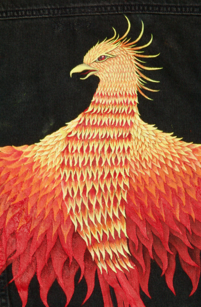

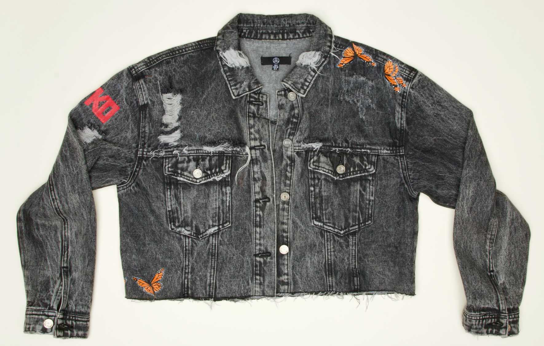
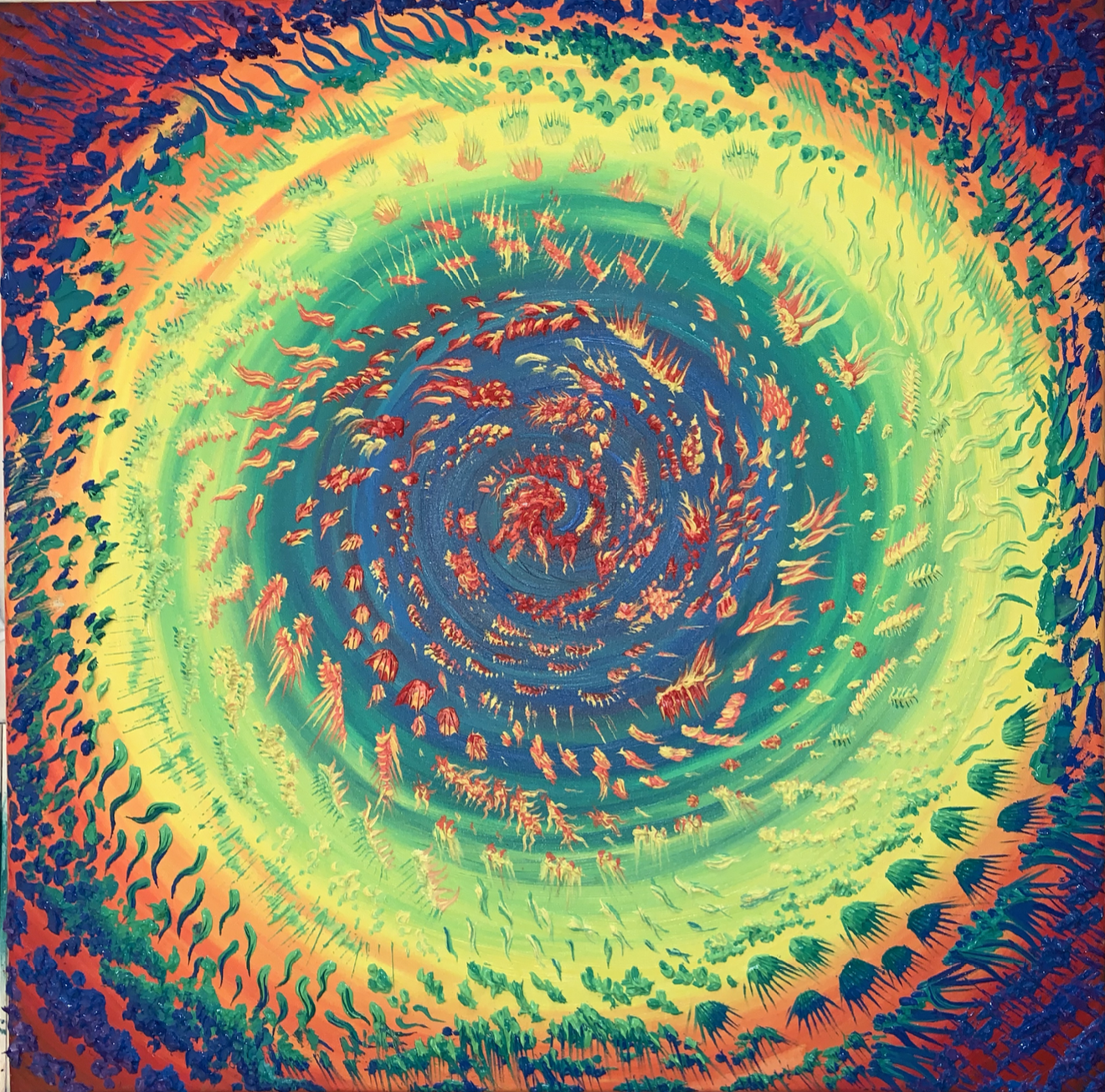
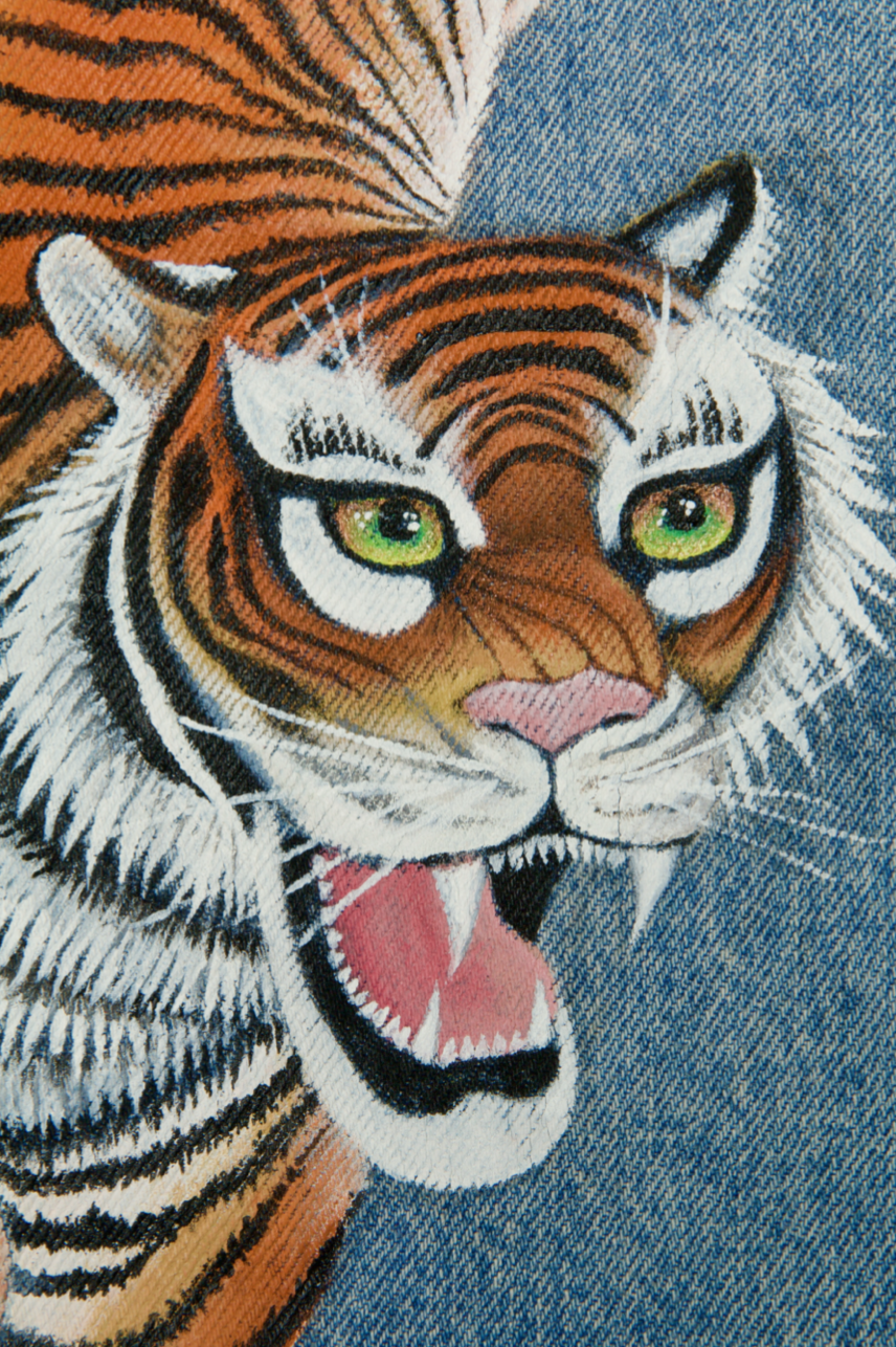


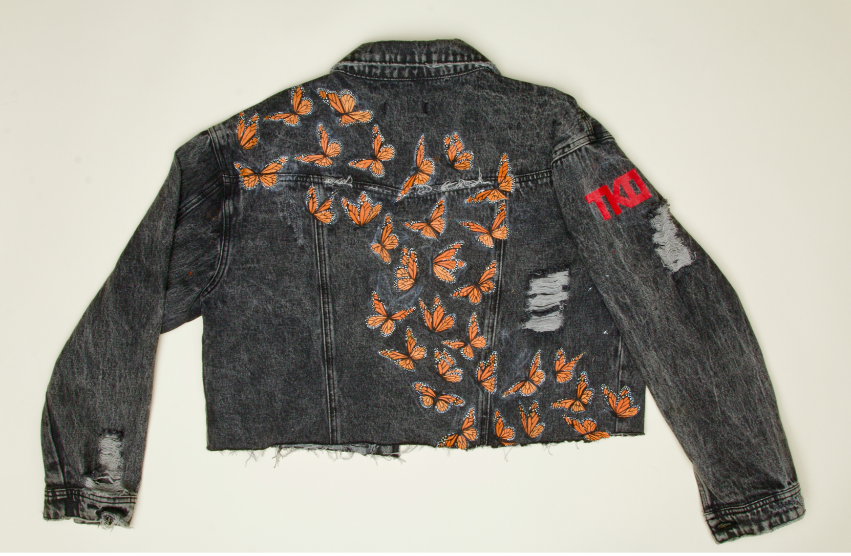


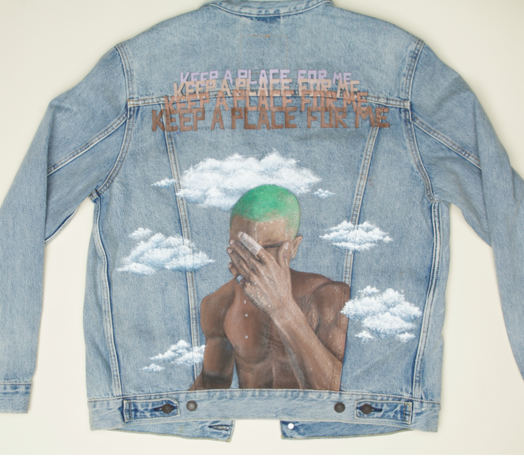
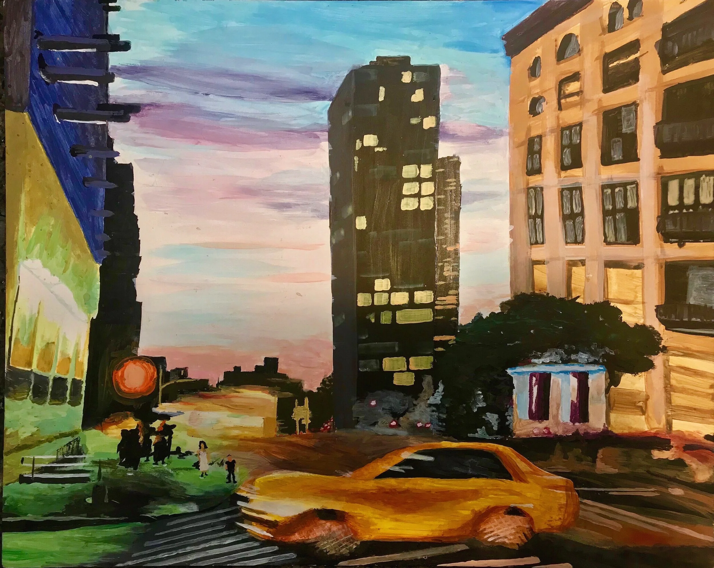

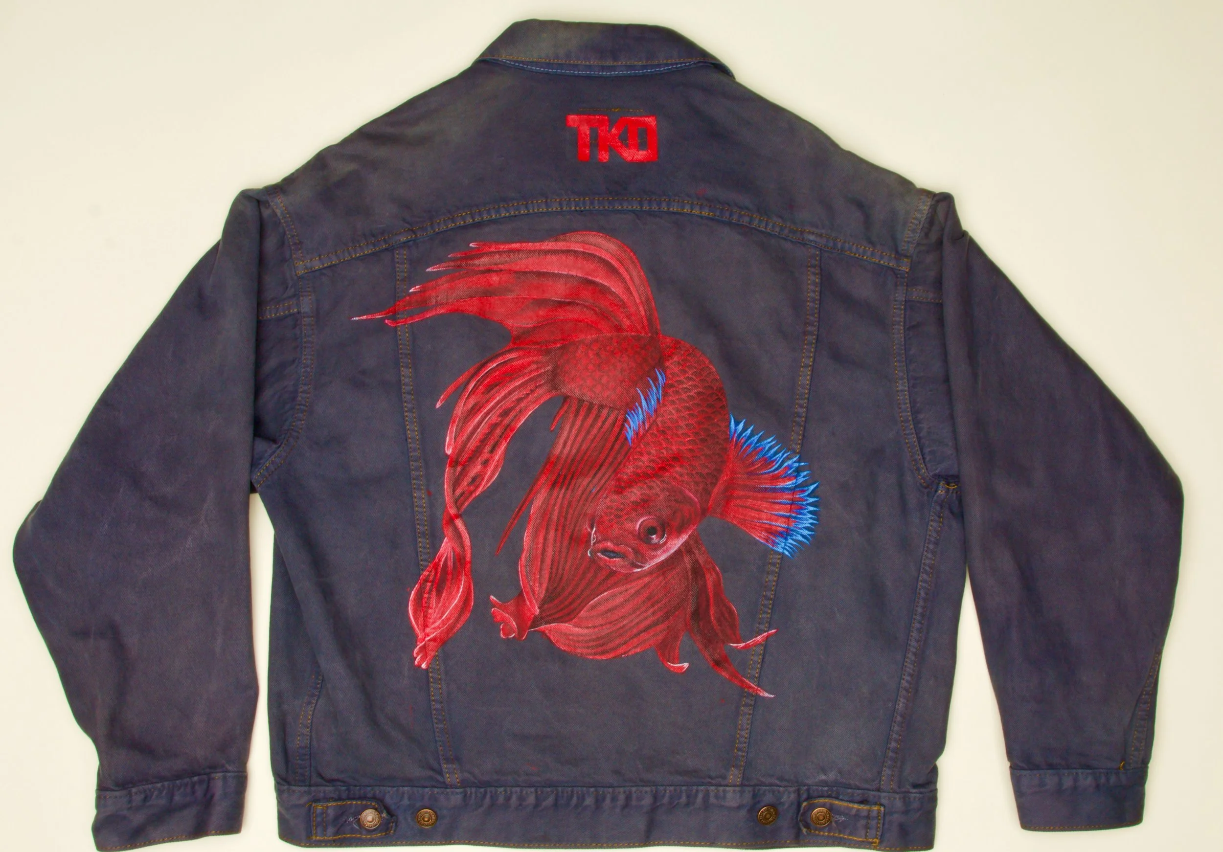
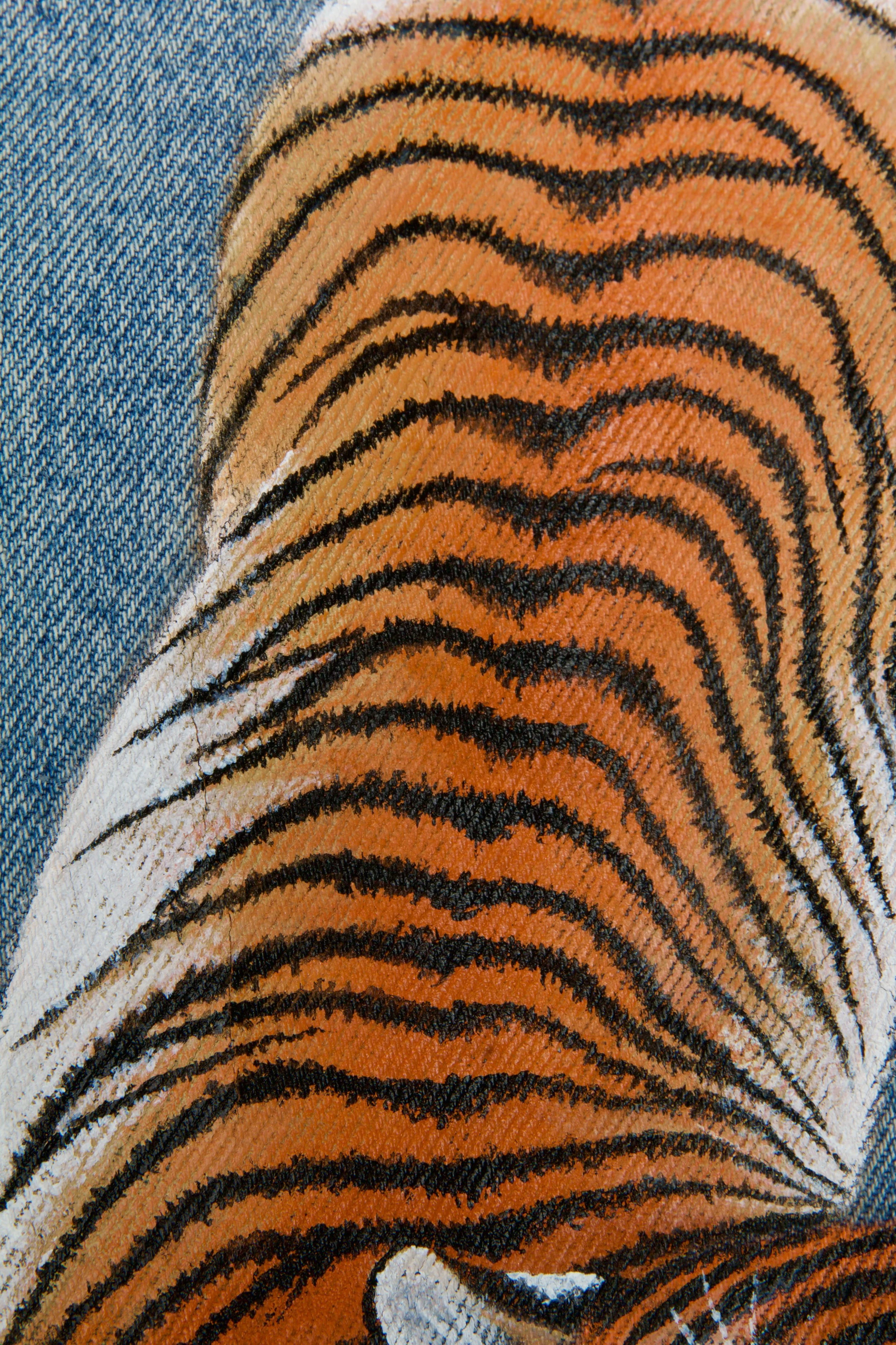
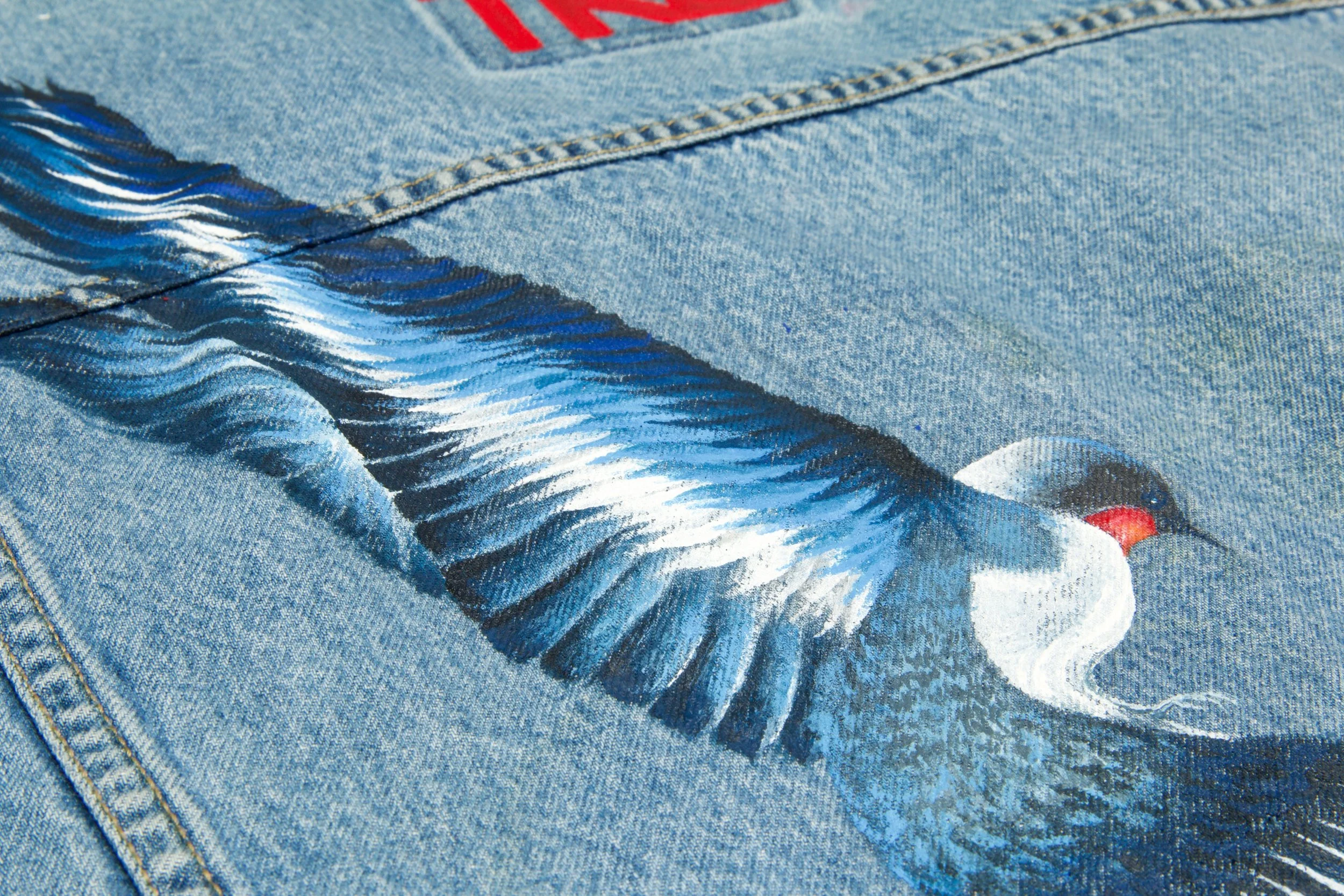

Commissioned works under brand TKO.