

Plannr
Centralize travel information. Solve communication and coordination issues. Impartially reach decisions. Plan an itinerary. Track spending. Better delegate the work.
Group Travel Made Easy
CHALLENGE
Design an app that solves an issue relating to travel, 4-week design sprint, utilizing the double-diamond design thinking model.
PROBLEM
From initial interviews two things became clear:
People mostly travel in groups
Planning that travel is always a mess
People struggle to coordinate and plan group trips, often times information gets lost and decisions don’t get made.
SOLUTION
Developed a travel app to solve the coordination and communication issues that arise when traveling in groups, for business or pleasure.
Plannr provides users with a means to impartially reach decisions, centralize travel information, track spending, plan an itinerary, share media, stay on time and solve problems efficiently.
SPECS
Scope: Independently developed in 4 weeks, from ideation to a fully functional high-fidelity prototype. Conducted user research, interviewed/tested 20+ users, created 50+ wireframes, created user flows, user journeys, storytelling visuals and 15+ other graphic artifacts. Iterated on interfaces integrating user feedback, and established a design system with reusable UI components and interactive animations.
Created two high-fidelity prototypes in Figma, demonstrating the user experience of onboarding and in-use.
Tools Used: Figma, Adobe Creative Cloud (XD, InDesign and Photoshop primarily)
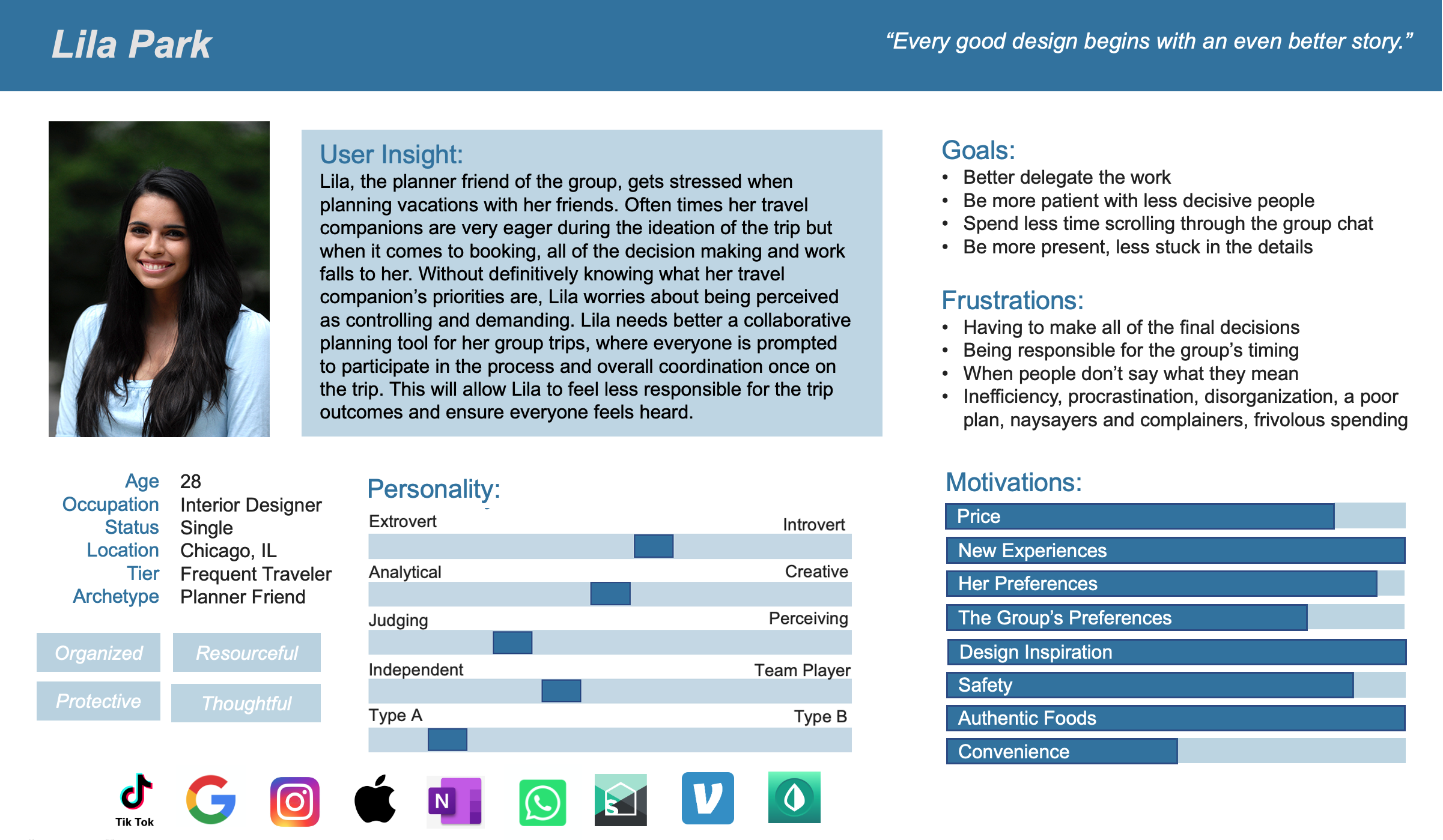
Who are our users?
Six user interviews and a survey with 73 participants was conducted. Key moments were then grouped to discern people’s most common travel habits, concerns and frustrations. During insight synthesis, a pattern emerged.
Most travelers fall into one of three archetypes, each with their own specific concerns:


Empathize with the User
What do people need a travel app to do?
I began my research by crafting research objectives:
What integrations would be advantageous?
What information needs to be prioritized?
What types of plans do people want to organize before the trip?
What types of users are we going to have?
What accessibility features need to be considered?
And ultimately, how can we improve the overall experience of traveling in a group, from ideation to execution and after?
The commonalities?
But no matter the archetype, everyone expressed some similar wants, hopes and needs.

How Can We Get More Specific?
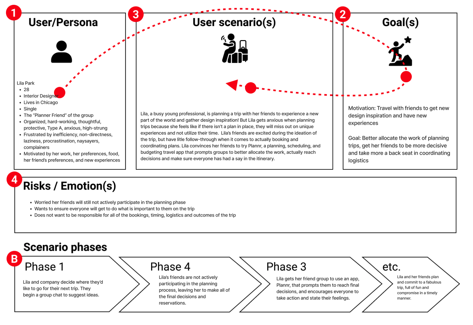
To synthesize these findings into one user persona, representing multiple users, I first explored what our users say, do, think and feel in an empathy map. Although the needs of the other two archetypes are important, I had to focus design solutions on the planner type, because they’re ultimately the ones doing the most work. Unlike the other two archetypes, the planner friend’s workload increases as the group size does.
We believe that users need an efficient means of coordinating group travel, to better utilize their time on vacation and ensure everyone has had a say. We observed that without an alternative, people rely on group chats where decisions don’t get made and the actual planning work falls to just a few.
Further iterating on those insights ultimately gave way to the Problem Statement:
Our persona…
Says they want to be more organized, and they like to plan and budget
Thinks the best way to prepare for a trip is to have one thing per day planned at least, so there’s room to go with the flow but they don’t miss the most important activities
Feels overwhelmed by having to make all of the final decisions and long texting threads, and worries people aren’t saying what they really feel
Does take on a significant share of the travel planning responsibility, coordinating the timing and booking accommodations, restaurants, and excursions ahead of time
Is pained when people are non-committal and slow to reach decisions
Is happy when everyone is on the same page and enthusiastically involved in the planning
Define the Problem
What is Already Out There?
To kickstart ideation, I did a deep dive into the competitors already available to users on the market: direct and indirect. Although a lot of these tools are already available to people, they’ve not yet been integrated into one platform, friendly to both iOS and android users.

What Can We Do Better Than Our Competitors?
To prioritize features, I looked into users’ needs: past, present and future. The idea clusters that formed from the “I Like.., I Wish.., What If…” ideation exercise ultimately defined the remaining research objectives to be answered: what integrations and accessibility features do people want?
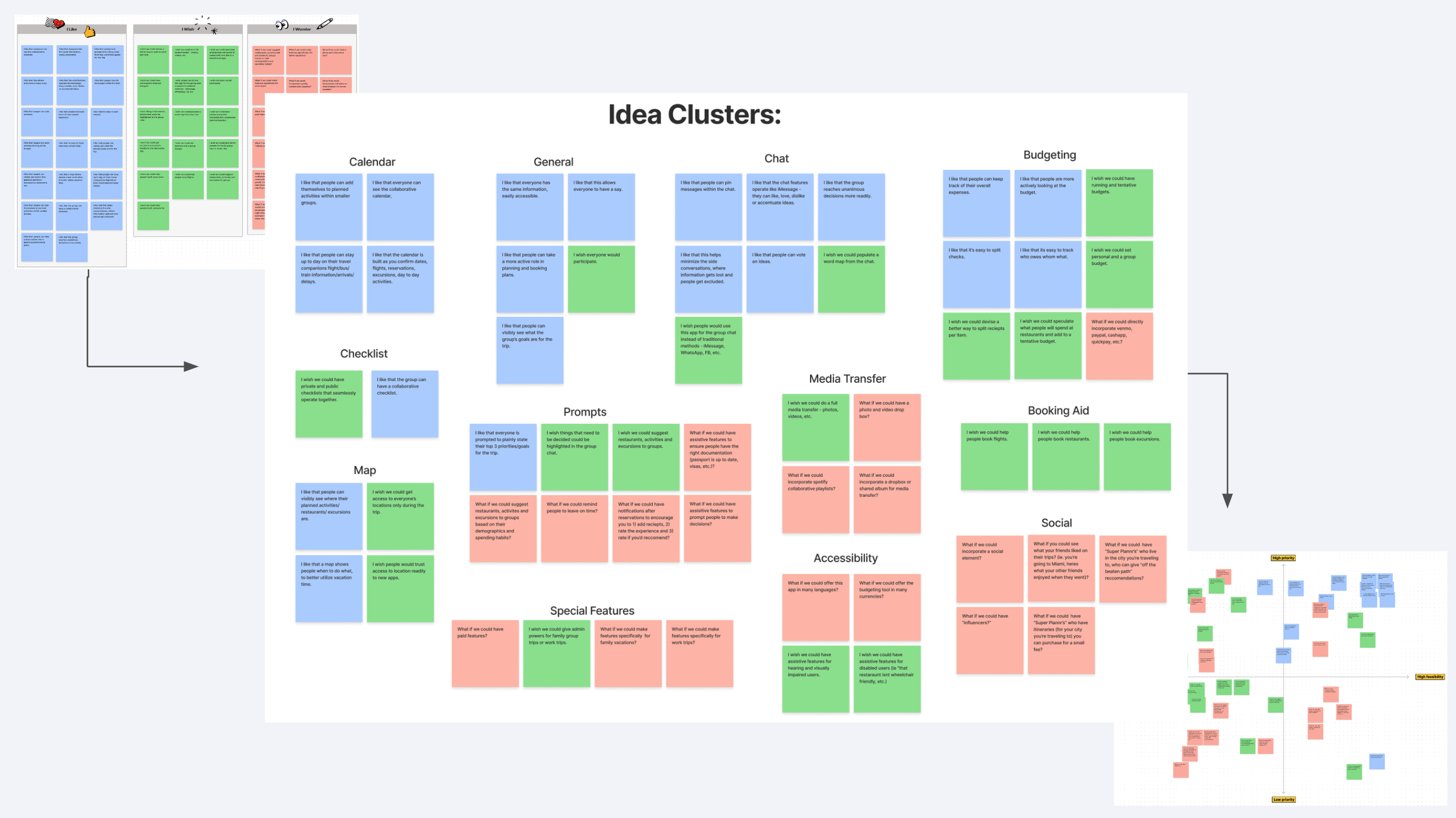
Do These Ideas Solve Our User’s Problems?
I then used storytelling methods to explore how these solutions could solve those mutual issues expressed by users during research and illustrate what benefits and pitfalls may present. Throughout these exercises I really wanted to focus on demonstrating how issues will still arise, Plannr isn’t the end all be all, but it can help!
One such example I demonstrated is how if you’ve overbooked your trip and timelines are too tight, the itinerary and calendar will visibly alert you to this and you can quickly send out a poll to settle it.


Ideate Solutions
Key Features:
Organized group travel information
Flight Tracker
Calendar and Itinerary
Collaborative Checklists
Group Chat
Budgeting Tool
Group voting and polls
A map and geo-location features
Media Transfer
How Well Do These Ideas Solve their Problems?
With still too many features prioritized for my scope, I utilized the Value Proposition Canvas Method to really dive into:
Which features alleviate the pain-points of which archetype?
Which features add gains for which archetype?
Which features alleviate the most customer jobs?
to ultimately decide which features add the most value, in deciding which features to move forward with while balancing scope with timeline.

Through these ideation exercises and the analysis and many iterations that followed, I defined the Value Proposition Statement:
My organization, Plannr, is developing an app to help groups traveling together solve coordination and communication issues impartially and efficiently.
We’re better because we’ve integrated all of the tools travelers might need into one simple but customizable platform, full of assistive features, prompts and reminders to keep groups on time, satisfied and balanced.
We’re believable because this idea was born of a group of friends on vacation together. Our varied personality traits and travel habits, good and bad, spurred research into types of users and their specific feelings, frustrations, wants and needs for traveling in a group setting.
We didn’t create what people theoretically need, we created what WE need.
I wanted to broaden my solutions to consider all three archetypes, to explore how each benefit, pitfall, job, pain reliever, and gain affected each archetype uniquely.
The orange post-its represent the planner archetype, the blue the procrastinator and the purple the middle man and the overall group.
Prototype the Design
How Do I Get People Interested?
Onboarding is crucial. If the app doesn’t grab people’s interest, show them what it’s about and make it easy for them to get started, even the best ideas can fall to the wayside. So I began my prototyping ideation with designing a task flow and then user flow for the onboarding process.
Research uncovered that people don’t have a problem with making an account, but if too much information is needed or it taking too long - they’re out. So I focused on liming options for ways to login, to contact points that any group of friends or colleagues would already know: google account, phone number or email.
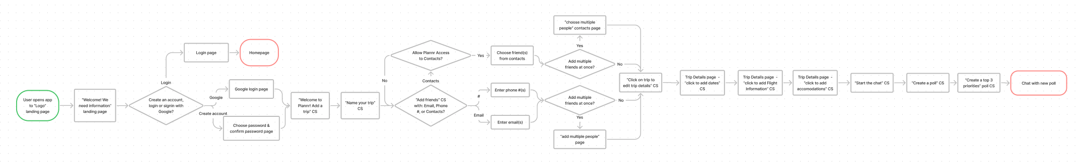
Once logged in, I decided to direct users through setting up their first trip as a demo of the features, utilizing pop-ip guides that they can bypass. I wanted this walkthrough to highlight secondary app features, because the primary ones were already spotlighted in the bottom nav.
The Outcome of the First User Tests?
After 5 A/B tests of this user flow in many rounds of feedback and iteration, I started paper prototyping with the overall objective of: simplify.
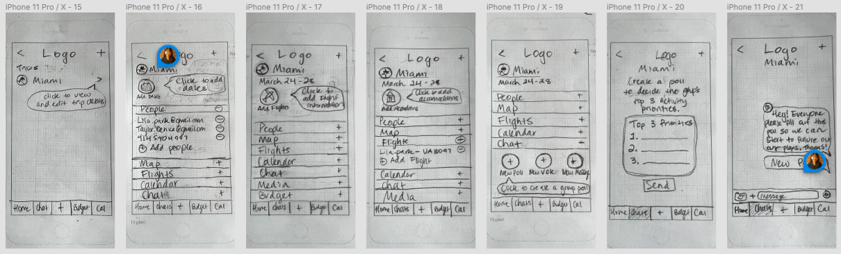
I also wanted to use an expansion/minimizing format because it’s familiar and I received so much feedback about endless scrolling being frustrating.
Test & Iterate, Again & Again
Lo-Fidelity Prototype:
Iterations after 3 more usability tests served as direction for the lo-fidelity digital prototype, specifically made to test the click-ability and flow. This is where we can start to see the introduction of the color scheme, which was chosen based off of:
Blue evokes a sense of purpose, productivity, responsibility and action – that’s why most social apps are blue
Purple is universally understood as royal, and evokes a sense of luxury, wisdom and power
I wanted the app to feel genderless, so I muted a blue-based periwinkle and expanded on that color in a monochromatic palette, for simplicity to the eye
Mid-Fidelity Prototype:
After some simple A/B, Tree and Usability testing, I transitioned to a mid-fidelity prototype to begin gathering the bulk of my user feedback.
The user flow ultimately became:
Users were first offered 3 ways to begin: existing user, signup or sign in with google
Then they’re asked to name a trip, add a photo and add friends
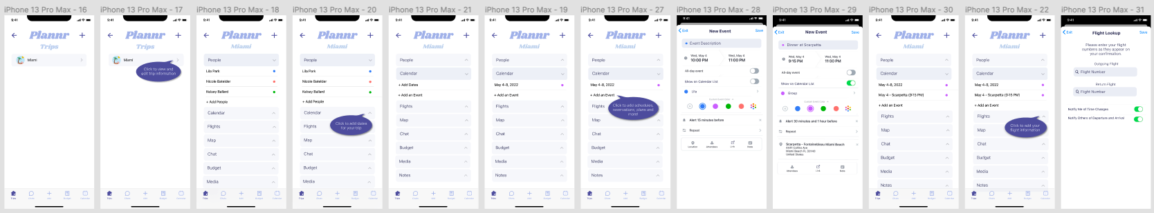
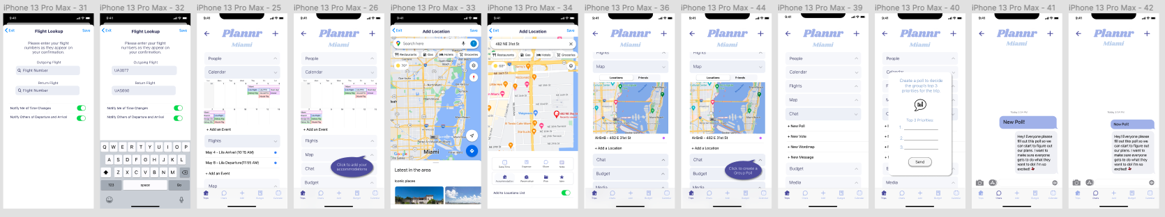
This is followed by coaching prompts illustrating where users can add their preliminary trip information: dates, flight information, accommodations, any existing reservations, etc.
And lastly, they’re asked to send a poll to their travel companions to start solidifying their travel plans!
Test the Usability:
Four user tests were conducted on this mid-fi version to asses usability, with the testing objectives of:
Simplify the onboarding process and UI design system overall
Find gaps or order of operation issues in the user flow
Pin-point moments of confusion and hesitation
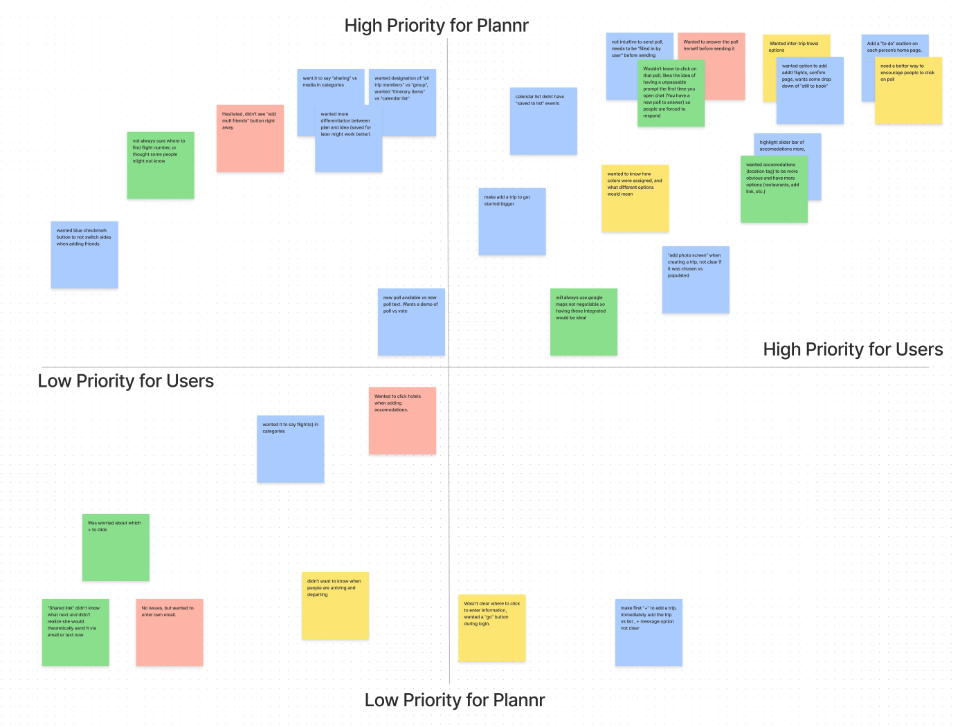
I asked users to walk through the steps outlined in the guides, which resulted in an 87.5% avg task rate success. In an affinity diagram and feature prioritization matrix, I analyzed the feedback and garnered these key takeaways:
Reword to include business travel (friends → people)
Add a “To-Do List”
Sending polls shouldn’t be in chat
Flight information prompt incomplete
Enlarge and darken some buttons
Missing iOS prompt screens for access
Missing or non-continuous elements
Hi-Fidelity Prototype:
After an additional round of testing and iterating on the Hi-Fi version, Plannr’s hi-fidelity onboarding prototype was ready!
Post-Launch Problem
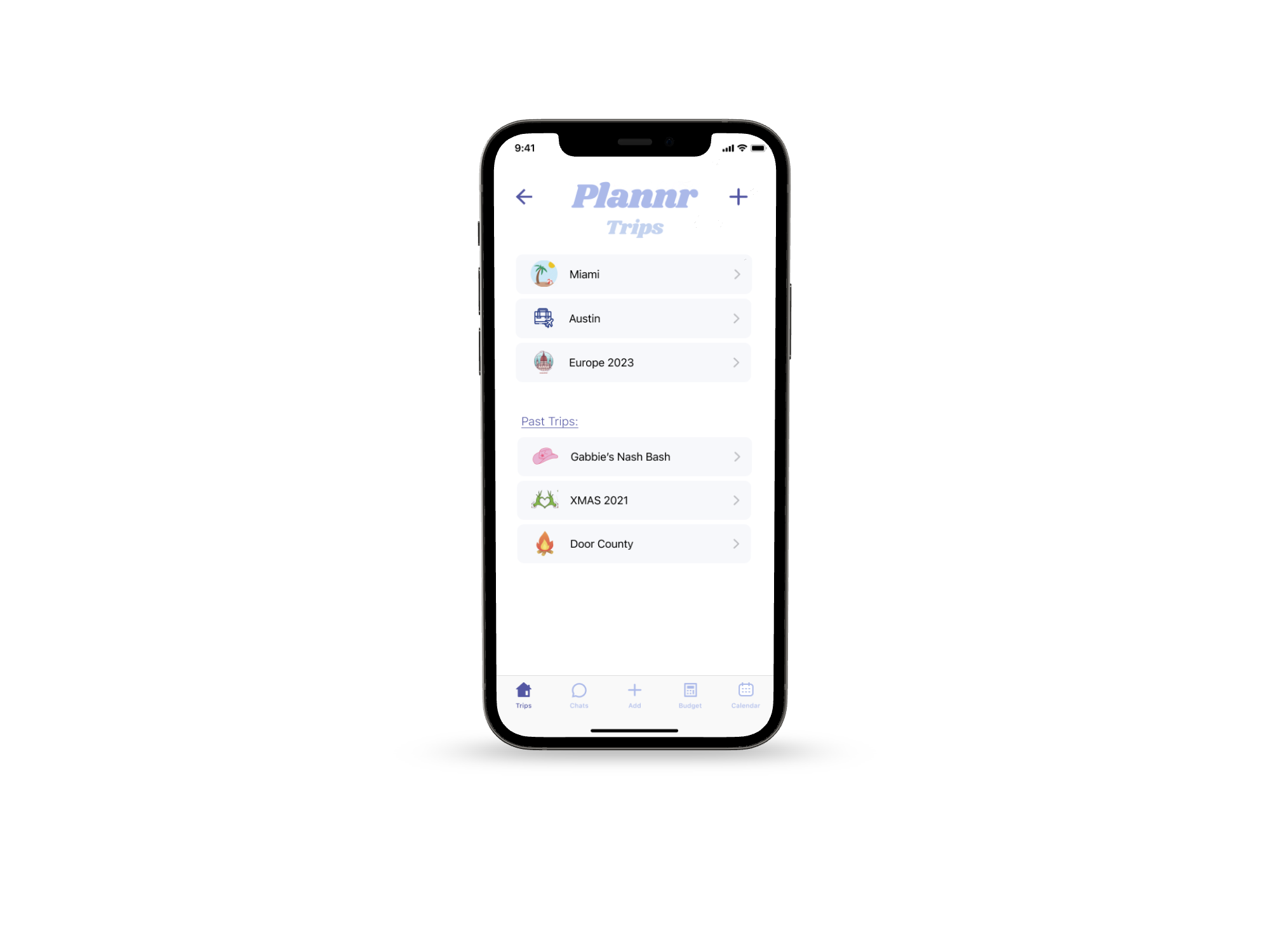
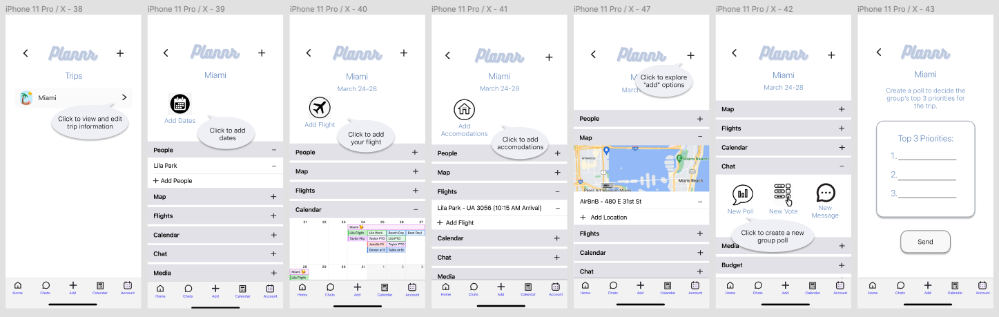
What Does the Plannr Look Like In-Use?
After presenting Plannr to my classmates and demo-ing it to family and friends, one thing became incredibly clear: an onboarding demo is not a great way to present the app’s overall concept.
So I focused my work post-grad on designing pages that illustrate what the app looks like in full-swing with past and upcoming trips, and testing an iterating on that user experience.
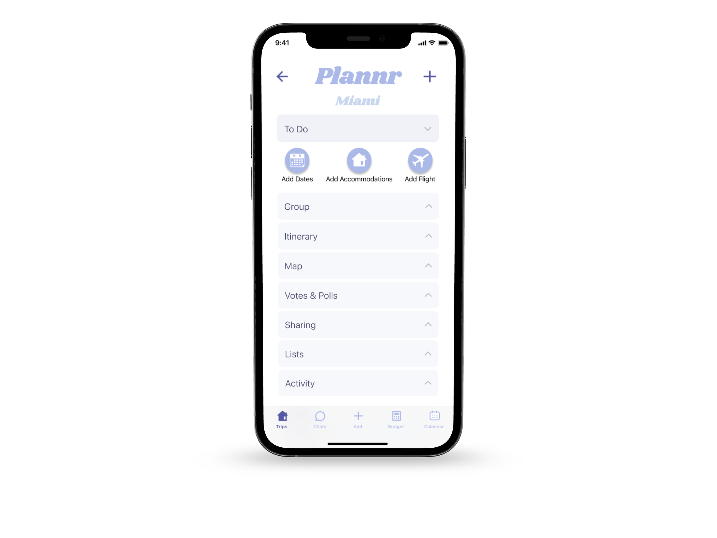
Key Features:
Group Travel Made Easy.
Centralize travel information. Solve communication and coordination issues. Impartially reach decisions. Plan an itinerary. Track spending. Better delegate the work.

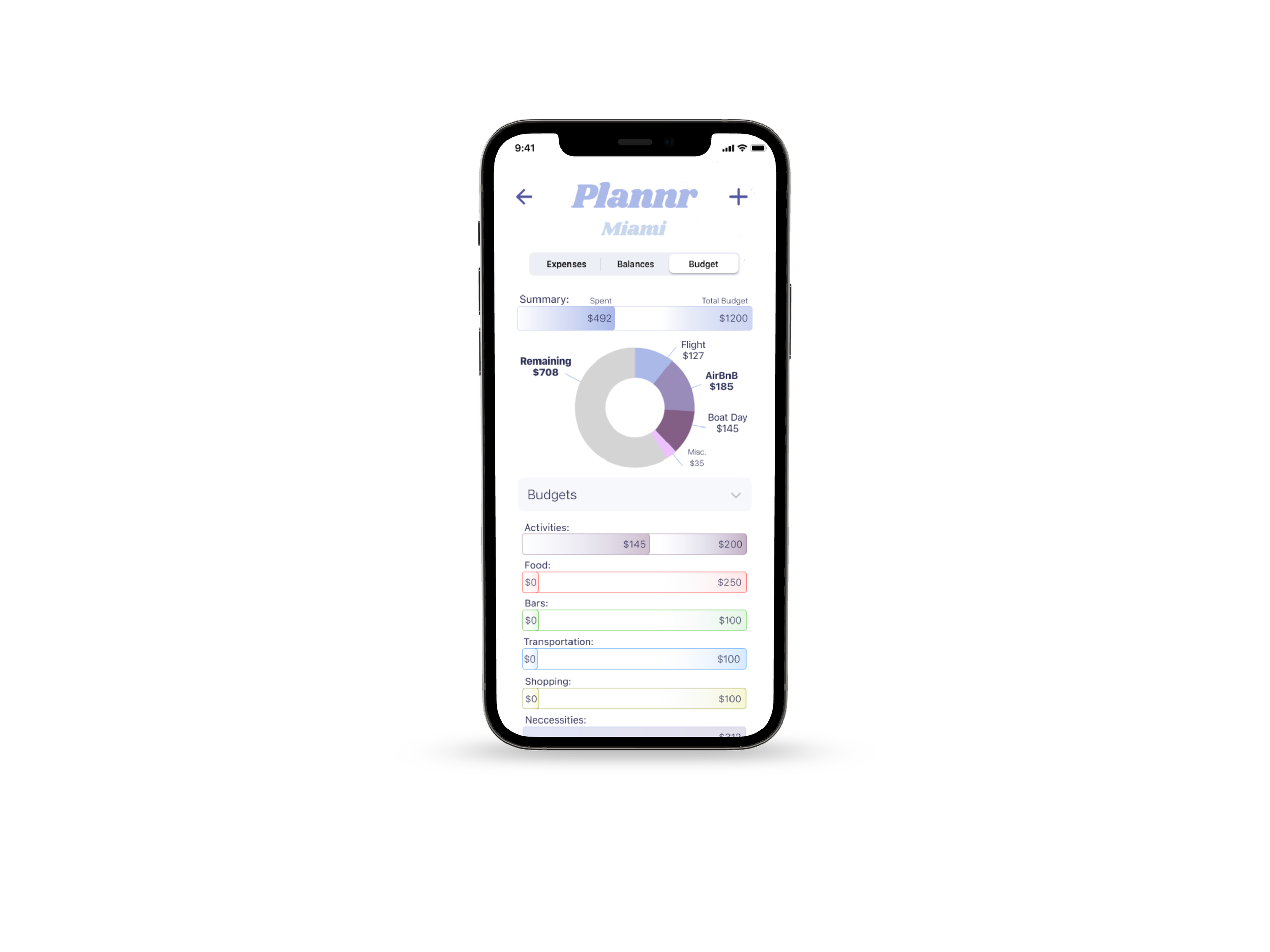
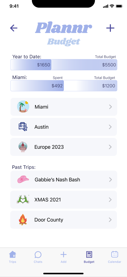
Budgeting Tool

Calendar & Itinerary
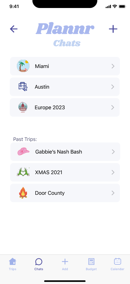
Group Chat
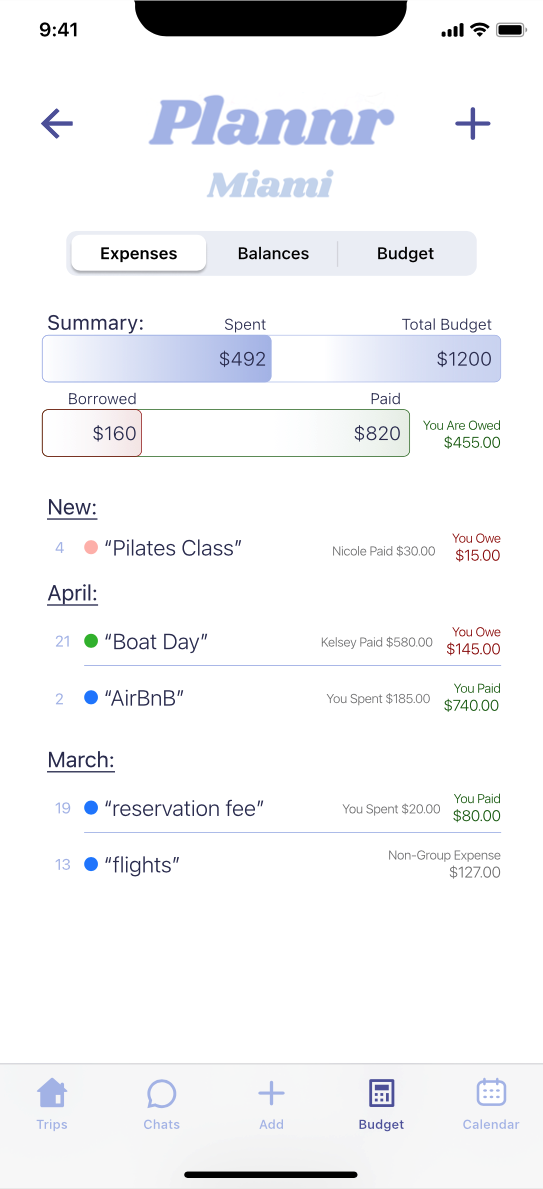
Traveling in a group with varied budgets and spending habits can be tricky. With Plannr you can:
Track spending, split payments, and simplify debts
Design and share your budget with your travel companions
Increase awareness of spending
The same group chat features you know and love, but fully integrated.
Message reactions, direct reply, etc.
Voting, polling and word cloud generation
Can generate “To-Do” list items and set reminders
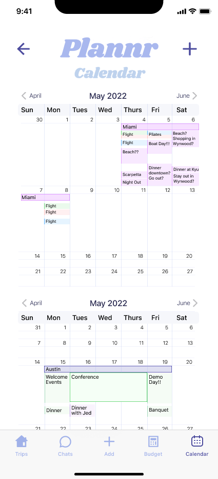
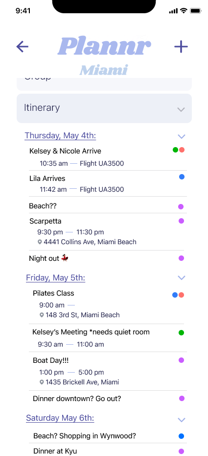
Two ways to visibly see how the plans align, keep the information readily accessible and improve timing.
Itinerary - a quick snapshot of each day
Calendar - in depth look at everyone’s schedule
Foster inclusion and collaboration


To-Do Lists
Stay on top of your to-do list, send reminders when action needs to be taken and keep the planning moving.
Map
Map out your accommodations, reservations, even tentative plans. Utilize the location services to stay on time and easily find your travel companions’ live location.
Group Information
Readily accessible contact information, color-coded for ease.
Votes & Polls
Anonymously gather feedback on proposed ideas. Give an equal opportunity to everyone to voice their opinions.

Sharing
One place for everyone to share photos, videos, playlists and more.
Lists
A tool for creating collaborative checklists and gathering notes.

One Place to Keep All of the Essentials

Lessons Learned:
User feedback is invaluable - what is logical to me may be entirely unclear to others
Figma components are your friend
Simplify onboarding as much as possible - retention is the goal
Design for your user persona but think of other users throughout the process
Don’t be afraid to redo or even remove whole parts - less can be more!
Next Steps:
The next step for Plannr is to continue testing and iterating, there is still a lot of work to be done and improvements to be made. Assuredly we will uncover more ways to expand on the original goal: organizing and storing travel information for groups.
Ultimately I want Plannr to improve the entire experience of traveling in a group. An all-in-one tool for solving the problems that inevitably arise as all different types of people: planners, procrastinators and everyone in between, travel together. User interviews made it clear - the main issue is not a lack of information organization. It is a varied group of people successfully communicating their needs and feelings, keeping the same schedule, fairly reaching decisions and then acting on those decisions.