

Clarity

Simplify finding skincare products that meet our specific needs within our personal lifestyle, access and cost constraints, and learn about the benefits and ingredients in layman’s terms, and a safety and packaging rating.
Clean. Clear. Conscious.

CHALLENGE
Research, prototype, test, and validate an idea for a brand-new mobile application with a group that solves a real, clearly identified need in users’ everyday lives.
PROBLEM
Due to a lack of transparency in the skincare industry, the sheer volume of options, and information that is often contradictory, users have a hard time finding the right products for them.
SPECS
Scope: 3 Weeks From ideation to a fully functional high-fidelity prototype that walks users through the onboarding process.
My Role: Served as project manager, leading a team of 3, defining product look and feel, providing feedback and managing product timeline and deliverables. Responsible for the opener: onboarding, the skin-type survey and results, and product pages, as well as style specification, branding and copy. Facilitated user research by completing 15+ user interviews, 10+ usability and accessibility tests, 5+ user flow tests and 5+ focus groups. Developed 30+ wireframes, and 37 lo-, mid- and hi-fidelity prototype screens and analyzed 123 survey results with data visualization tools. I additionally designed all of our internal graphics and did all of the secondary research about skincare and cognitive biases.
Tools Used: Figma, Photoshop, Adobe XD, InDesign
SOLUTION
An app which helps users narrow their search for skincare products, by providing information on the benefits, ingredients, safety and packaging. Users can scan their product’s barcode to get this feedback instantly. The app will also provide personalized recommendations from a database of cruelty-free and sustainable brands with straightforward products and clean formulas.
Empathize
Why Skincare?
Our idea began as an app that helps users live a more sustainable life – inside and out. A cross between an online marketplace and a tool for in-store shopping where users could scan or enter any product – food, health, skin, beauty, etc. and get a return on its ingredients, benefits, failings, and sustainability. It will also recommend a healthier choice product that better suits the user’s needs.
We defined our user-focused motivation as:
The goal is for all the products we use daily to be 100% organic, sustainable and clean – so that we are. This isn’t viable today, but a balance can be achieved by everyday actions towards the goal.
Considerations like cost, access and lifestyle dictate what products we use and how to get them. But there doesn’t need to be so much guilt surrounding wellness, nor excuses: it’s not all or nothing. This app will provide transparency on ingredients of, or alternatives to, your everyday products. The goal is to form more sustainable and healthy habits, as an everyday small step towards improving our lives and our environment.
Why Does This Issue Persist?
Despite these four excellent options and many more, why do people still struggle to find the right skincare for them? We believe part of the problem to be cognitive biases.
What Matters To Our Users?
We conducted 5 interviews and a survey, which received 59 responses, to get to the heart of the solution. We focused our interview objectives on discerning:
Where are most people on their skincare journey?
How knowledgeable are people generally, about skincare?
How do they currently make these skincare decisions?
How willing are people to change their skincare habits?

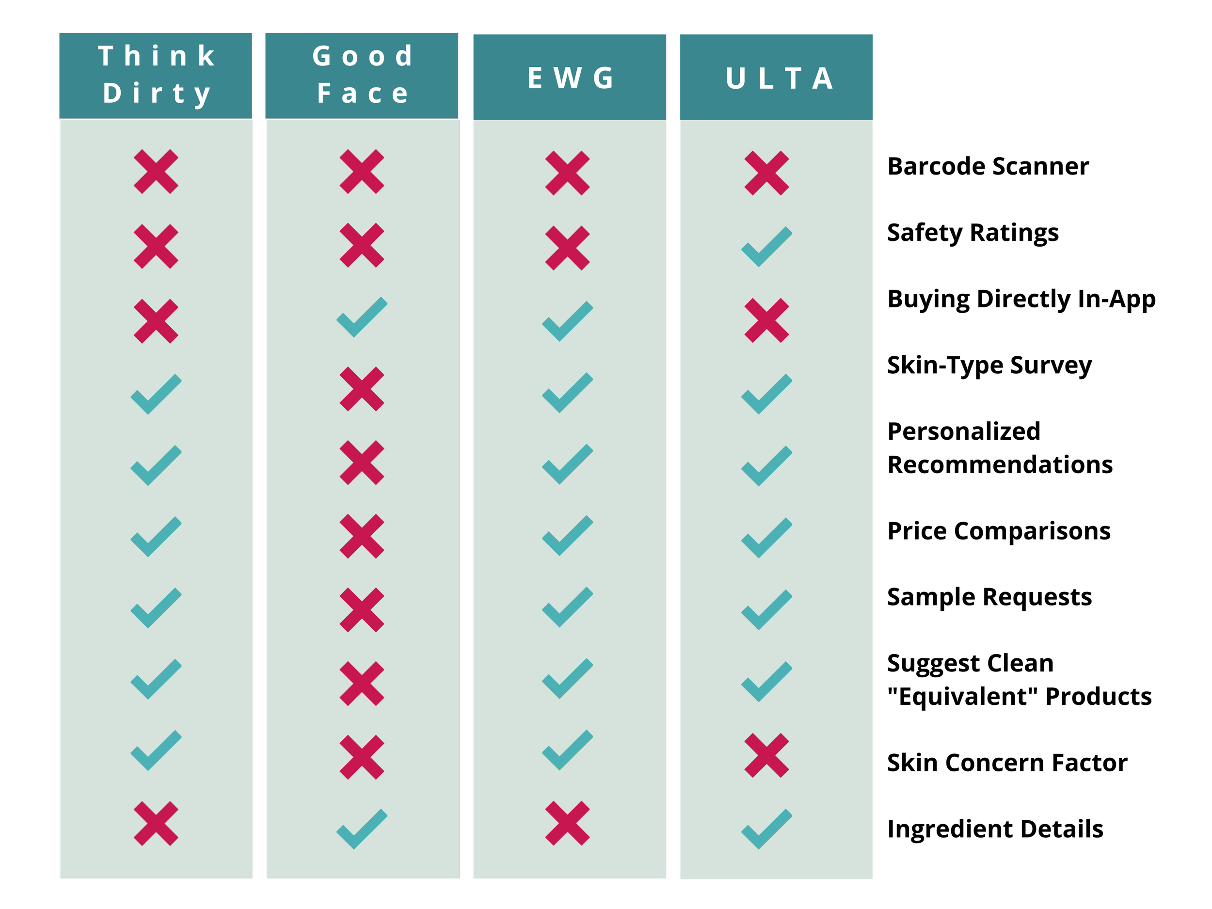
What Already Exists in the Market?
We compared 4 skincare apps to better understand what is widely popular among users and what about them works and what doesn’t.
Who Are We Designing For?
We began our research by defining our Proto-Persona:
Our user is very health-conscious, valuing wellness – physical, mental and spiritual.
In all things, including skincare, she is frustrated with excessive waste and the lack of regulations in the US.
She additionally has a hard time finding solutions that meet her cost, access and lifestyle constraints.
People like:
Barcode scanners – a popular feature among all four products
Keeping track of what products they liked and disliked
Personalized care
Filters and/or setting preferences
Feedback from the community
People don’t like:
long surveys to get recommendations
When alternative options aren’t suggested
But in keeping context and scope in mind, we landed on focusing on skincare because it is the part of wellness we already knew the most about.
Define
When asked “what’re the steps in your daily routine?”
The most common feedback:
People don’t know where to start
People don’t know what to focus their efforts and resources on, and in what order to apply products
People don’t know what ingredients they need
When asked “how do you find your skincare products?”
People prioritize cost and access primarily, but sustainability does matter to them when asked
People primarily rely on recommendations: professional, personal and online, often with little further research
People rely on what they already know, or already do
When asked “if you learned your skincare products used ingredients that were harmful, or weren’t beneficial to you, how likely (1-5) would you be to change it?”
People are willing to change, they just don’t have the resources
We also asked people, “how have your skincare habits changed over time?’
Their habits have already have changed over time
People tend to care more about skincare as they age
They also tend to care more about skincare, as they have the financial means to spend more time and money on finding what works for them
How Can We Help? What Can We Do Different?
Simplify the search process. Simplify the design. Simplify the survey. Simplify the feedback.

We discovered consumers are often overwhelmed by the volume of skincare information, unsure of which online sources to trust, and worried about the ingredients, sustainability, and morality of brands they use.
Therefore, we believe consumers need a simple way to pinpoint their specific skincare needs. We might be able by providing transparency on the ingredients and sustainability of popular brands, as well as research-backed recommendations on what would be beneficial to different skin types and lifestyles.
We might do this by helping users understand what ingredients are safe, what those ingredients hope to achieve and how they achieve it, and what brands use those ingredients in clean and straightforward products. Doing so will allow us to aid users in finding brands/products that better align their needs and constraints with their overall skincare goals.
What Are People Already Using?
How Do They Make These Decisions?
What’re Their Priorities, Making These Decisions?
When asked to “rate (1-5), how much each factor matters to them, when choosing skincare products?”
1 being the least important factor
5 being the most important factor
How Willing Are People To Change Their Habits?
Ideate
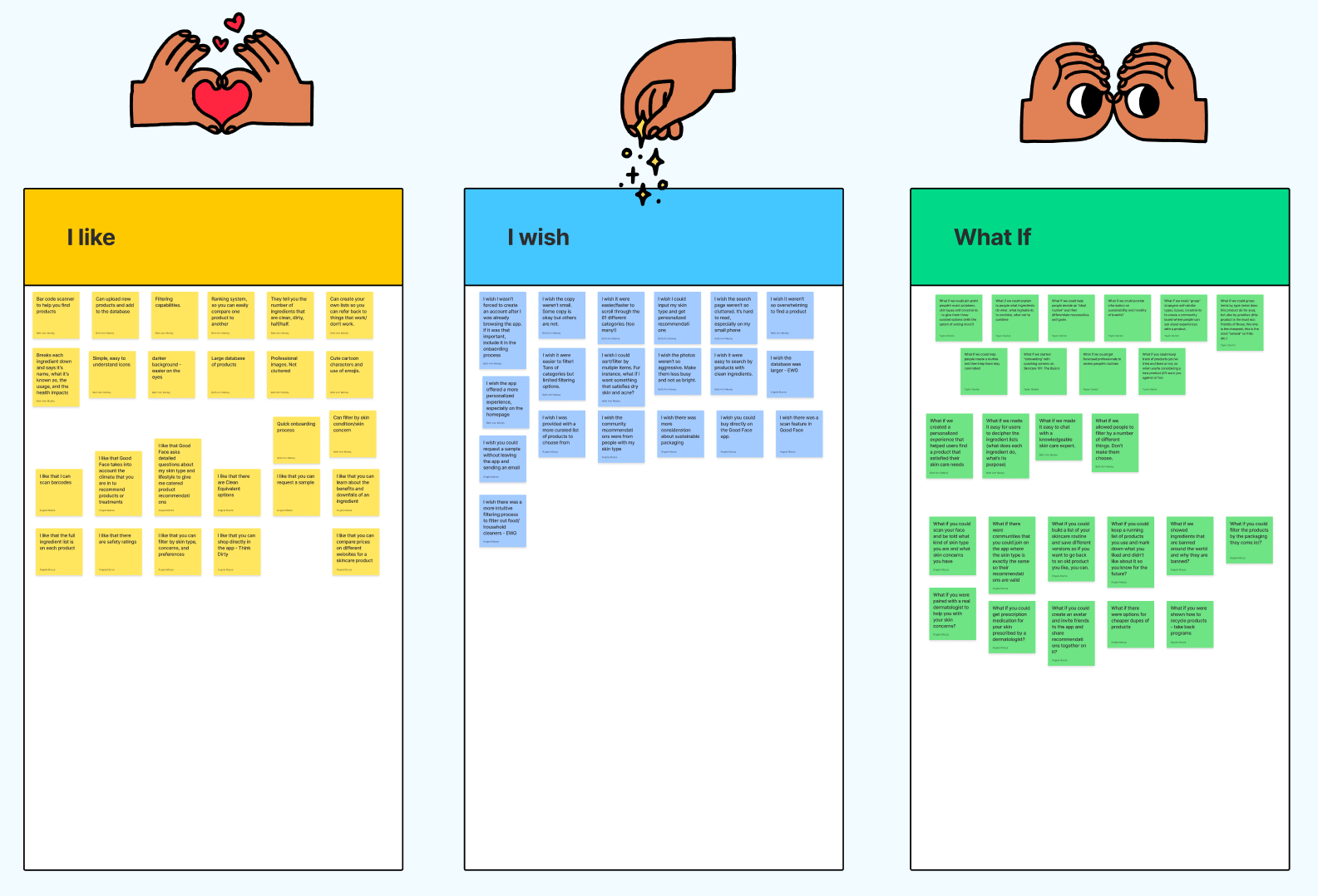
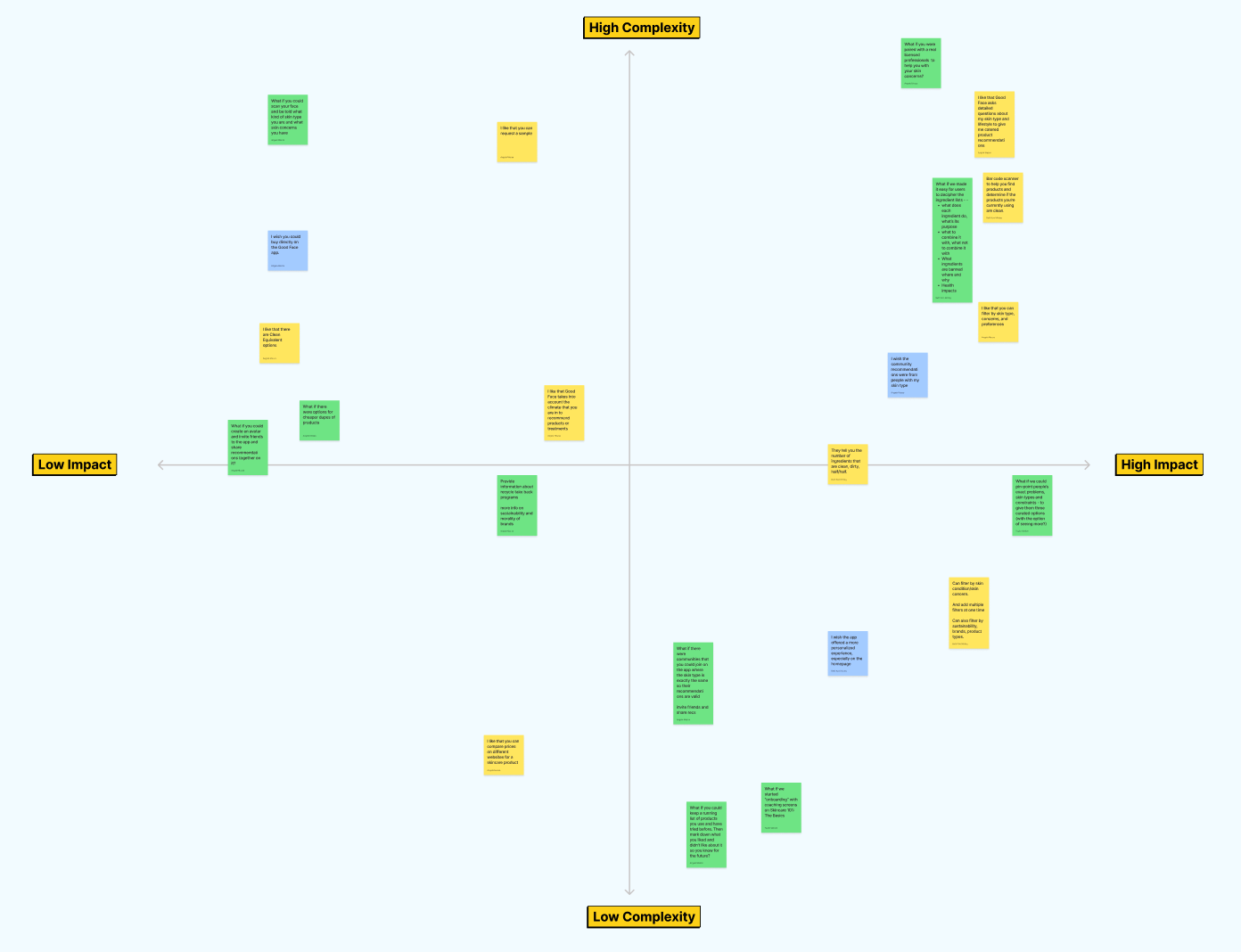
What Features Should We Prioritize?
Using the “I like…",”I wish…,” “What if…” ideation method and a feature prioritization matrix, we landed on designing an app that:
Pinpoints user’s exact needs based on: skin type, skin conditions, lifestyle, location, and goals
Makes personalized recommendations from a database of “clean” brands
Breaks down the exact ingredients in those products, what those ingredients aim to do and how to use them
Filters options by category: price, packaging, and skin type match
Asks users to sign up to save products and improve their routine over time
Has a barcode scanner to check ingredients and other information about products
There are a lot of other features we’d love to see come to fruition, but due to complexity and scope: we had to scale back for now. Some examples are:
Scan your face to output skin type and concerns
Compare prices, buy products directly or request samples
Social features – create a profile, review products and view friend’s reviews, find people who have similar skin types and issues and share recommendations. Build a community of people with similar skin-care goals.
Recycling takeback program
Cheaper dupes to expensive but loved products
How Did We Solve The Problem?
To continue empathizing with our user and visualize their emotions when interacting with the app, we explored the highs and lows of the user experience in a journey map and a storyboard. We then summarized all of these findings and our proposed solution in a problem statement:

Our app was designed to help users navigate the overwhelming amount of skincare products and brands on the market today, to discern what would be the best solution for their specific skin needs and goals within their constraints.
We observed that users are overwhelmed by the sheer volume of information surrounding skincare, so they often rely on recommendations from people they know, brands they’ve heard about, or what they’ve always done. But what is right for some isn’t right for others, and good enough isn’t the best.
How might we provide users with options for products from sustainable and cruelty-free brands, which offer clean and simple formulas, so they can make informed decisions that balance their needs and lifestyle with their skin care goals and morals?
Prototype
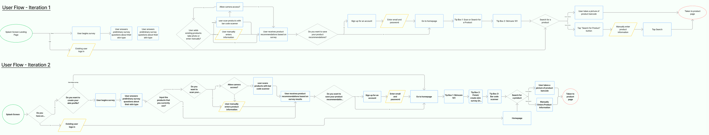
How Do We Direct Users to the Main Features?
When trying to decide how users will move through the features, we designed a user flow. We designed it to outline a path through onboarding and the key features: a short survey & subsequent results, the homepage elements and scanning a product.
Our first iteration asks the user initially whether they’d like to take a survey for personalized results or skip it. This version lead them through the barcode scanner as part of the survey, all BEFORE being prompted to sign up. Our initial goal with delaying signups was to maximize user retention; don’t ask too much of them too soon. We paper prototyped this and did basic testing which uncovered some issues in the user flow.
It became clear this would lead to a lot of pains when people go through the process, get what they need and exit and the survey results are lost repeatedly
How to use the barcode scanner wasn’t clear & users who skipped the survey couldn’t access it
So our next iteration begins by giving the options of: existing user, new user & start the survey, or continue as guest.
Our goal was to make singing up feel like a step in the survey, rather than it’s own laborious task. We additionally simplified the survey, to making it even quicker.
We also moved the barcode scanning feature to our homepage and created tool tips to guide users there.
We realized that users will also want to scan products many times, being the one feature consistent through all competitors. So it should be a prominent feature of the homepage.


Test & Iterate
What Is Working and What Is Not?
We then conducted 5 usability tests with the overall goal of discerning:
Where can we simplify the onboarding and survey process?
Are their gaps in the user flow?
Can users navigate the homepage features? Can users find the barcode scanning feature?
Is the overall language and UI simple and clear?
We analyzed the feedback in an affinity diagram, and a feature prioritization matrix. After much discussion, we ultimately landed on the following changes:
Rework the user flow at junction points, be sure the intermediate pages are clear
Survey copy needs to be entirely in layman’s terms
Add somewhere to save recommended products and clarify if it’s “saved for later” or “saved to routine”
Continue to clarify the barcode scanning page, specifically the “take photo” button
Define WHY these three products are the recommendation: Best Match, Best Budget, Best Sustainability

After some additional testing and small modifications, Clarity’s Hi-Fi Onboarding Prototype was ready:

Skincare Simplified
We designed Clarity to simplify finding skincare products that meet our specific needs within our personal lifestyle, access and cost constraints.
Not interested in personalized recommendations? Clarity can also be utilized to scan products for its benefits and ingredients in layman’s terms, and a safety and packaging rating.
Clarity first asks users to complete a quick but comprehensive survey to recommend 3 products: the Best Match, the Best Budget choice and the Best Sustainability choice; from a database of cruelty-free and sustainable brands with straightforward products and clean formulas.
The homepage includes assistive features like and quick educational videos to keep users progressing on their skincare journey.
What works for some will not work for others, and good enough isn’t the best!
Contemplate
Lessons Learned:
The less time and energy users need to spend on the survey, the more likely they are to do it. Give people the option to complete a more in-depth version in a profile page.
Creating an account before taking the survey allows for a disruption-free onboarding process.
Copy should be easy-to-understand since not all of our users are familiar with skin care terms.
Next Steps:
Build out the homepage features!
Our goal with the skincare 101 demos is to be short, animated sequences where people can learn the importance of different skincare products, techniques and more! Often times people don’t even understand the value these seemingly unimportant steps add to your skincare routine!
The routines section needs to be realized as well still. Our goal with the “+ New Routine” feature is to consider weekly or monthly routines people do and be able to set reminders for those. But overall we want to provide a space for people to track what they currently use and when, what they sometimes use, and even what they’d like to ideally use.
Run additional user tests, focusing on the homepage.
A/B split test to determine the ideal length for a product page.
Develop low-fidelity profile page and “add a new routine” process.