The U.S. Department
of Energy

PROJECT
Independently redesign the website for a government agency of your choosing, based on heuristics, information architecture and usability issues discovered in a two-week design intensive. Execute the double diamond thinking model and UI design process to create a responsive high-fidelity clickable prototype for desktop and mobile screen sates.
RESULT
I chose to work on The Department of Energy’s website because I’ve interacted with it a significant amount. Civil Engineers, among many other professions, rely on the DoE’s website for permitting information, news and research, contact information and so much more. Despite the site already being quite attractive, their information architecture makes it quite hard for professionals in the industry to get what they came for quickly, and the layman to actually utilize the amazing tools they have.
SPECS
Tools Used: Figma, Photoshop, Adobe XD, InDesign, Sketch
My Role: Independent project.
Empathize
Who Are We Designing For?
Project requirements first asked us to identify a proto-persona, a specific task they would interact with the site to accomplish and how they could accomplish it.
What is Working and What is Not?
Heuristic Evaluation:
A careful analysis of the current website’s heuristics revealed that while they do have a clear, consistent and pleasant design with copy that is free of technical jargon and good iconography, there are issues with:
hierarchy of headers, subtext and the DoE’s priorities
inconsistent use of white space
style changes
some pages with incredibly dense text or information overload
no breadcrumbs, or location indications
very difficult to find contact information
Accessibility Testing:
I then tested the accessibility of their color scheme and font sizes and found some of their font sizes to be too small and and more bold colors to fail.
Usability Testing:
I then tested the usability of the site, and it’s mobile version, by asking users to complete Andrew’s task. My testing objectives were to discern:
other paths to the same outcome, “Find a Car Tool”
moments of confusion and pain-points in getting there
ways to simplify the homepage landing, for quick and easy access to tools
strengths and weaknesses of the “Find a Car Tool”
if people can find information and tools relevant to the layman vs. corporations/businesses
My target users were those who don’t know too much about EVs but are interested in the science or the environment in general. I also aimed to test people who don’t interact with the DoEs site much in their daily life, because I wanted to see if the layman could find all of the fantastic features and tools they have on their own.
Our user is named Andrew, he’s a 37 year old eco enthusiast who works for a Renewables company. He wants to incorporate more sustainability into his personal life, so he’s looking into purchasing an Electric Vehicle. He feels that his habits don’t align with his beliefs, and one small action he can take today is to purchase an EV rather than continue using his gas-powered vehicle.
He turns to the DoE in hopes of finding accessible and easy to understand information on his options. He wants to easily and quickly compare mileage, prices, deductions, and availability of charging stations. While living a more sustainable life through changing everyday actions is his ultimate goal, he does want to spend his money wisely.
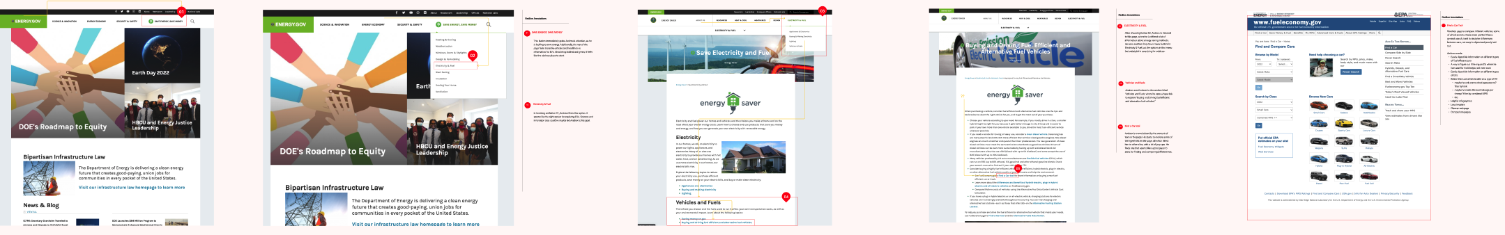
When trying to complete this task he is taken down a few dead end roads advertising “Save Energy, Save Money,” “Emerging Technology” and so on. He finds a page titled “Buying and Driving Fuel Efficient and Alternative Fuel Vehicles” and gets lost in a sea of heavy text with many hyperlinks. After a lot of reading, clicking links and backtracking he makes it to a page titled “Find A Car Tool” and gets the information he was looking for.


Define
What Changes Would Improve Interaction?
Key Takeways:
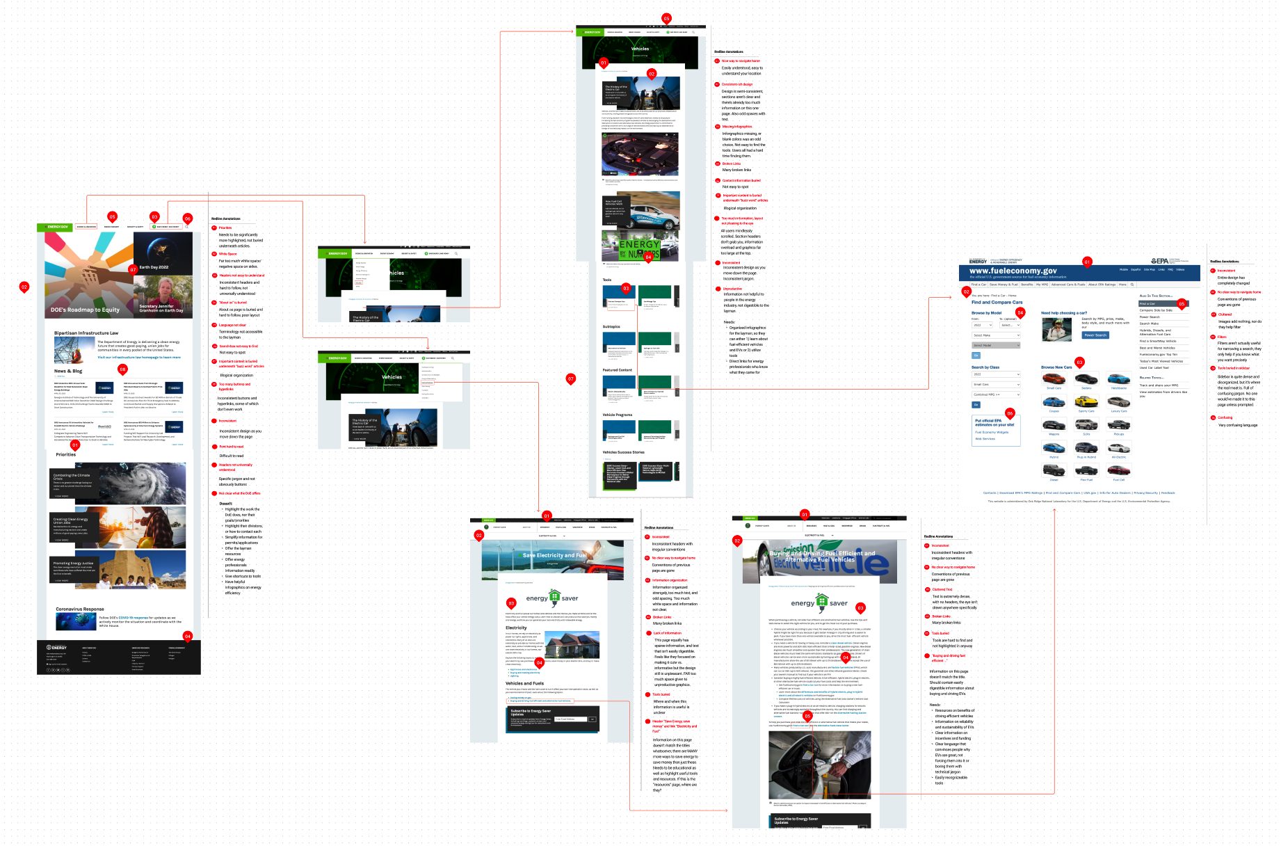
IA issues: Primary and secondary navigation titles confused people. For example, the majority of people expected information on EVs to be under the “Science and Innovation Tab.”
Repeated information: Users found many ways to complete the same task, each resulting in a different end point though. For example, people didn’t always make it to the “Find a Car Tool” but landed on a page that talked about just a few models of EVs and continued down that limited path.
UI Issues: Dead ends, missing hyperlinks and the styling accessibility issues need to be updated. Dense text leading users to skim vs. internalize the valuable content. People repeatedly said they would absorb the content more if infographics were utilized, hyperlinks were more curated and content was simplified. Two users pointed out that if they could’ve identified what caliber of information they needed, they could've had a better interaction. For example, the information a EV buyer needs is dramatically different than what a General Contractor installing EV charging stations in a parking garage needs. Without a very clear IA, one might end up where the other one was supposed to, confused and frustrated.
Direct Quotes:
"The design feels like a government site, clunky and I don't need most of this information."
“Asking me who I am, ie. company, person, etc., and what I need would’ve been a nice touch. I wanted infographics too. I want readily digestible facts covering this base level of information I need.”
“I don’t like that it took me to the fueleconomy.gov page (and out of the DoE site) without notification. Too many hyperlinks and interacting with them was confusing.”
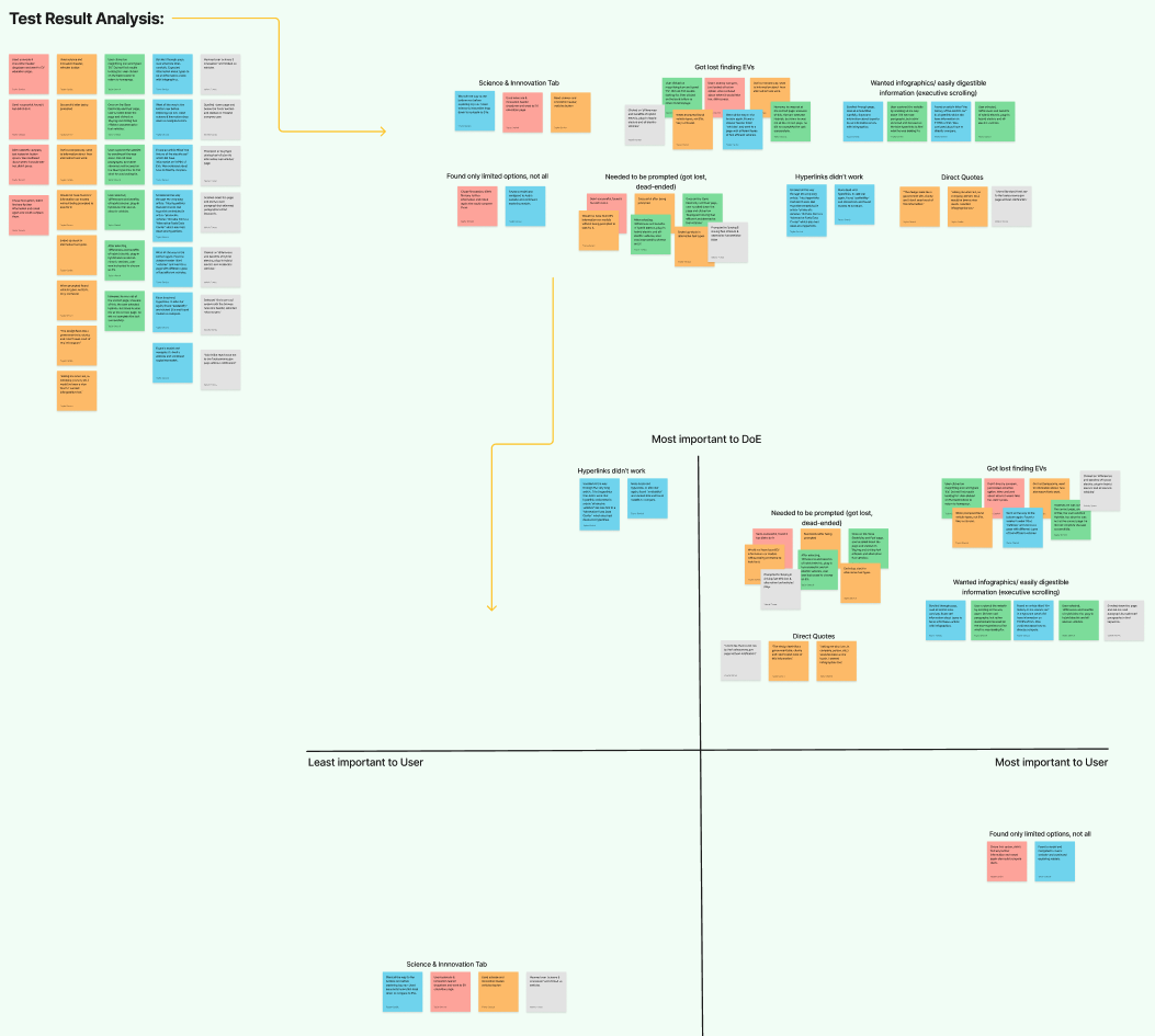
Combining What We’ve Learned:
I did one additional annotation and analysis of the pages outlined in our user flow to summarize all of the findings throughout testing. Resulting in the following User Hypothesis:
It’s unclear to users what the DoE does for/offers the layman, and where the resources are that professionals in the energy industry need. Unprompted, people wouldn’t know these excellent tools exist. The site may look pleasing initially, but the insightful information is lost in a lot of heavy text, unproductive graphics and unclear headers.
Ideate
Why Isn’t The Information Architecture Working?
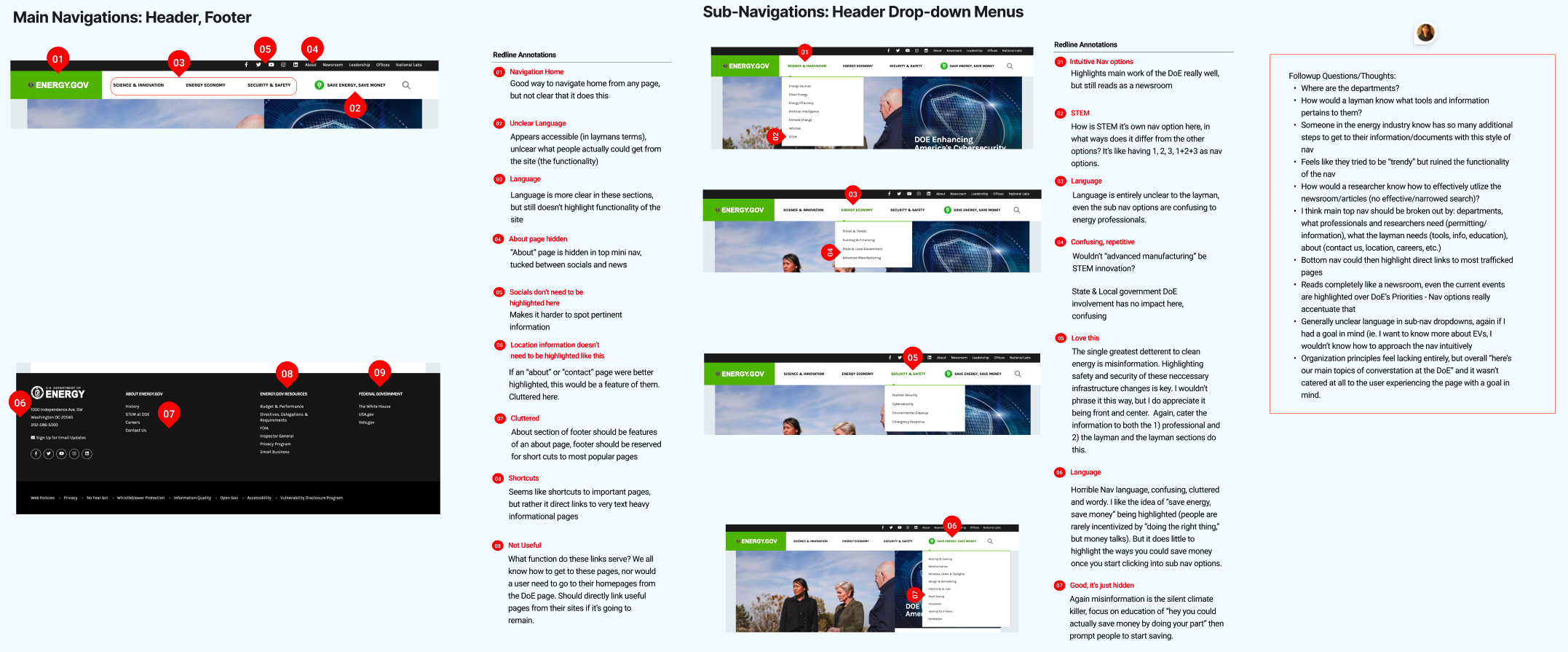
Navigation:
I began ideating solutions to the identified problems by annotating and critically analyzing the current primary and secondary navigation. I then tested my hypothesis in another round of usability testing, which focused on users moving through the navigation bar to complete tasks. My testing objectives were:
Can people successfully navigate the main nav and sub-navigation to complete tasks?
Can people successfully find information in the footer navigation?
Why do people navigate the website the way that they do? What are they trying to do?
Which I answered by having them complete the following tasks:
Find information on an environmental or energy issue that you’re interested in.
Find something you as a user could do in your life, to improve your energy consumption.
Figure out what the DoE does.
Figure out the different departments of the DoE and how to get into contact with them.
This resulted in a very low task success rate. Everyone successfully identified the energy conservation tools, but struggled to identify an energy issue they’re interested in, what the DoE does specifically and what their departments are and their contact information. Resulting in the following conclusions:
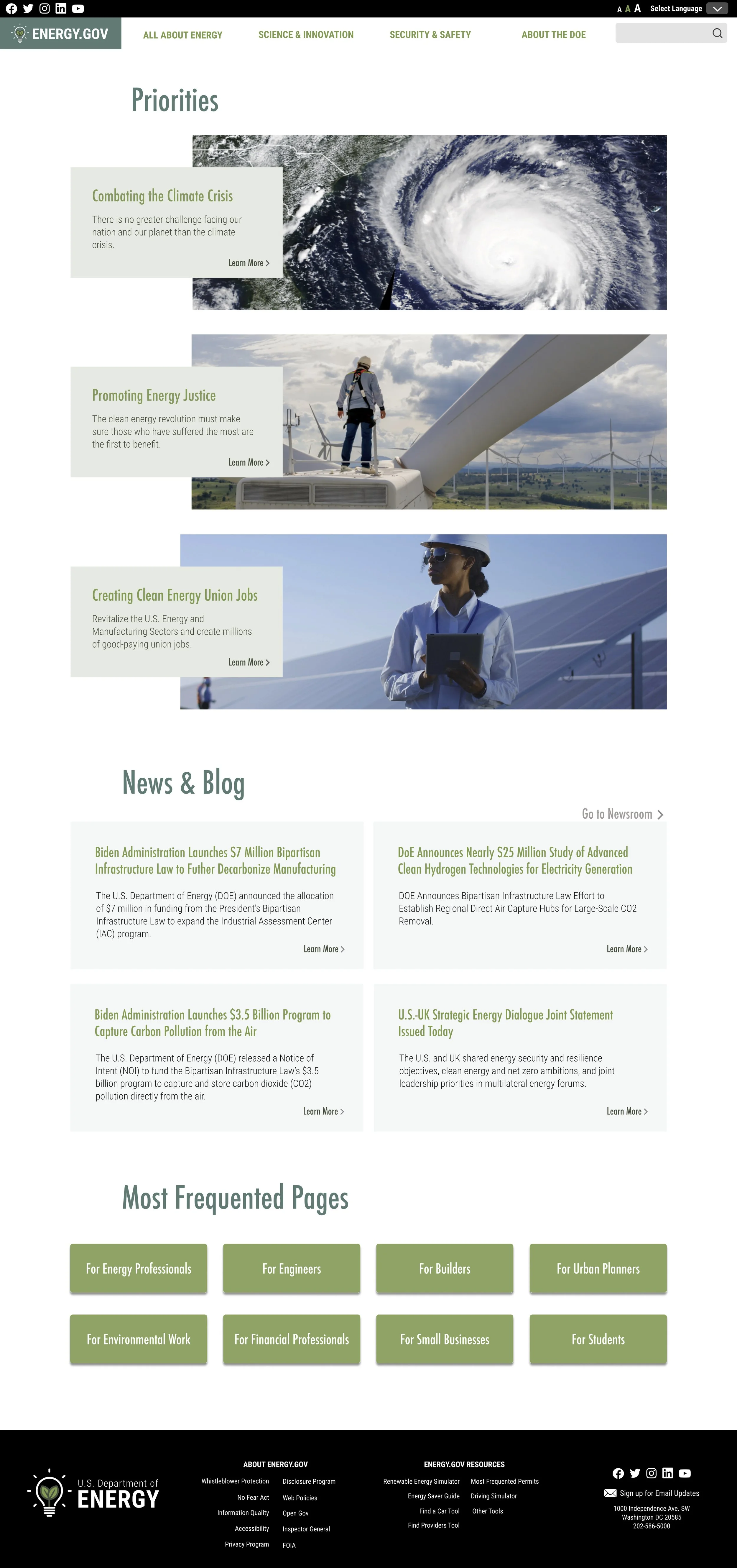
Homepage reads like a newsroom, with current events given precedence over DoE’s Priorities.
Need a clear difference in pages catered to the layman, and the pages for energy industry professionals. Energy professionals are doing so much extra work to get to their information. The layman is also doing extra work, as well as miss key information and tools.
Isn’t responsive for mobile screens
Lacking departmental and contact information
There needs to be more education of the issues and science involved. Misinformation is the silent killer of clean energy. Highlighting the security and safety of these necessary infrastructure changes is key. Additionally the conversation shouldn’t be “here’s why you’re part of the problem” but rather “you can save money while doing your part.”
Bottom navigation should highlight direct links to the most trafficked pages.
Ultimately it feels like they hurt the functionality of the navigation in the name of being trendy and fun.


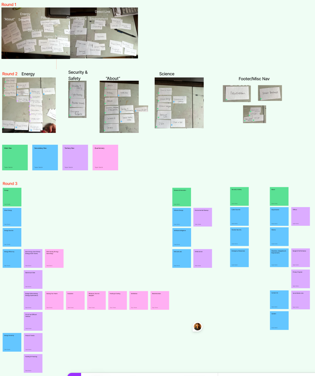
How Can We Simplify the IA?
I then performed three rounds of a card sorting analysis, which I summarized in a sitemap.
I then took this new IA and wireframed the primary and secondary pages to test usability on. I also redesigned how this navigation would operate on a mobile screen to test in another round of usability testing.
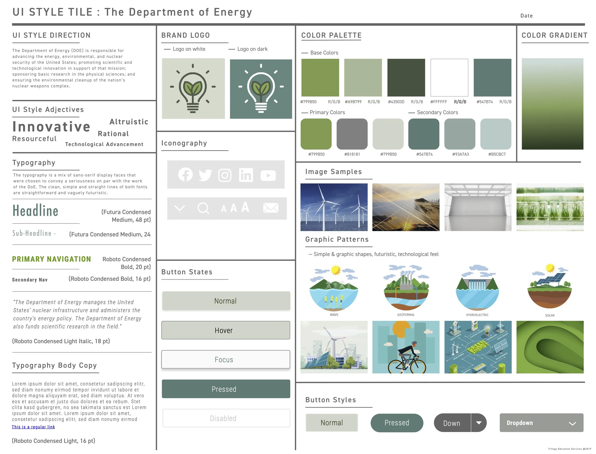


After some A/B Testing of this new structure, I made additional changes to the IA. At this stage I also explored the styling tone and feel direction I think the DoE should go in in a Moodboard and Style Guide.
Prototype, Test & Iterate
One of my biggest lessons throughout this process was component systems in Figma are your friend. As I was integrating my style guide into my previous component system, I ran into so many little errors, spacing issues, and so on. I had to completely scrap my previous nav system and start from scratch, properly layering text styles, auto-formatting and variants.
At this stage I did 5 additional usability tests, with the same testing objectives from previous tests and analyzed the feedback in an affinity diagram. My key takeaways being:
still needed further differentiation of landing pages
header fonts and tertiary navigation fonts should be larger
simplify footer
fix dead ends
After making these updates I did one additional round of testing on this hi-fidelity desktop and mobile versions, resulting in a 89.3% success task rate, and iterated to the final Hi-Fidelity Responsive version. Key changes were adding hover states, continuing to address IA and accessibility issues.