

Fill a Heart 4 Kids
A full website redesign for Fill a Heart 4 Kids, a non-profit who has helped house homeless youth and support foster children in the Chicagoland area for over 10 years!

PROJECT
Redesign the website for a local non-profit of your choosing, in a three-week design intensive. In teams of three, execute the UX double diamond design thinking model and UI design process to create a high-fidelity responsive web design (RWD) solution through a clickable UI prototype.
PROBLEM
FIll a Heart 4 Kids has been helping house homeless children and support foster children in the Chicagoland area for over 10 years. They organize gifts, events, and other essential childhood experiences for kids; all with the goal of ensuring no child feels isolated, nor ashamed of their situation.
Their website should be reflective of the importance and integrity of the work they do. But as it stands, with: difficult to read fonts, overly bright colors, heavy sections of text, outdated information and graphics, and an IA structure that can be hard to follow; they could really benefit from a redesign. Their website should showcase their decade of success and clearly show people how they can get involved in the decades to come!
SPECS
Tools Used: Figma, Photoshop, Adobe XD
My Role: Unfortunately one of our team members had to drop the course early into the project, and my remaining partner had a medical emergency about 1.5 weeks into the project. So we completed the research in a team of two, I completed the majority of our definition and ideation phases, and I designed the prototype, tested and iterated independently.
SOLUTION
We believe that the website of Fill a Heart 4 Kids should focus on highlighting 1) what FH4K does 2) how they do it and 3) how people can help, in a straightforward tone with friendly and concise design.
We focused content on the organization’s directives, history and credibility, as well as made getting involved as easy as possible. To reflect the fantastic work FH4K’s does, the website should readily gain the trust of new donors, engage volunteers and ultimately aid FH4K’s in accomplishing their goals.
Empathize
Why Fill a Heart 4 Kids?
We chose to redesign for Fill a Heart 4 Kids because we feel that no one should be homeless, especially not a child. And not only does this nonprofit aid in housing Chicagoland’s youth, but they also work to ensure those children experience typical and essential core memories. Hearing classmates talk about holidays, gifts, birthday parties, family movie nights, summer camp, etc. can be deeply isolating and painful. That’s why Fill a Heart 4 kids organizes care packages, events and many other experiences for children in the foster care system. With 6,000 yearly volunteers, they need a website that is easy to navigate and informational so the focus can stay where it should be: on the children!
What is the “Competition” Doing?
We then explored how other non-profits that do similar work present online. What is working and what is not? What overall tone are they setting? What features could be advantageous to FH4K?
Key Takeaways:
Focus on conveying impact and mission immediately
Defined long vs. short term goals with strategy for each
Highlight upcoming events
Framing events as “programs” highlights their ongoing nature
People love being able to follow the money
How much, being spent where and when. Full transparency.
People love shortcuts and quick reference links
Serious, concise and authoritative tone with choice use of soothing colors and an overall clean simple design
Simple navigation, highlighting clear calls to action
How Can We Help Non-Profits in General?
MONEY. Supplies. Volunteers. Donations.
Non-profits that work with children especially need funds. They buy clothes, shoes, backpacks and more for growing bodies. They supply children with school supplies that need to be restocked often. They’re planning events, camps, and more for kids regularly.
In 2021 alone, they worked with over 2,500 children to:
serve over 15,000 meals
supply roughly 35,000 school supplies, 75,000 toiletries, 10,000 masks and 8,000 feminine hygiene products
give out over 8,800 holiday gifts
supply roughly 2,000 coats, hats and gloves and 12,000 units of socks, clothes, and shoes
distribute over $30,000 in food gift cards
install 4 gardens in group homes
renovate 4 foster group homes
launch a Foster Junior Youth Board program
and more
Uniquely this type of non-profit does a lot, all of the time, and needs significant resources to continue the wonderful work they do at this caliber.
What Is Working and What Is Not?
To better understand FH4K’s web presence strengths and weaknesses, we did a very thorough analysis utilizing Jakob’s Ten Usability Heuristics.
What Works:
Fun quirky but welcoming childlike feel with a motherly and warm color scheme
Great statistics about their work and the need for the work overall
Consistent design standards
Strong call to action
What Doesn’t:
Not a clean, simple, or light design
Text heavy with difficult to read fonts and an unclear hierarchy of information
Unclear user flow and navigation architecture
Outdated information, pages and graphics
Very limited information on their history and credibility
What Do People Value in a Non-Profit’s Website?
To get to the core of “what information do people expect on a non-profit’s website,” we completed 5 user interviews. We posed our interview questions to hopefully gain insight on these core research questions:
What are the habits of donors/volunteers?
What kinds of organizations do they get involved with and why?
What motivates people to actually get involved with a non-profit?
What information are they looking for to get involved?
What spurs them to take action?
What does engagement look like to them?
What keeps them involved? What deters them from staying involved?
How is the current website being received?
What deterrents exist? What incentives exist?
Can they find the important information?
Do they recognize a call to action?
What service should this website provide?
Why do users interact with the site?
What information helps them accomplish key tasks?
What specifically engages people with this organization?
What is unique about FH4K and how can we highlight that?
In Illinois there are approximately 25,000 unaccompanied homeless youth in Illinois and only 600 available beds in shelters.
There are approximately 17,920 children in DCFS custody and 3,347 foster children awaiting adoption in Illinois.
Most homeless sites close at 5pm, leaving many without shelter.
Chicago is one of the leading cities in human trafficking, and nationally 1 in 5 homeless youth fall victim to human trafficking. 68% of youth trafficked into sex work did so while homeless.
Define
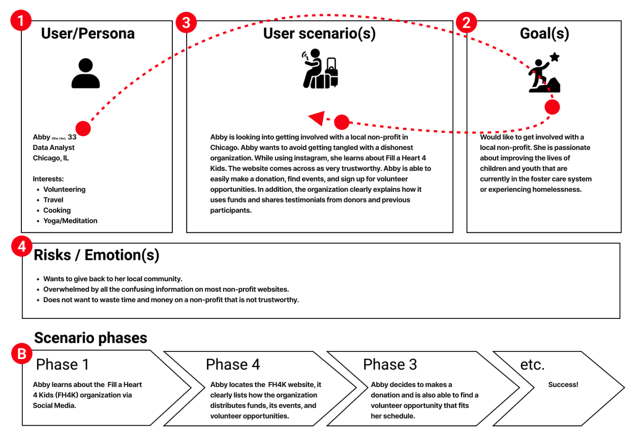
Who Are We Designing For?
To synthesize our findings into further insights, we first affinity diagrammed our user and stakeholder interview results. We then utilized an empathy map to create our user persona, and we explored their motives, actions, needs and feelings in our user insight statement:
The website of Fill a Heart 4 Kids was designed to highlight their story, and past and upcoming events.
We have observed that as the site exists, people who aren’t familiar with their work are wary of the non-profit’s credibility and impact, and are unable to pin-point what it is exactly they do and how they do it. These blockers combined with the convoluted information on how to get involved, are likely damaging donor and volunteer engagement.
How might we make the website of FH4K highlight pertinent information, while having a clear and encouraging call to action?
What Do They Use the Website For?
Once we better understood the mind of our user, we further defined the issues present with FH4K’s website and how we might combat them:
During user interviews, we discovered that users are generally wary of large non-profits. To trust that their money and efforts are actually making an impact, users want the fruits of their labor to be clearly outlined.
Therefore, we believe that the homepage of Fill a Heart 4 Kids should focus on highlighting 1) what FH4K does 2) how they’ve done it 3) how they will continue to do it and 4) how people can help, in a straightforward tone with clear & clean design.
We will do this by focusing the content of the website on the org’s directive, history and credibility, as well as make getting involved as easy as possible. We hope to increase engagement through incorporating testimonials and data on FH4K’s results, as well as an active calendar of upcoming events with clearly stated volunteer and donor information.
We believe the website should reflect the inspiring work FH4K’s does, readily gain the trust of new donors, engage volunteers and ultimately aid FH4K in accomplishing their goals!


Ideate
What Do Our Users Want?
To kickstart ideation, we did an “I like.., I wish.., What if...” exercise and analyzed the results in an affinity diagram to prioritize the user feedback we received. A balance of priority and scope feasibility was found to dictate our principle design changes.
Better Define:
Who is FH4K?
Background
Credibility
Mission Statement
What do they do?
Past, present and future projects
Current financial directives
Testimonials
How can you get involved?
Volunteer application process
Ways to donate
Other ways to give
Other Key User Issues:
Make donating easier
Better user shortcuts
Clarify a call to action

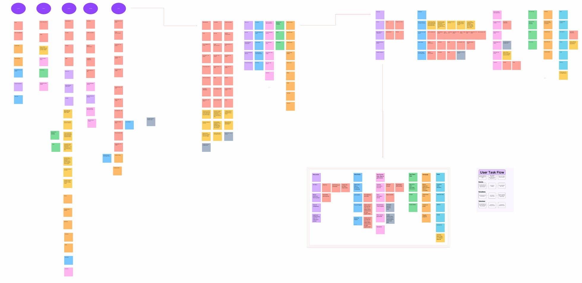
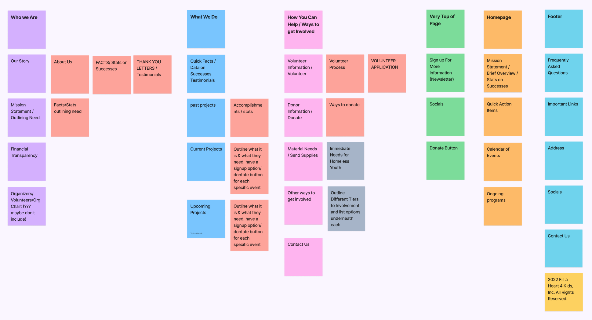
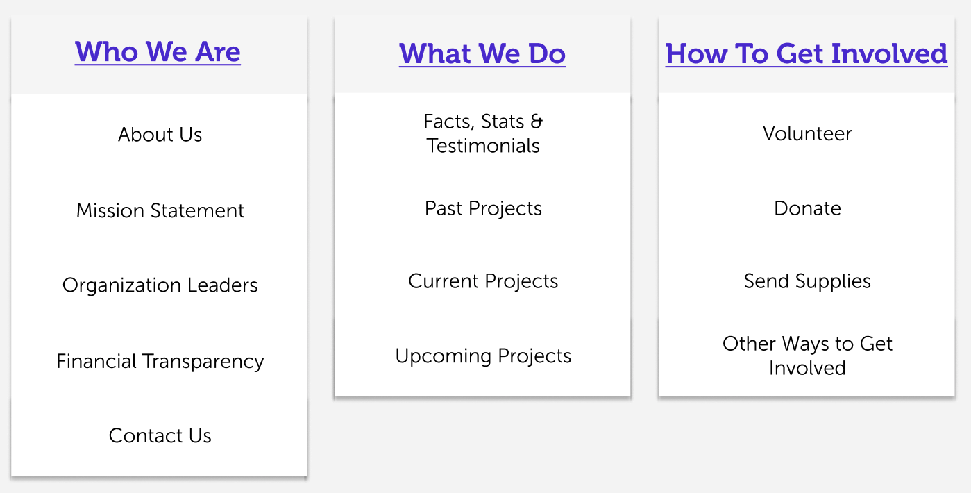
We additionally did a card sorting analysis on their current Information Architecture and used those insights in combination with our principle design changes to define a new streamlined sitemap.
To examine how a user might now move through the site based on calls to action, we created a user task flow.
How Well Do They Solve The Problems?
Next we explored how these solutions might solve our users’ issues, create gains or cause more pains in a User Storyboard and a User Journey Map.


Will These Solutions Solve Their Problems?
We then explored the ways in which these products and services changes could provide customer pain relievers and gains in a value proposition canvas.
What Does This Solution Look Like?
After rounds of sketching exercises led to a paper prototype, which I A/B tested and iterated on, we had our digital lo-fidelity clickable prototype ready for additional testing and iterations.
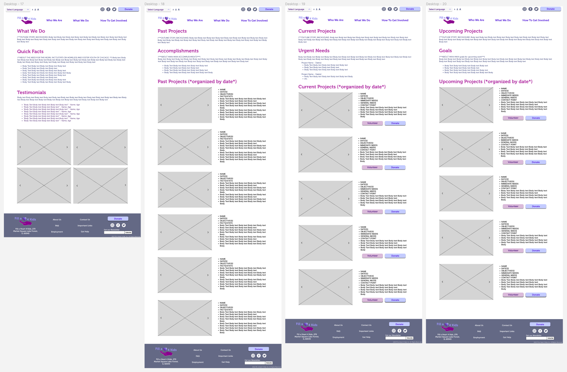
I wireframed all 14 pages that we outlined in the new sitemap, because I really wanted to demonstrate that all of the same content, even with the addition of the new pages, can readily fall into this simplified navigation structure. I also believed it important to illustrate how to achieve cohesion with so many varied pages with a lot of images.
Prototype
Does It Work?
I then usability tested 4 users for this lo-fi prototype to pin-point any user flow issues, and moments of confusion or frustration among users. Our testing objective was to discern if people can readily:
Learn about the organization
Locate an upcoming event, and how to either donate to it or volunteer for it specifically
Locate how to donate to the organization
Learn how to get involved

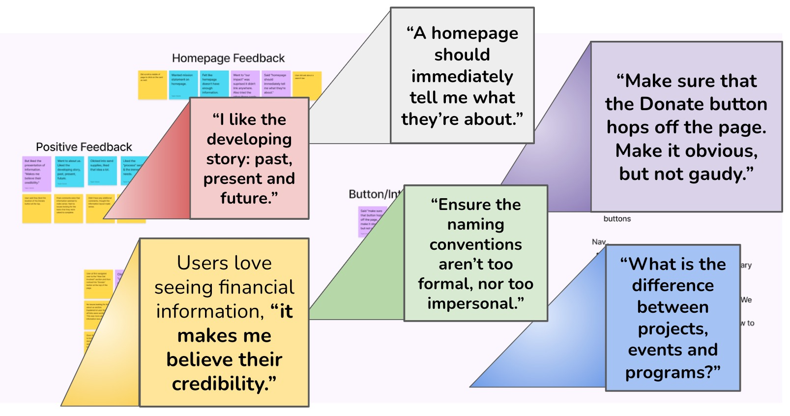

The most repeated bits of feedback we received during our initial user interviews was: FH4K’s font and color scheme are distracting to the content, and the sense of childlike playfulness is fun and cute.
So I focused on designing a style guide that addressed the pains of the original site, but still pulled on its colors, tone and spirit.
100% of users were successful in executing all of the tasks, but their commentary while completing said tasks was invaluable! I analyzed the feedback and pulled key changes to make:
add mission statement to the homepage - front and center
missing click-ability on cards and buttons
ensure spacing and alignment conventions are consistent throughout
make donate button POP
build more interactions
consider the fold - what is someone going to see on smaller screens?
Test & Iterate
Because I was so limited on time from having to do the work of three alone, I wasn’t able to formally test my mid-fidelity design. I ended up doing some A/B testing, and making edits on that mid-fidelity file until I reached the hi-fidelity final version.
Final Round of Testing:
One additional round of A/B Testing & some accessibility testing on this hi-fidelity version uncovered some additional issues, more aesthetic rather than foundational. I continued to enforce grid conventions, standardize fonts and ensure the copy is easy to read and consistent.
As I continued to uncover those pain-points, design inconsistencies and user flow issues, the key resulting changes were:
Added style guide elements to component system, and continued to tweak to ensure cohesion and the intended hierarchy of text elements
Prototyped all pages, fixed dead ends and added hover states
Added more information on the homepage about mission statement
Continued to iterate on the calendar of events, playing with hierarchy and alignment
Ensured the donate button stands out, and the secondary buttons feel highlighted as well
Changed naming conventions to ensure cohesion and consistency
Built out the content of a few other key pages
Homepage:
The single most consistent bit of feedback we got was “we love seeing pictures of the kids!” So front and center I added a carousel with images from their projects an org events. I also wanted to introduce some accessibility features like language and font size.
One user said ““A homepage should immediately tell me what they’re about.” So in keeping that concept, I wanted to highlight their mission statement, as well as summarize their impact, projects and goals.
One of the other main bits of feedback received was people love shortcuts. So I built this calendar of events to do exactly that and approached our footer design with the same principles.
“What We Do” Pages:
Another one of our testing takeaways was that people love hard facts. Data and testimonials, essentially quantifying impact, is a great way to solidify users’ trust. As well as being able to learn about past accomplishments, their ongoing work and future goals.
One feature of their original website’s features that user’s particularly enjoyed was that they could donate to or volunteer for a specific event or project, rather than the entire org itself. So I kept that option throughout the design.
“How To Get Involved” Pages:
In an effort to make getting involved as straightforward as possible, I wanted to focus on remedying the issues that arose during user interviews around actually signing up to volunteer. I focused on clearly outlining the process, the need and future opportunities. I also introduced this concept of “immediate needs” to allow FH4Ks a space to provide information on time sensitive issues.
One of the other ideas developed from testing was this concept of outlining “levels” to involvement. Users could find quick action items, low-commitment opportunities, or mid-to-high commitment opportunities, so they can figure out what the best fit for involvement looks like for them. I wanted to ensure users aren’t deterred by being asked for too much too quickly but convey how important and extensive their needs are.

“Who We Are” Pages:
Again user interviews revealed to us that people understood that the org helps homeless and foster children, but not HOW they do it. So the core of my work was an information architecture overhaul.
Rounds of testing made it clear users wanted to better understand their beginnings, story and impact, their mission statement and the need for this work. Users were also adamant about wanting to understand where the money was being spent as well. In addition to these key elements I wanted to add a personal feel by introducing the wonderful people behind the org and make getting in contact feel more inviting.


Final Thoughts:
We hope Fill a Heart for Kids continues to grow and expand on the fantastic work they do! They currently disseminate information mostly via newsletter and emails, but hopefully through partial or full implementation of some of these design principles they can foster a stronger online presence and ultimately accomplish more!