

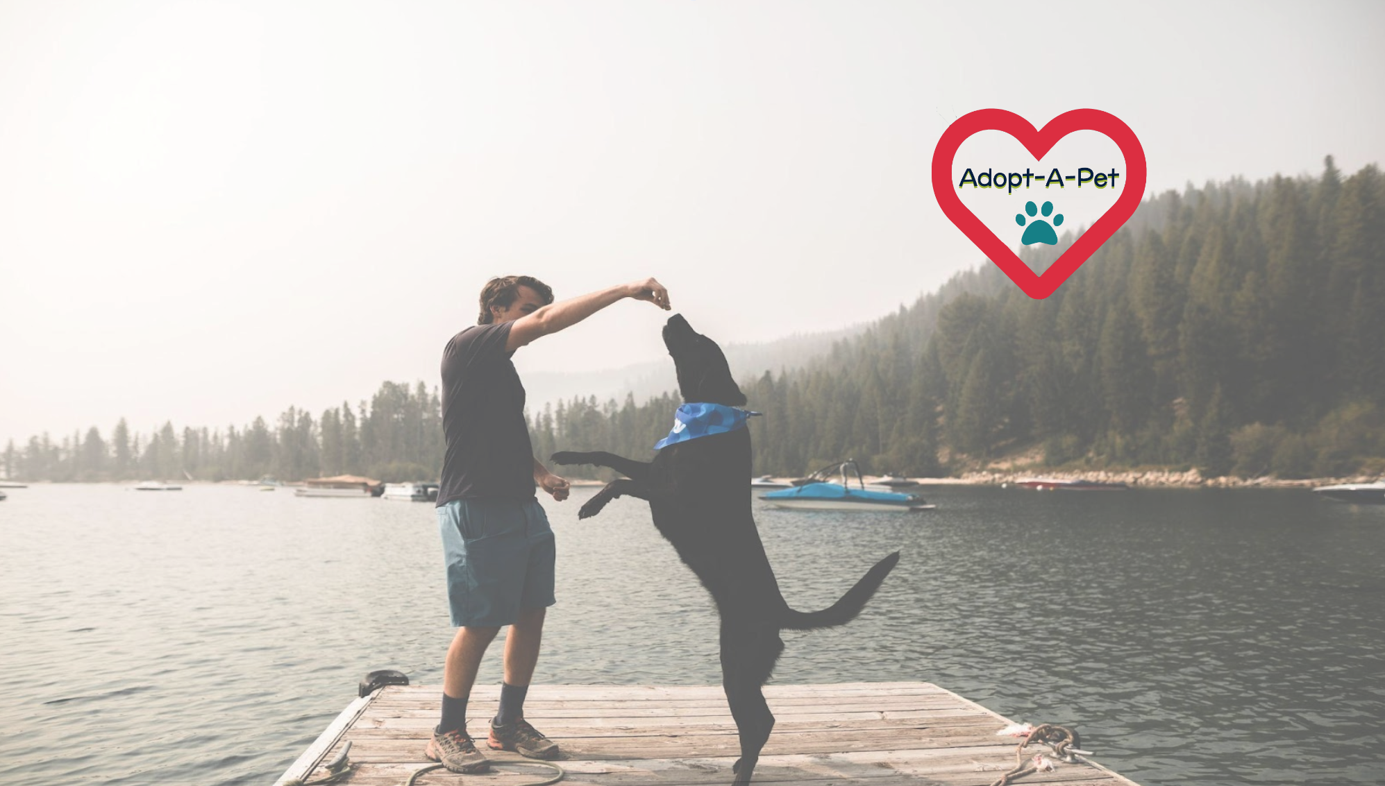
Adopt-a-Pet
A full website redesign for Adopt-a-Pet, a non-profit no-kill rescue shelter proudly serving furry friends of the Chicagoland Area since 1981!
PROJECT
Redesign the website for a non-profit of your choosing, in a three-week design intensive. In teams of three, execute the UX double diamond design thinking model and UI design process.
RESULT
A clickable high-fidelity prototype of the redesigned website and a live, coded for version of one of the homepage. As well as a case study capturing the entire design process from ideation to finished product, highlighting the: what, where, when, how, why of key decisions made in design iterations.
SPECS
Tools Used: Figma, Photoshop, Adobe XD, GitHub, VSCode, Bootstrap, jQuery, HTML5, CSS
My Role: The entire team had a hand in every part of the process, but we each had a speciality we more so worked in, mine being in the details. I served as project manager, focusing on pacing, conflict resolution and the overall cohesion of our deliverables. I also served as the lead interaction designer, specifying our copywriting, branding, colors, typography, iconography and more. I also completed a lot of our usability testing and all of our accessibility testing, focusing on where to improve interaction pain-points and moments of confusion.
Once we landed on a common interest, the unconditional love we all have for our pets, we began our user research and UI analysis.
Empathize
Why Adopt-A-Pet?
Adopt-A-Pet helped pioneer the “shelterless shelter” approach to animal foster care back in the 1980s. Since then, they have placed over 11,000 dogs and cats into their forever homes. Such an amazing and vital organization deserves a website that helps them further their mission and continue to better the lives of countless animals, owners, and volunteers.
How Can We Design for Specific Users?
Our user is someone who is interested in adopting a furry family member, or at the very least wants to get involved with an animal shelter to spend more time with animals.
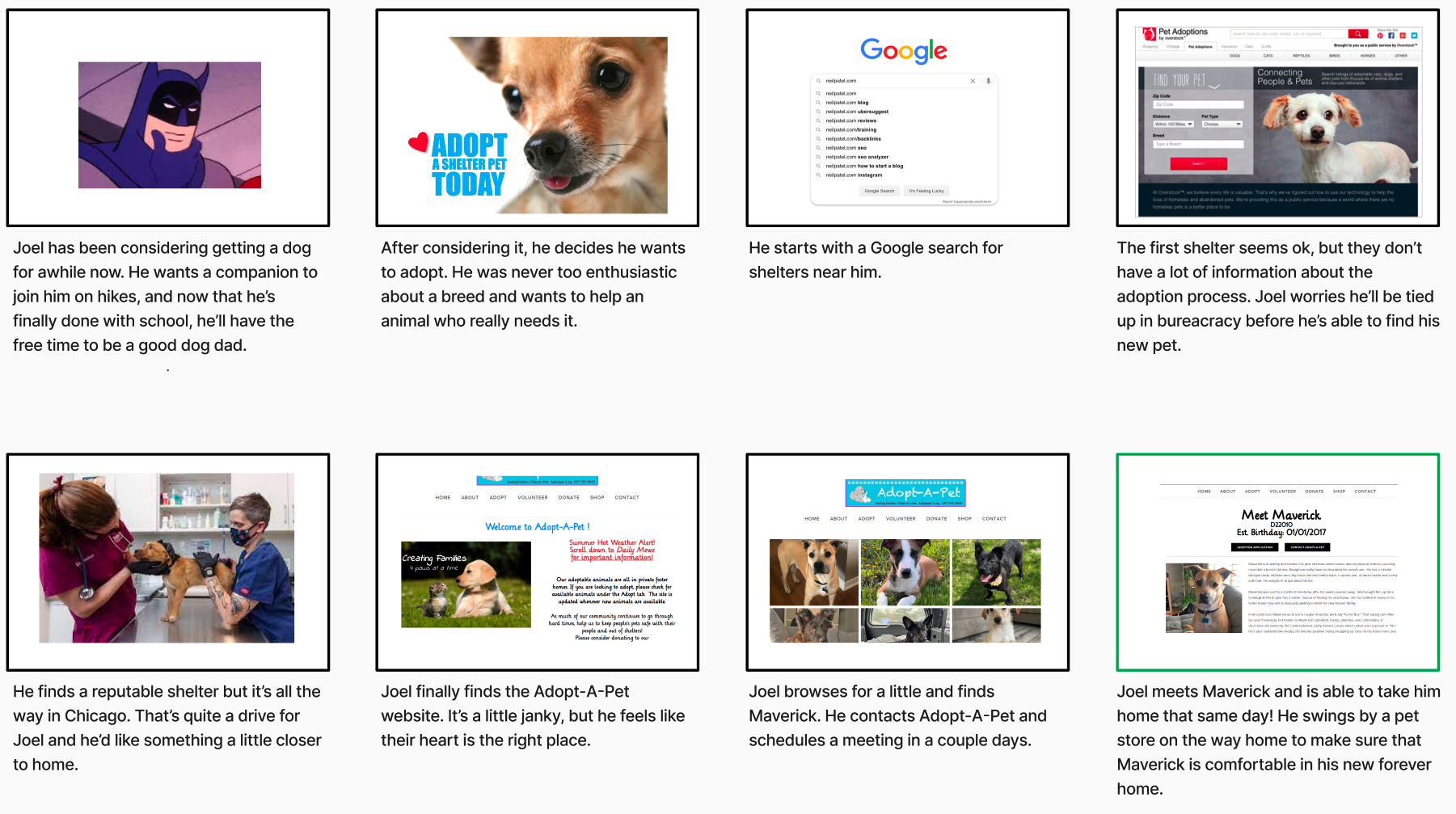
After a lot of character development, we focused on Joel: a 39 year old geologist from Carbondale seeking a dog who can keep up with his active “on the go” lifestyle.
How Can We Remain Competitive in the Market?
We then asked ourselves, how do other animal shelters connect people with the right pet and ensure that they keep that pet?
To figure this out, we analyzed the three direct competitors: PAWS Chicago, Get Your Pet & One Tail at a Time; and two in-direct competitors: Facebook Marketplace and a local dog breeder. We focused our analysis on their features, competitive advantages, strengths, weaknesses and reviews.
Popular Features:
Detailed pet bios with ample photos and videos
Events, training and resources for new pet parents
Medical & crisis aid for pets
Live updates on specific pets’ availability status
Compatibility tests
The Biggest Lessons:
Reputation is important, people tend to fall back to what they already know & trust
VERY clearly outline adoption, foster & volunteer process steps and limit blockers
Explicitly state the requirements for each available pet
People want to know what they’re doing actually helps
How Can We Help Shelters in General?
We then did additional research into the issues generally facing animal shelters and found some shocking statistics:
The most likely outcome for adopted dogs is to be returned (43.3%).²
Most common reason for return was lack of information about the animal (pet health or diet issues, weight, etc.).²
50% of shelter dogs and cats are euthanized, #1 reason is overcrowding.¹
41% of people who returned an adopted pet indicated they would not attempt to adopt in the future.¹
What Is Working and What Is Not?
To better understand Adopt-A-Pet’s web presence strengths and weaknesses, we did a very thorough analysis utilizing Jakob’s Ten Usability Heuristics. Some key takeaways:
Lack of consistency and design standards
Limited readability, with large, colorful and really playful fonts
Large blocks of text with an unclear hierarchy of information
Outdated graphics and pet photos
Very little information on their history & credibility
No clear call to action
What Do Users Value in a Pet Adoption Website?
To get to the heart of “what draws people to one shelter over another,” we completed 6 initial user interviews, all whom have adopted or fostered a pet before.
We additionally crafted an anonymous survey, which received 63 responses 90% of which have a pet, all with the goal of further defining:
How people find the shelters & orgs they work with?
What do you look for on the website?
What would compel them to choose one over the other?
What are the qualities you look for when adopting a pet?
What pain-points and successes existed in the process?


Define
Through user interviews and a comprehensive survey, we uncovered that people are finding their pets online. In this age of information, people want shelters to have an up-to-date, informative and detailed website to aid them in the search for their furry family member.
To ensure each pet placed is in the right forever home, expectation management is key. We believe the website for Adopt-A-Pet should focus on simplifying their content, and in doing so, highlight a complete breakdown of adoption requirements, process steps and the timeline. This in combination with a new format for fun, detailed and honest pet pages will encourage people to take initial steps in connecting with Adopt-A-Pet.
The priority remains ensuring the safety and success of each pet. But ultimately we believe that by being direct about each pet’s unique backstory and needs, and simplifying adoption information, Adopt-A-Pet can get even more animals adopted and adored!
Iterations of user insights and further summarizing the definition findings revealed the crux of our Problem Statement:
We believe that the website of Adopt-A-Pet should be reflective of the joy adopting a pet brings to people’s lives! But prospective parents need the information presented in a thorough and direct manner to make informed decisions.
We have observed that users spend the bulk of their search on individual pet pages, which often lack the personality, and quantity and quality of information and photos they seek. To keep users from seeking out breeders and other organizations, we need to provide the clear directives and ample resources needed to let them lead the process.
By outlining the cost, care and timeline expectations for each unique pet, Adopt-A-Pet can ensure the safety and longevity of each placement. Choosing a new furry family member is no easy task, so how might we simplify the process and ultimately increase adoptions?
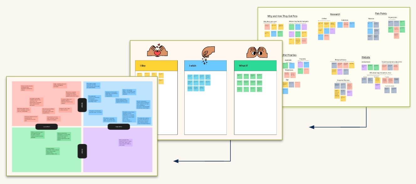
To garner further insights from this raw data, we first analyzed the numbers and pulled key quotes from interview moments to answer our research questions:


We then combed over this data, research and feedback, carefully analyzing it and finding commonalities to personify their voices in an Empathy Map and a User Insight Statement:


Where Do People Get Their Pets?
They’re adopting pets mostly from rescue organizations and the Humane Society, primarily due to high need and low cost.
How Do They Choose Their Pets?
People ultimately choose the pet whose temperament best matches their lifestyle, so they can be sure they’ll be a good home for that pet.
What Can We Do To Stand Out?
We need to provide users with all of the tools to let them lead the process themselves. People don’t like waiting periods, missing or unclear information and confusing requirements.
Overwhelmingly people want to know:
Adoption process specifics:
Requirements
Action steps
Process timeline
Costs
Detailed pet descriptions, accurately describing:
Age
Temperament
Compatibility with pets and/or kids
Any special needs or dietary restrictions
Breed, weight or expected size
Ample high-quality photos
Ideate
Next we looked at our users newly defined needs and what we gleaned from our competitive analysis to prioritize Adopt-A-Pet’s Website’s features. A balance of need and scope feasibility, and our overarching design principle of ‘simplicity’ dictated the outcome.
We also performed a careful analysis of the information architecture on Adopt-A-Pet’s current site. With an unclear hierarchy of information being one of the main problems, our priority was to call attention to the action pages: adopt, volunteer, contact and donate.

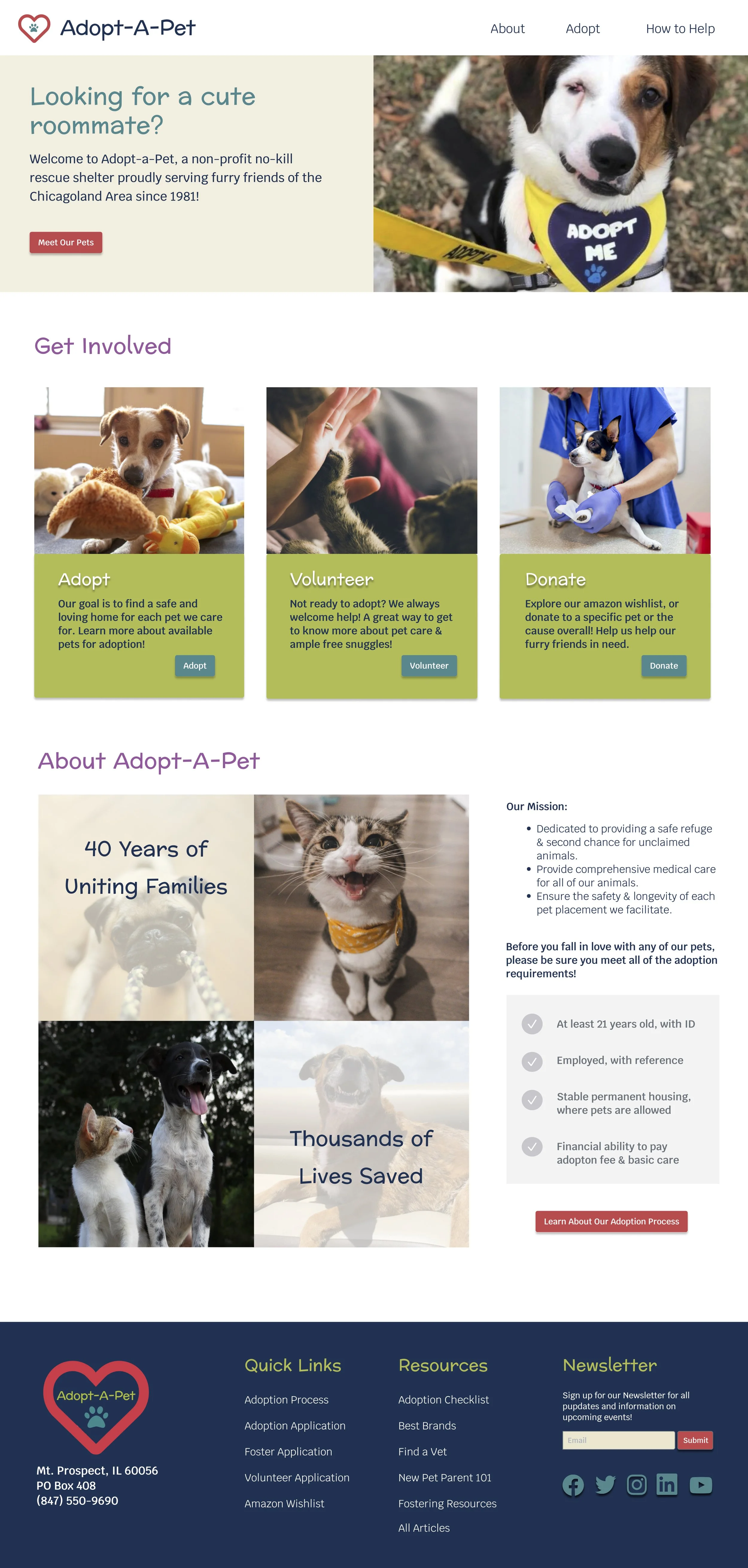
What Key Information and Shortcuts Belong on the Homepage?
Simplified Navigation
Only About Us, Adopt and How to Help
High-level overview of the adoption process and requirements
Preparedness checklist graphic - what is absolutely required to adopt
A LOT of pet photos
Showcase a pet who has had difficulty getting adopted
Primary buttons directing people to adoptable pets
Secondary buttons directing people to CTA pages: adopt process, volunteer, contact and donate
Basic contact information
High-level overview of the organization’s mission statement and impact
Quick reference links
Adoption, volunteer and foster applications
Amazon wishlist
Recommended vets, brands, trainers, etc.
“New Pet Parent 101” guide
Resources and articles
We also did sketching exercises to get a better idea of potential layouts and the direction we’d like to go in before paper prototyping. Additionally we executed storying telling methods to demonstrate how our proposed solutions might solve the problems identified during research.
The overall style and tone of our design was chosen to evoke warmth, happiness and a fresh youthful feel. We wanted to walk the line of playful, but not childish. Bright but not forceful. Simple yet engaging.
Our navigation system was designed with those same principles, only containing the most frequented pages. We additionally received a lot of feedback that people want more shortcuts, so our footer was designed to prioritize quick-links to CTA pages, as well as resources we think Adopt-A-Pet should offer.
Prototype
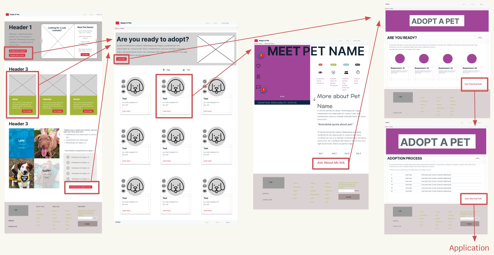
Rounds of sketching exercises, paper prototypes, digital prototypes, iterating and so on gave way to our high-fidelity clickable prototype.
After paper prototyping we were still at odds as a group, with one member wanting to steer away from typical UI conventions and tinker with eccentric layouts to garner attention.
After some friendly debate and two low-fidelity prototype iterations, we landed on a simple and welcoming layout, because of our lessons learned examining competitors. People don’t need you to break the mold, they want clear information and consistently updated content when choosing a pet. However, we did decide to get creative with our interactivity to create intrigue and intentionally move people through our key pages.


Test & Iterate
User Flow Outline:
With our ultimate goal being '“more animals adopted”, we focused our designs on moving users through the specific pages involved in the adoption process.
We then the usability of this lo-fidelity prototype and affinity diagramed the feedback to iterate to a mid-fidelity prototype. To iterate to the final hi-fidelity prototype we tested 6 additional users and found some unexpected issues with interactivity.
Accessibility testing also uncovered that some of our text and button colors didn’t pass contrast testing.
Additionally the repeated use of “learn more” on the action cards could make it difficult for users who need screen readers to discern which action they’re actually taking.
We also chose to quickly cover the base adoption requirements right on the homepage, being one of the most requested bits of information. In this section we also added some quick facts about Adopt-A-Pet to immediately address their credibility.
Homepage Iterations:
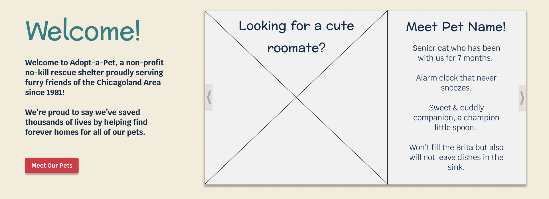
Through the rounds of testing and iterations we tinkered quite a bit with our hero space.
Initially we thought it’d be fun to use that space to showcase pets who’ve been with the shelter the longest in a humorous way, but this led to a lot of hierarchy. Our initial round of user testing solidified it – they were finding the section fun, albeit crowded and text heavy with competing headers.
It also dawned us that if implemented, the shelter would have to be responsible for consistently making the new graphics. So we transitioned to a carousel, not only allowing us to showcase more pets but also give users what they overwhelming asked for – more adorable pet photos!
All Pets Page Iterations:
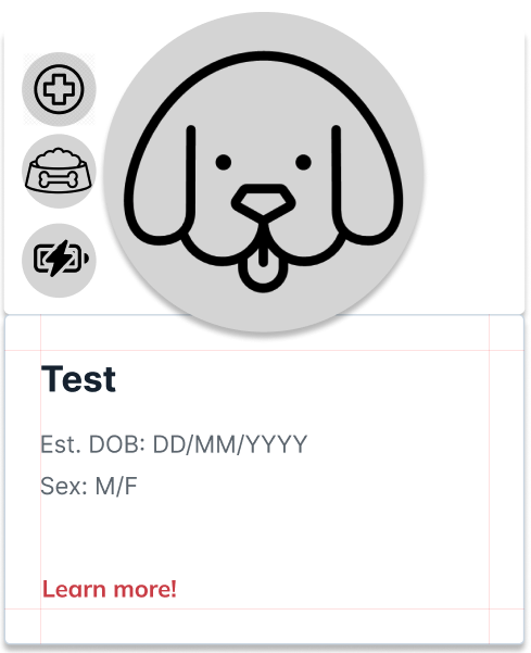
Usability testing throughout the “all pets” page iterations uncovered some issues with our individual pet cards, the main issue being interactivity. The transitions “felt abrupt” to users, making it difficult to scroll down and actually click on the moving elements.
Again with our main design objective being simplicity and a clear hierarchy of information, and a goal of creating intrigue through interactivity, we kept the idea but softened the transitions.
Another key change throughout iterations was the iconography of our pet characteristics. These specific pet characteristics were chosen to be highlighted because of our secondary research. They’re the top reasons pets get returned, so it was important to us that the icons are easily identifiable.
We also narrowed down the card content through iterations, so that they only features the key information that users said was most important to then, throughout our interviews and survey.
Adoption Process Page Iterations:
One of our main interview takeaways was that people want - clearly defined adoption process steps.
Testing revealed to us that our accordion design wasn’t straightforward:
Users weren’t able to open the accordion without the hotspot guides
They couldn’t have multiple tabs open
The initial landing page “felt like it was missing something”
So we transitioned the content to a single page with all of the important content open & ready to read, to ensure key adoption requirements are properly highlighted. To keep users engaged, we added some of the scrolling features back in.
Pet Profile Page Iterations:
In keeping with our research finding that users spend the majority of time on individual pet pages, we focused iterations of the pet profiles on better showcasing the unique personality, cost & care information for each pet.
We also changed the format for viewing pet photos, to no longer pop up because we received feedback that it was disruptive. Now with the carousel, users can have all of the tools they need in one place, to make an informed decision about expanding their family!
Additional Usability Changes:
Some additional key usability changes made through rounds of user testing were prototyping the logo to take users home when clicked, simplifying the navigation design, and removing the breadcrumbs. These changes all ultimately came from the same design principle: simplify.
Contemplate
What Did We Learn?
Users generally want full transparency
Even if it’s not good news, they want it and sooner rather than later
Interactivity inspires engagement, but it can be disruptive if too many elements shift
Iconography is a language not an art form, identifiability and usability is what matters first and foremost
What’s Next?
Although Adopt-A-Pet wasn’t able to actually update their website at the moment, they did take our advice to simplify and streamline! Along with the updates proposed here, we’d recommend:
Add filters if the number of adoptable pets increases significantly
User test nav bar terminology, in particular "shop"
A/B split test Adoption Process page