


Full Website Redesign
Fill a Heart 4 kids
project background
FIll a Heart 4 Kids has been helping house homeless children and support foster children in the Chicagoland area for over 10 years. They organize gifts, events, and other essential childhood experiences for kids; all with the goal of ensuring no child feels isolated, nor ashamed of their situation.
-
Their website should be reflective of the importance and integrity of the work they do. But the current site lacks lacks readability, has outdated information and a confusing IA structure. The redesigned website for Fill a Heart 4 Kids focuses on concise and friendly content that highlights their mission, approach, and ways to help. User testing revealed hesitancy in involvement and donations, so we focused on showcasing the organization's directives, history, and credibility while simplifying the process of getting involved.
To reflect the fantastic work FH4K’s does, the website should readily gain the trust of new donors, engage volunteers and ultimately aid FH4K’s in accomplishing their goals!
-
Redesign the website for a non-profit of your choosing, in a three-week design intensive. In teams of three, execute the UX double diamond design thinking model to deliver a clickable hi-fidelity prototype, as well as a case study capturing the the: what, where, when, how, why of key decisions made throughout design iterations.
-
Unfortunately, one of my team members dropped the course early into the project, and my remaining teammate had a medical emergency about one week into the project. As a result, the research was completed by a team of two, and I took on the responsibility of independently completing the definition, ideation, prototyping, testing, and iteration phases.
Facilitated user research by leading all communication with project stakeholders, and conducting 7+ user interviews and 13+ usability, A/B, and tree tests and data analytics.
Tools: Figma, Adobe Creative Cloud (Illustrator, XD, InDesign and Photoshop primarily)
why?
We chose to redesign for Fill a Heart 4 Kids because we feel that no one should be homeless, especially not a child. They not only aid in housing Chicagoland’s youth, but they also work to ensure every child gets to experience joyful essential core memories.
-
Hearing classmates talk about holidays, gifts, birthday parties, family movie nights, summer camp, etc. can be deeply painful. To help alleviate those feelings of isolation and jealousy, they organize care packages, events, and experiences for children in foster care. With a dedicated team of 6,000 volunteers, they need an easy-to-navigate and informative website that keeps the focus where it should be - on the children!
-
To begin understanding the pressing challenges they may face, we delved deeper into the critical statistics:
Chicago is a leading city in human trafficking, with nationally 1 in 5 homeless youth becoming victims of human trafficking.
68% of youth trafficked into sex work did so while homeless.
In Illinois, there are approximately 25,000 unaccompanied homeless youth, but only 600 available beds in shelters.
There are approximately 17,920 children in DCFS custody, and 3,347 foster children in Illinois awaiting adoption.
Many homeless shelter sites close at 5pm, leaving many without shelter.

how?
We analyzed market competitors and the current site's usability to understand what drives user engagement on non-profit websites. This guided our research and provided valuable insights for creating a more compelling online experience for FH4K's visitors.
-
After conducting a comprehensive analysis using Jakob's Ten Usability Heuristics, we identified the following strengths and weaknesses in FH4K's web presence:
What Works:
Fun and welcoming childlike feel with warm and maternal color scheme
Compelling statistics highlighting their work and the need for their services
Consistent design standards
Strong call to action
What Doesn't:
Design lacks cleanliness, simplicity, and lightness
Text-heavy content with difficult-to-read fonts and unclear information hierarchy
Unclear user flow and navigation architecture
Outdated information, pages, and graphics
Limited information on their history and credibility
-
After examining the online presence of similar non-profit organizations, we gathered the following insights regarding their strengths and areas for improvement, as well as features that could benefit FH4K:
Key Takeaways:
Emphasize the impact and mission of the organization from the outset
Clearly define long-term and short-term goals with corresponding strategies
Highlight upcoming events and frame them as ongoing programs
Provide transparency on financial aspects, including the amount spent, allocation, and timing
Include shortcuts and quick reference links for easy navigation
Adopt a serious, concise, and authoritative tone with a clean and simple design
Prioritize clear calls to action
-
Understand the habits and motivations of donors and volunteers in relation to non-profit involvement
Identify the key information that individuals seek when looking to get involved with a non-profit
Explore the factors that spur individuals to take action and engage with a non-profit
Determine the elements that contribute to sustained involvement and identify potential deterrents.
Evaluate the reception and usability of the current FH4K website
Assess the effectiveness of the website's call to action and the discoverability of important information
Determine the desired services and functionality that users expect from the website
Investigate the specific factors that engage individuals with FH4K and highlight its unique qualities

What?
The ongoing efforts of FH4K requires significant resources to continue their impactful work at such a high caliber. Non-profits, especially those working with children, greatly benefit from various forms of support:
-
Financial Contributions:
Need funds to purchase essential items like clothes, shoes, backpacks, and school supplies that require regular restocking
They also organize events, camps, and other activities
Volunteer Engagement:
They rely on volunteers who can contribute their time, skills, and expertise to support their programs and services
Donations of Supplies:
They need toiletries, masks, feminine hygiene products, coats, hats, gloves, socks, clothes, shoes, and other necessities
-
In 2021 alone, this particular non-profit worked with over 2,500 children, providing them with:
Over 15,000 meals
Approximately 35,000 school supplies, 75,000 toiletries, 10,000 masks, and 8,000 feminine hygiene products
Over 8,800 holiday gifts
Roughly 2,000 coats, hats, and gloves, along with 12,000 units of socks, clothes, and shoes
Over $30,000 in food gift cards
Installation of 4 gardens in group homes
Renovation of 4 foster group homes
Launch of a Foster Junior Youth Board program
… and more!
DEFINE & EMPATHIZE &
DEFINE & EMPATHIZE &
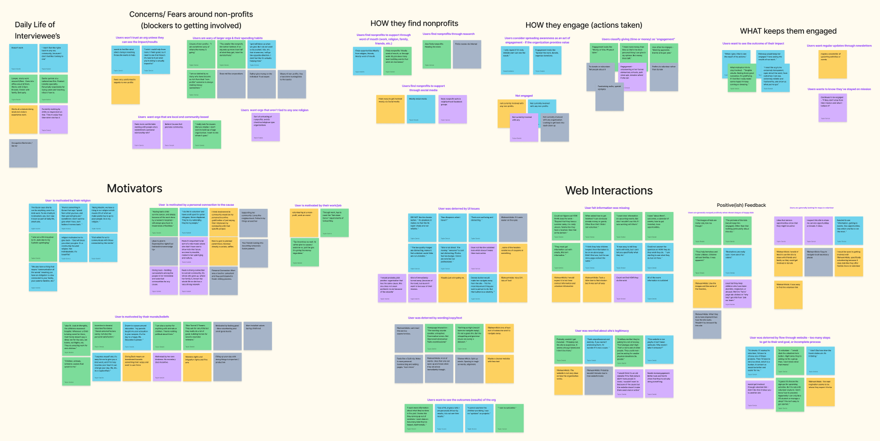
I conducted five user and two stakeholder interviews to group key moments and identify the essential elements that drive user engagement on non-profit websites and assess the current website's usability and accessibility performance.
User feedback
-
Users visit organization websites before getting involved
They trust organizations they find through word of mouth, social media, and research
They prefer local community-based organizations and crowd-funding
They are less trusting of religious organizations
They value quantified impact, regular updates, and contact via newsletters to stay engaged
Almost all are open to getting involved, but few are currently engaged
-
They feel more trusting of organizations that show impact, results, and financial transparency – they avoid organizations plagued by scandals.
They are wary of larger organizations' spending habits
They are motivated to give based on religious affiliations, personal connections, work, tax incentives, and morals or beliefs
They think engagement with an organization involves giving time, money, or spreading awareness
They find the current website has UI issues, difficult-to-read text, user flow issues, and missing information on legitimacy, history, outcomes, and financials
-
Satisfied by making a difference locally, experiences personal gratification
They like participating in local events for good causes, which offer new experiences and the opportunity to meet like-minded people
They struggle with knowing where to start, with a lot of non-profit websites lacking clarity about missions and services

What sets us apart?
Users have concerns about large non-profits and want clear evidence of impact. To address this, we propose that the homepage of Fill a Heart 4 Kids should focus on highlighting what they do, how they've done it, how they will continue, and how people can help. It should do so in a straightforward tone with a uncomplicated and engaging interface.
-
To achieve this, we will emphasize the organization's directives, history, and credibility while making involvement easy. We plan to incorporate testimonials and data on FH4K's results, as well as an active calendar of upcoming events with clear volunteer and donor information. Our goal is to inspire trust in new donors, engage volunteers, and help FH4K achieve their goals!
-
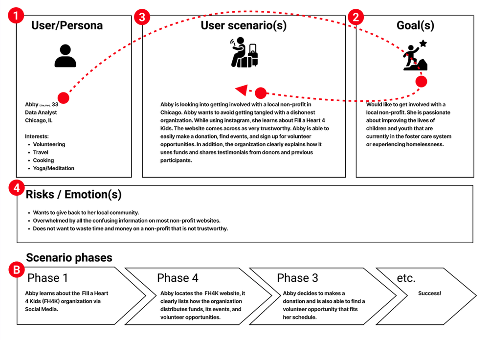
Abby is skeptical about Fill a Heart 4 Kids’ credibility and impact. Because their site focuses on showcasing their story and past, as well as upcoming events, she struggles to understand the organization’s purpose and how they operate.
Additionally, with unclear information on how to get involved, Abby is hindered from volunteering and donating. Abby wants to engage with a non-profit she believes in the cause and impact of. To get involved with FH4K, Abby needs their site to effectively highlight key information and provide a clear and encouraging call to action.
-
Says they visit organization websites before getting involved, trusting those they discover through word of mouth, social media, and research, and they are open to engagement but not currently engaged.
Thinks local community-based organizations and crowd-funding are preferable, with less trust in religious organizations, and values quantified impact, regular updates, and contact via newsletters to stay engaged.
Feels more trusting of organizations that demonstrate impact, results, and financial transparency, and is wary of larger organizations' spending habits, being motivated to give based on religious affiliations, personal connections, work, tax incentives, and morals or beliefs.
Does believe engagement involves giving time, money, or spreading awareness, while identifying UI issues, difficult-to-read text, user flow issues, and missing information on legitimacy, history, outcomes, and financials on the current website.
Is driven by the satisfaction of making a difference locally, personal gratification, meeting like-minded people, and new experiences.
Is pained by the struggle of knowing where to start, unclear missions and services on non-profit websites, finding local events for good causes, and avoiding organizations plagued by scandals.

WHO, WHAT, WHERE, HOW, WHY?
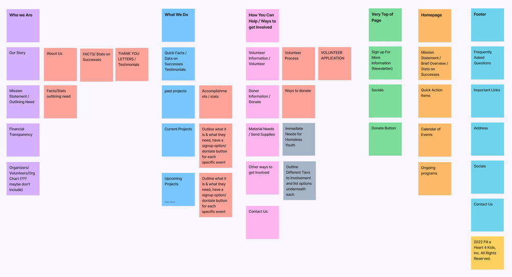
User interviews revealed to us that people understood that the org helps homeless and foster children, but not HOW they do it. So the core of my work was an information architecture overhaul. In this I aimed to create a more compelling and effective website for FH4K, fostering trust, engagement, and ultimately helping them achieve their goals!
-
We conducted a card sorting analysis to evaluate their existing IA to develop a more streamlined sitemap. With information about their credibility and impact scattered across many different pages and headers that don’t correlate with the linked content, simplifying the IA was imperative.
-
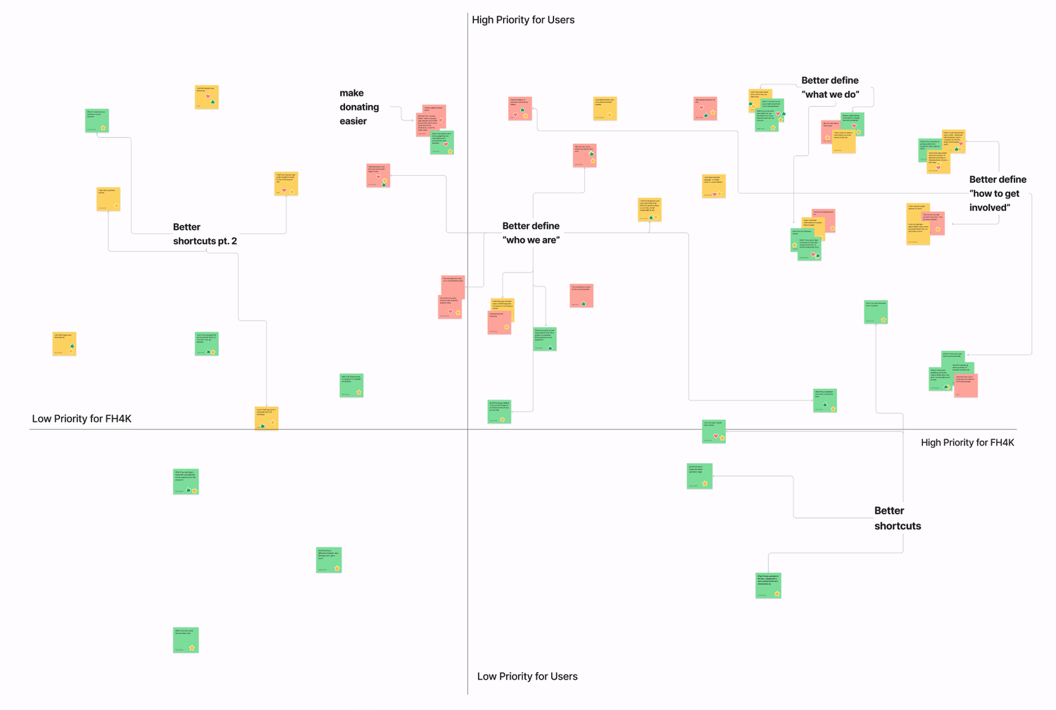
During ideation, we conducted an "I like..., I wish..., What if..." exercise to gather user feedback. We prioritized the most important and feasible ideas that will aid in fostering trust with new volunteers and donors. This guided our design changes, aligning user needs with organizational goals.
-
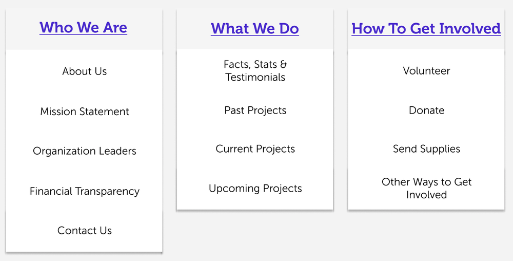
Define FH4K:
Background and credibility
Mission statement
What FH4K does:
Past, present, and future projects
Current financial directives
Testimonials
Getting involved:
Volunteer application process
Ways to donate
Other ways to give
Other User Issues:
Improve donation process
Enhance user shortcuts
Clear call to action
-
We then visualized how these solutions would address user issues, create benefits, and potential challenges through a User Storyboard and User Journey Map.
-
Our research has unveiled the significance of a compelling online presence for non-profit organizations like FH4K. To build trust and engagement, we recognize the need for a website that effectively communicates FH4K's impactful mission, showcases their track record, and provides clear avenues for involvement.
By highlighting FH4K's inspiring work, quantifiable outcomes, and transparent financial stewardship, we aim to foster donor confidence and increase volunteer engagement. Join us in making a lasting difference in the lives of vulnerable children and experience the power of compassion and community with FH4K!
-
![]()
IA Audit
Card sorting analysis
-
![]()
Ideation Exercises
“I like.., I wish.., What if…” Ideation
-
![]()
Feature Prioritization
Balancing feasibility with priority
-
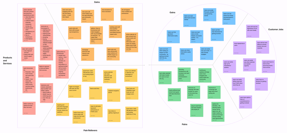
![]()
Value Proposition
Customer pains & gains
-
![]()
Storyboard
Illustrating potential benefits and pitfalls
-
![]()
User Scenario
illustrate what benefits and pitfalls may present
-
![]()
Journey Map
illustrating potential benefits and pitfalls


PROTOTYPE & TEST &
PROTOTYPE & TEST &
Through an intuitive user experience, streamlined navigation, and simplified call-to-action prompts, we strive to make getting involved with FH4K a seamless and rewarding experience.
Due to my intensely tight timeline, doing the work of three people just myself, I followed my teacher's guidance to transition directly from paper sketches to a low-fidelity digital prototype. The subsequent transition from low to mid-fidelity involved minimal changes, primarily incorporating the newly developed style guide.
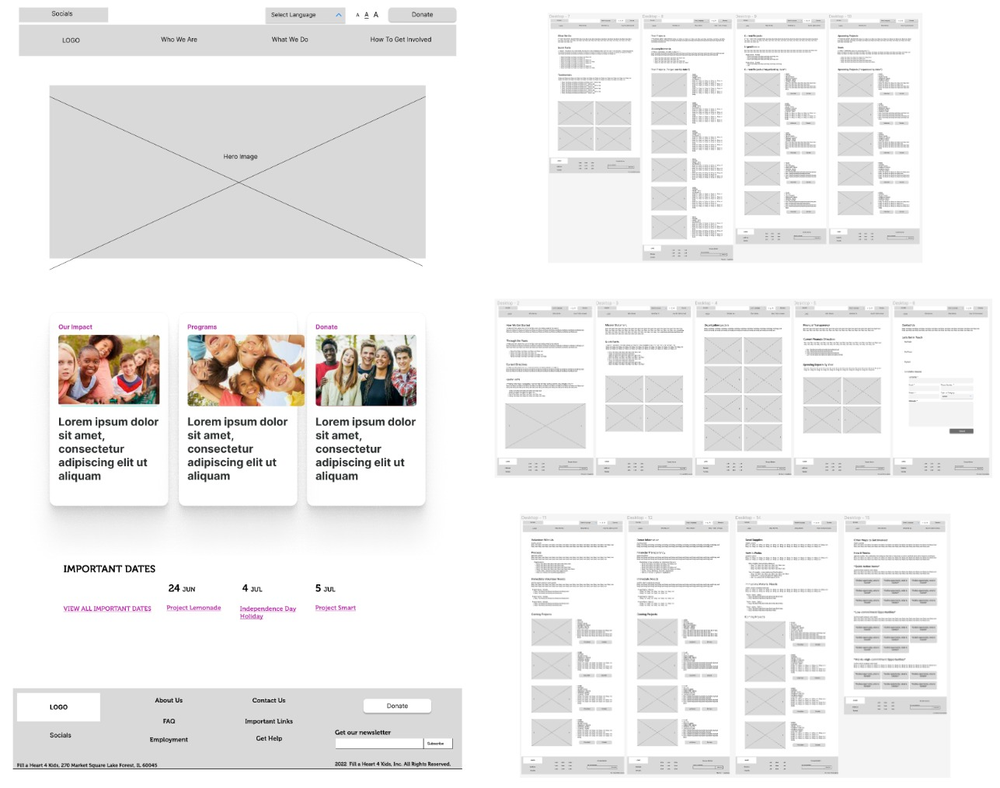
Lo-Fidelity Prototype
Test the interface
After extensive sketching exercises, I developed a paper prototype that underwent A/B testing and continuous iterations. This led to the creation of a digital, lo-fidelity clickable prototype for further testing and refinement.
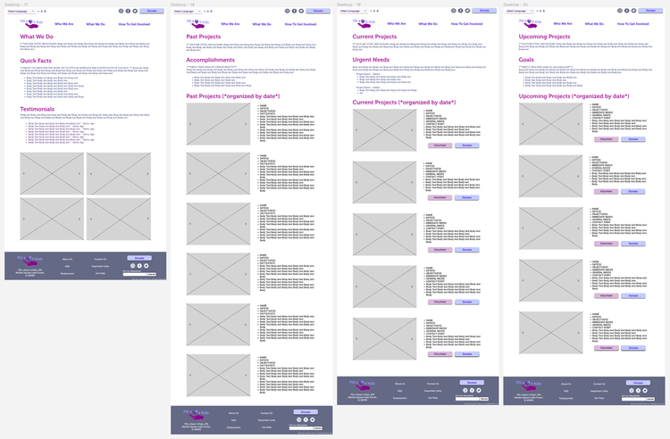
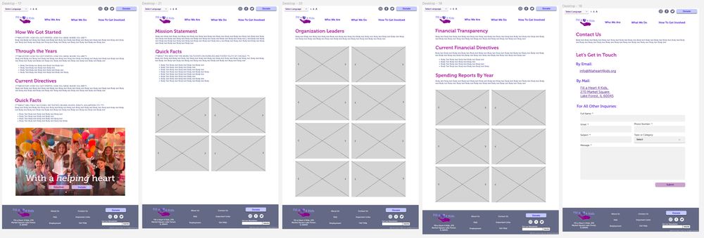
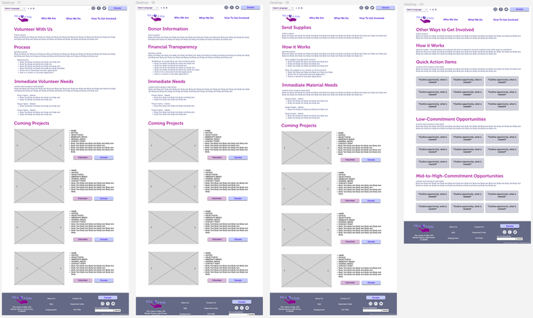
To showcase the streamlined navigation structure, I wireframed all 14 pages outlined in the new sitemap. It was crucial to demonstrate that all the existing content, along with the new additions, seamlessly fit into this simplified structure. Additionally, I focused on achieving visual cohesion despite the diverse range of pages and abundant images.
mid-Fidelity Prototype
Refine the interface
Based on recurring feedback from our initial user interviews, it was clear that FH4K's font and color scheme were distracting people from the content. However, the playful and cute childlike essence was well-received. To address these concerns, I focused on designing a style guide that addressed the pain points of the original site while still capturing the essence of its colors, tone, and spirit.

What works, what does not?
I then conducted usability testing on four users using the mid-fidelity prototype to identify any user flow issues and moments of confusion or frustration.
-
Our usability testing aimed to evaluate the ease with which users could accomplish the following tasks:
Learn about the organization
Find information about upcoming events and understand how to donate to or volunteer for them
Locate information on how to donate to the organization
Understand how to get involved with the organization
-
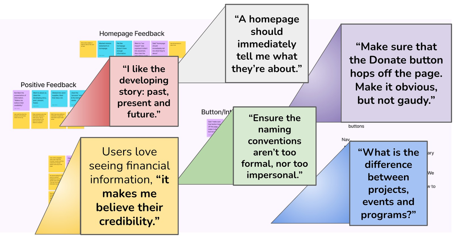
All users successfully completed all tasks, but their feedback provided valuable insights for further improvements. Based on their comments, the following key changes were identified:
Add the mission statement to the homepage in a prominent position
Improve the clickability of cards and buttons
Ensure consistency in spacing and alignment conventions throughout the website
Make the donate button more visually striking
Incorporate more interactive elements throughout the website
Consider the visibility of important content above the fold on smaller screens
-
Based on consistent user feedback, I made the following improvements:
Added a carousel showcasing images of FH4K's projects and organization events, as users “love seeing pictures of the kids”
Introduced accessibility features like language options and font size adjustments
In keeping with the feedback that “a homepage should immediately tell me what they’re about,” highlighted the mission statement to immediately convey FH4K's purpose
Summarized the impact, projects, and goals to provide a clear understanding of FH4K's work
Because people repeatedly expressed the desire for handy shortcuts:
Created a calendar of events to provide user-friendly shortcuts for getting involved
Designed the footer with the same user-centric principles to enhance navigation and accessibility
Hi-fidelity prototype
“What we do” pages
Users expressed a strong desire for hard facts and data to quantify impact, so we incorporated testimonials and quantifiable metrics to build trust. The pages now highlight FH4K's past accomplishments, ongoing projects, and future goals, providing a comprehensive overview of their work.
Additionally, we maintained the feature that allows users to donate to or volunteer for specific events or projects, giving them a sense of targeted engagement and involvement.
Hi-fidelity prototype
“Who we are” pages
Through multiple rounds of testing, it became evident that users desired a deeper understanding of the organization's history, impact, mission statement, and financial transparency. Due to the lack of clarity on how FH4Ks achieves their goals, a lot of these pages are entirely new, or underwent significant redesigns.
To add a personal touch, the pages were enhanced with introductions to the individuals behind the organization, creating a more inviting atmosphere for users to get in contact. These changes aimed to meet users' need for clarity and connection with FH4K.
Hi-fidelity prototype
“How to help” pages
In response to user feedback, these pages were redesigned to address the challenges users encountered when signing up to volunteer. The process is now clearly outlined, and future opportunities are highlighted to encourage ongoing engagement.
Additionally, a new section called "Immediate Needs" was introduced to provide timely information on urgent matters. They currently disseminate information via newsletter and emails. To cater to varying levels of commitment, the concept of involvement "levels" was developed, allowing users to choose quick action items, low-commitment opportunities, or mid-to-high commitment options. This approach ensures that users can find a suitable level of involvement that aligns with their preferences and showcases the importance and breadth of FH4K's needs.
Addtl Usability testing
After conducting another round of A/B testing and accessibility testing on the hi-fidelity version, I identified additional issues, more aesthetic than foundational. To address these, I focused on enforcing grid conventions, standardizing fonts, and ensuring consistent and readable copy throughout the design. Through this process, I addressed pain-points, design inconsistencies, and user flow issues, resulting in the following key changes:
Prototyped all pages, fixed dead ends and added hover states
Expanded the information on the homepage to prominently feature the mission statement
Iterated on the calendar of events, refining the hierarchy and alignment for improved usability
Enhanced the visibility of the donate button and highlighted secondary buttons for better user engagement
Adjusted naming conventions to maintain cohesion and consistency throughout the website
Expanded the content of several key pages to provide comprehensive information to users
FInal testing
-
After conducting another round of A/B testing and accessibility testing on the hi-fidelity version, I identified additional issues, more aesthetic than foundational. To address these, I focused on:
Reinforcing grid conventions
Standardizing fonts,
Ensuring consistent and readable copy throughout the design
-
Through this process, I addressed pain-points, design inconsistencies, and user flow issues, resulting in the following key changes:
Prototyped all pages, fixed dead ends and added hover states
Expanded the information on the homepage to prominently feature the mission statement
Iterated on the calendar of events, refining the hierarchy and alignment for improved usability
Enhanced the visibility of the donate button and highlighted secondary buttons for better user engagement
Adjusted naming conventions to maintain cohesion and consistency throughout the website
Expanded the content of several key pages to provide comprehensive information to users
See Testing Results + Analysis →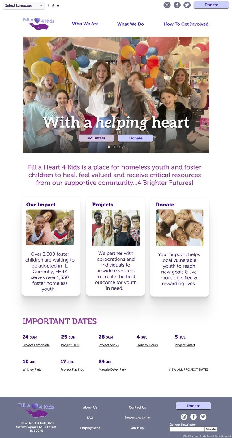
TEST THE PROTOTYPE ~
TEST THE PROTOTYPE ~
We wish Fill a Heart for Kids continued growth and success in their impactful work. By fully or partially implementing these design principles, we hope they can enhance their online presence and achieve even greater accomplishments!