

Full Website Redesign
Adopt-a-pet
project background
Adopt-A-Pet, a trailblazer in the "shelterless shelter" concept for animal foster care, has successfully found loving homes for over 11,000 dogs and cats since the 1980s. With its significant impact this remarkable organization deserves a website that enhances their mission!
-
To address the issue of returned animals, most commonly due to lack of information, we focused on introducing fun, detailed and honest pet pages that outline the unique cost, care and adoption timeline expectations for each pet.
To enhance competitiveness with larger shelters, we integrated new resources for pet parents and ensured a flexible design that highlights the currency of information.
While prioritizing the safety and success of each pet, these changes aim to facilitate more adoptions and a greater number of cherished pets!
-
Redesign the website for a non-profit of your choosing, in a three-week design intensive. In teams of three, execute the UX double diamond design thinking model to deliver a clickable hi-fidelity prototype and a live coded version of the homepage, as well as a case study capturing the the: what, where, when, how, why of key decisions made throughout design iterations.
-
In a team of 3, developed a fully functional prototype, and a live high-fidelity mockup constructed using HTML5, CSS, JavaScript, jQuery, Bootstrap, GitHub and VSCode.
Served as project lead, managing a team of 4, project timelines and deliverables, and troubleshooting design solutions.
Facilitated user research by leading all communication with project stakeholders, and conducting 10+ user interviews and 20+ usability, A/B, and tree tests, and data analytics on 73 survey results.
Tools: Figma, Adobe Creative Cloud (Illustrator, XD, InDesign and Photoshop primarily), HTML5, CSS, JavaScript, jQuery, Bootstrap, GitHub, VSCode
why?
Our shared passion for the unconditional love that pets bring to our lives fueled our motivation to redesign a website that would effectively serve Adopt-A-Pet's mission and enhance the overall experience for potential adopters, current pet owners, and dedicated volunteers.
-
Understanding the pressing challenges faced by animal shelters, we researched:
An alarming 43.3% of adopted dogs are returned, with the primary reason being inadequate information about the animal's health, diet, and other essential factors.²
Disturbingly, 50% of shelter dogs and cats face euthanasia due to overcrowding.¹
41% of individuals who returned an adopted pet expressed indicated they would not attempt to adopt in the future.

how?
In our quest to understand what users value in a pet adoption website and what influences their choice of shelter, we conducted a thorough analysis.
-
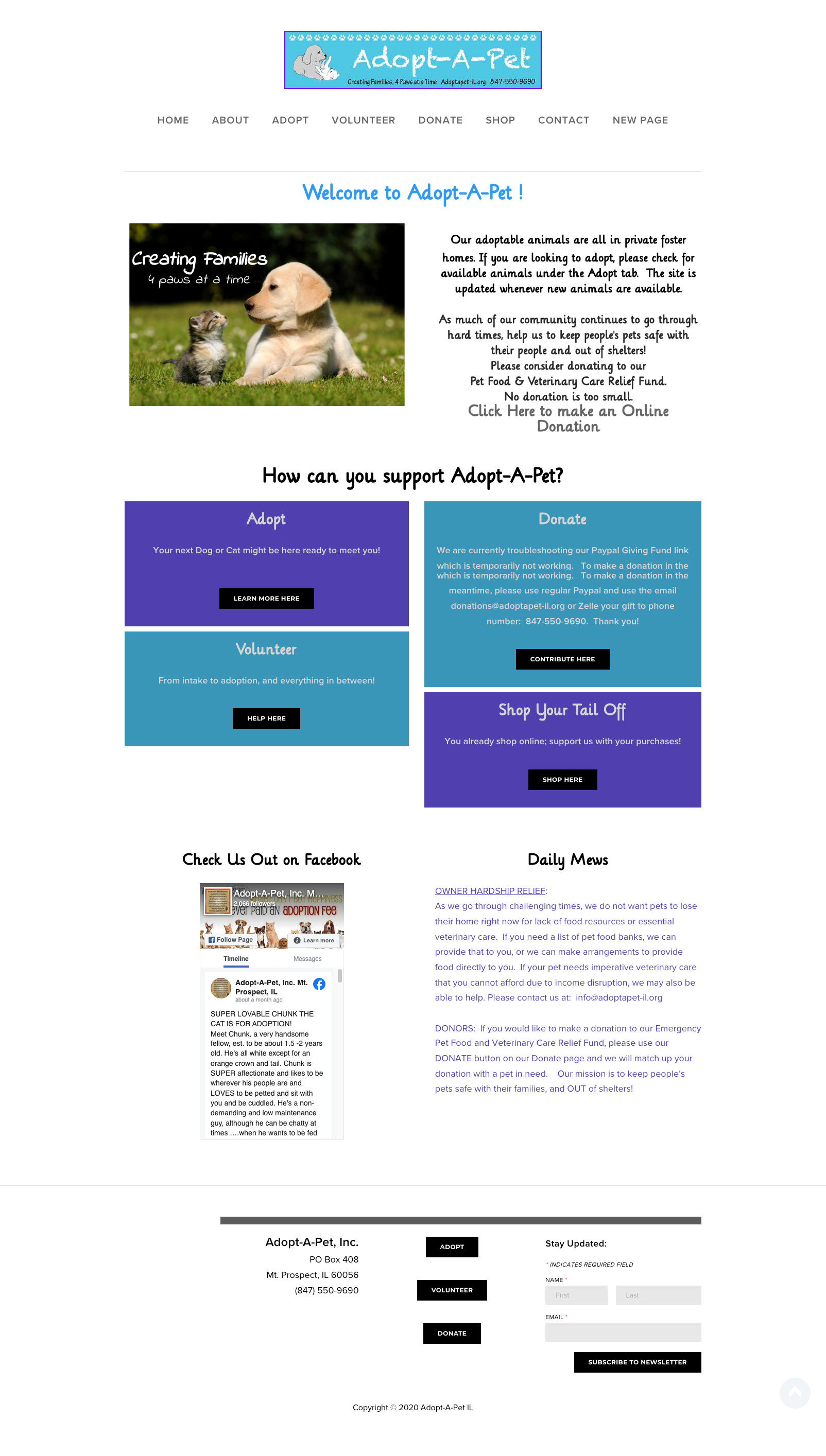
What is Working:
Brand recognition
Colorful and playful design
What is Not:
Inconsistency and design standards: Lack of cohesive design language and layout
Readability issues: Large, colorful text blocks compromise readability.
Information hierarchy: Unclear organization of text blocks makes it difficult for users to find relevant details.
Outdated graphics: Outdated visuals diminishes credibility.
Lack of historical information: Insufficient background information about the organization hampers trust-building.
Unclear call to action: Absence of a prominent and clear call to action confuses users on how to get involved.
-
We examined three direct competitors (PAWS Chicago, Get Your Pet, and One Tail at a Time) and two indirect competitors (Facebook Marketplace and a local dog breeder) to understand how they connect people with the right pet to ensure pet retention.
Popular Features:
Detailed pet bios with ample photos and videos
Events, training, and resources for new pet parents
Medical and crisis aid for pets
Live updates on specific pets' availability status
Compatibility tests
Biggest Lessons:
Reputation is important; people tend to stick with what they already know and trust
Clearly outline adoption, foster, and volunteer process steps to minimize barriers
Explicitly state the requirements for each available pet
Provide transparency on the impact and effectiveness of actions taken
-
Explore how users discover and connect with shelters and organizations.
Understand the factors that influence users' decisions in choosing one shelter over another.
Investigate the key factors users consider when browsing the shelter’s website.
Identify the qualities that users prioritize when choosing a pet.
Uncover the pain points and successful aspects experienced during the pet adoption process.
who?
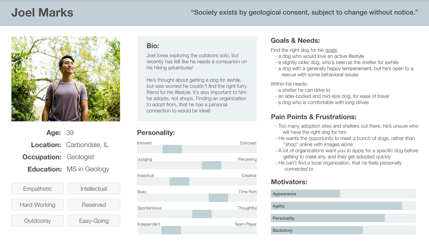
Through Joel's unique persona, we aim to empathize with individuals like him, understand their needs, and design a solution that caters to their specific requirements and aspirations.
-
Hyper-active Joel
Age: 39
Occupation: geologist
Status: single, no pets or children
-
Joel's aims to find a canine companion who can match his energetic and adventurous "on the go" lifestyle.
Joel is also keen on getting involved with an animal shelter to indulge in the joy of spending quality time with animals.
-
A lot of options for where to start, but most shelters have:
Limited information
Inconsistent or outdated information
Limited pet interaction opportunities
A lack of transparency on adoption process steps & fees

See Persona Development →DEFINE & EMPATHIZE &
DEFINE & EMPATHIZE &
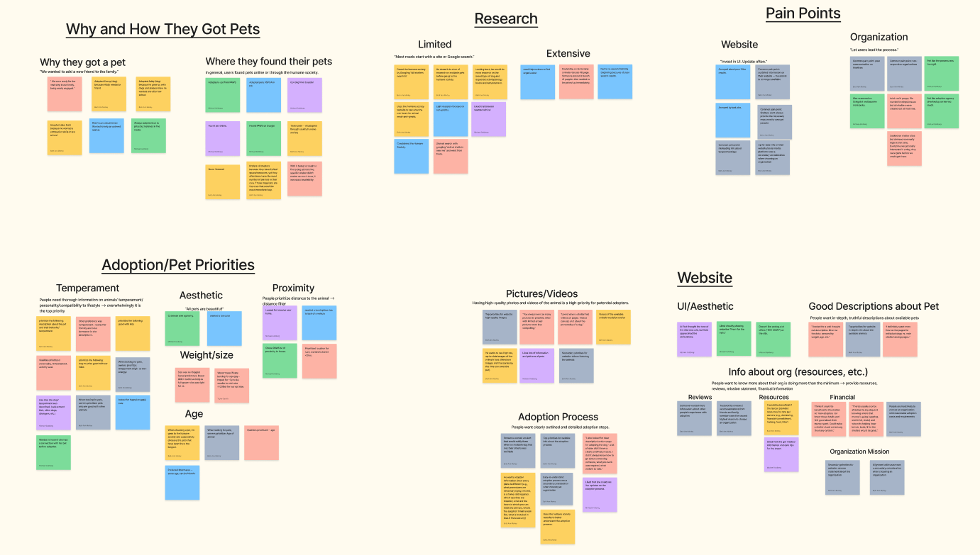
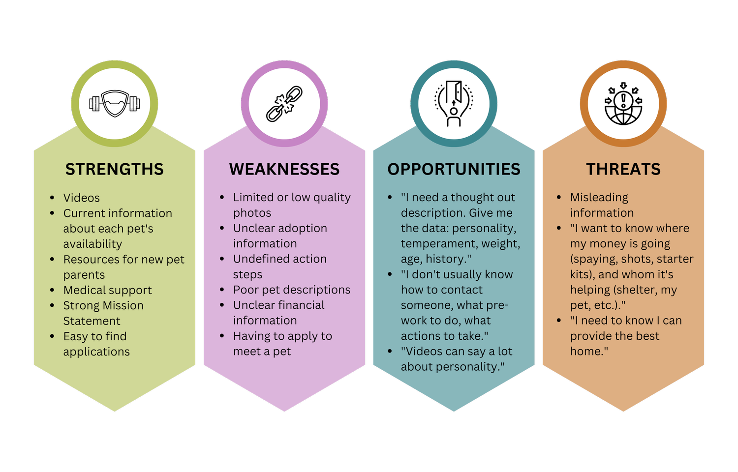
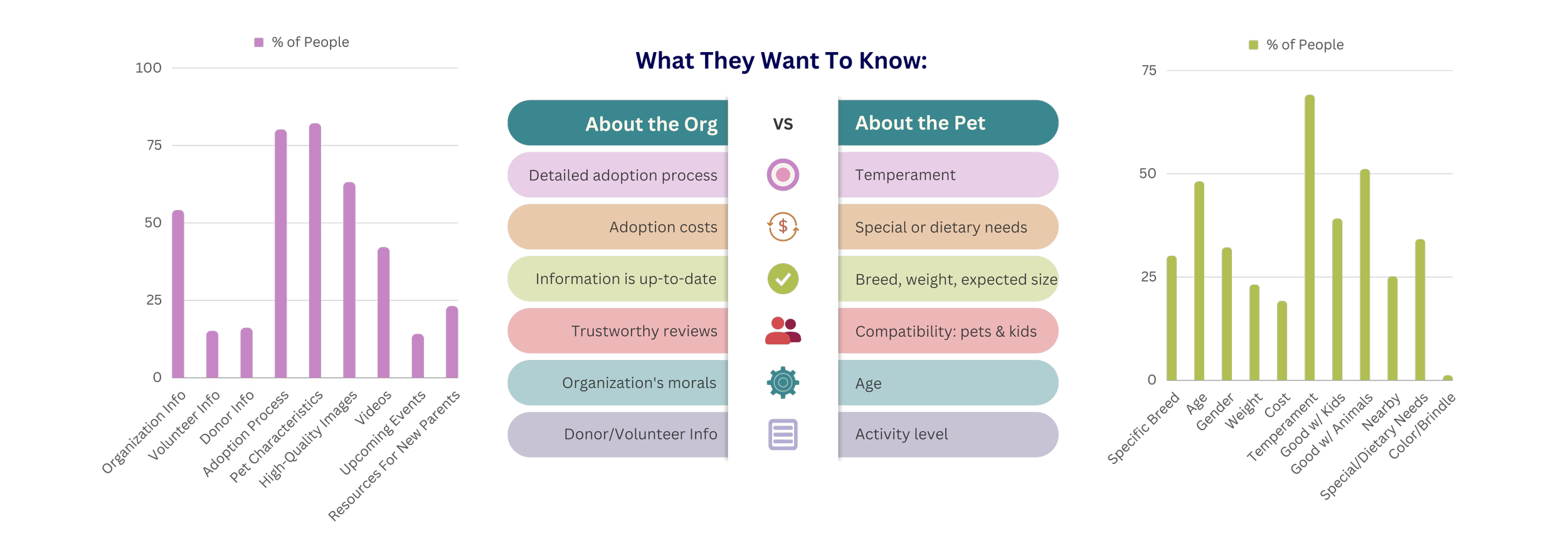
We then conducted 6 user interviews with individuals who have adopted pets and received 63 survey responses, with 91% of participants having adopted a pet. We extracted the following valuable insights from the raw data, visualizing data and focusing on key quotes.
Search Methods
-
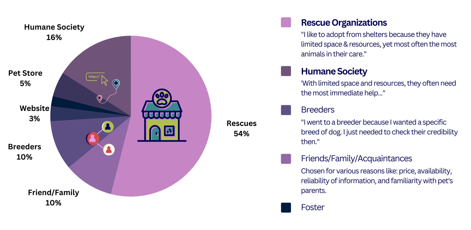
Users predominantly adopt pets from rescue organizations and the Humane Society, motivated by the high demand for pets in need and the affordability of adoption fees.
Priorities & Decision Factors
-
Pet selection is primarily driven by the desire to find a companion whose temperament aligns with one's lifestyle, ensuring a suitable and loving home for the chosen pet.
needs & wants
-
Key features that users overwhelmingly desire include:
Adoption process specifics:
Requirements
Action steps
Process timeline
Costs
Detailed pet descriptions that accurately outline:
Age
Temperament
Compatibility with other pets and/or kids
Any special needs or dietary restrictions
Breed, weight, or expected size
Ample high-quality photos to showcase the pets.
What sets us apart?
To empower users in the adoption process, we must provide them with comprehensive tools, eliminate waiting periods, and ensure clear and transparent information, avoiding any confusion regarding requirements.
-
Our research revealed that people are increasingly finding their pets online, emphasizing the importance of shelters having an up-to-date, informative, and detailed website. To ensure successful pet placements, managing expectations is crucial.
Adopt-A-Pet's website should prioritize simplicity, providing clear adoption requirements, step-by-step processes, and timelines. By implementing a new format for engaging, detailed, and honest pet profiles, users will be motivated to initiate connections with Adopt-A-Pet.
-
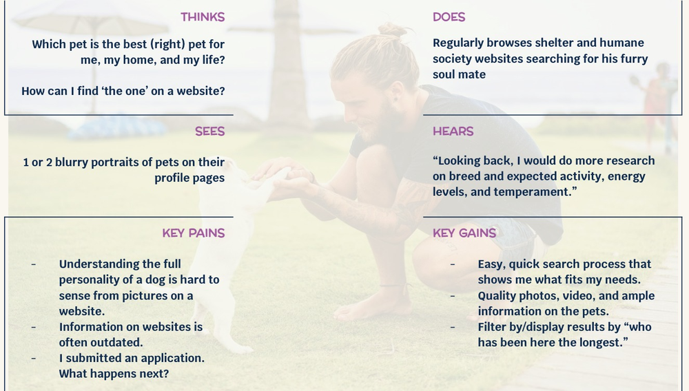
Joel wants Adopt-A-Pet to offer clear action steps and abundant resources, empowering him to take the lead in the adoption process. But he is frustrated by spending most of his search on individual pet pages, which lack essential personality information and ample pet pictures.
Transparent communication of cost, care, and timeline expectations is crucial to ensure the safety and longevity of each pet placement. By simplifying the adoption process, Adopt a Pet can meet joels needs, increase successful adoptions and assist families in finding their new furry companions with ease!
WHO, WHAT, WHERE, HOW, WHY?
Adopt-A-Pet's website should embody the joy pets bring to our lives, while ensuring prospective parents have access to the comprehensive information they need to make an informed decision.
Simplifying the adoption process is essential to increase successful adoptions and assist families in finding their new furry companions with ease!
-
Our approach involved balancing user needs and feasibility of implementation and upkeep, all while keeping the overarching design principle of 'simplicity' in mind.
We explored concepts to enhance pet profiles, streamline the adoption process, and provide comprehensive resources for prospective pet parents.
-
Through a meticulous analysis of Adopt-A-Pet's information architecture, we identified an issue with the unclear hierarchy of information. Our focus was to prioritize the visibility of key action pages, including adopt, volunteer, contact, and donate, addressing the primary concern of improving user engagement and navigation.
-
Simplified Navigation:
About Us
Adopt
How to Help
Homepage Features:
Adoption Process Overview:
High-level overview of the adoption process and requirements
Preparedness checklist graphic highlighting essential adoption requirements
Pet Showcase:
Showcase a pet who has had difficulty getting adopted
Ample pet pics
CTA Buttons:
Primary buttons directing people to adoptable pets
Secondary buttons directing people to CTA pages: adopt process, volunteer, contact, and donate
Organizational Information
High-level overview of the organization's mission statement and impact
Basic contact information for inquiries
Quick Reference Links:
Adoption, volunteer, and foster applications
Amazon wishlist
Recommended vets, brands, trainers, etc.
Resources and articles for pet care, training, etc.
"New Pet Parent 101" outlining essential information
-
To explore potential layouts and guide our direction, we utilized storytelling techniques to illustrate how our proposed solutions address the issues identified during research. These methods allowed us to visually communicate the user experience and demonstrate the effectiveness of our design concepts.
-
Our research revealed that people are increasingly finding their pets online, emphasizing the importance of shelters having an up-to-date, informative, and detailed website. To ensure successful pet placements, managing expectations is crucial.
By transparently communicating the cost, care, and timeline expectations for each pet, Adopt-A-Pet can improve the safety and longevity of each placement. Simplifying the adoption process is essential to increase successful adoptions and assist families in finding their new furry companions with ease!
-
![]()
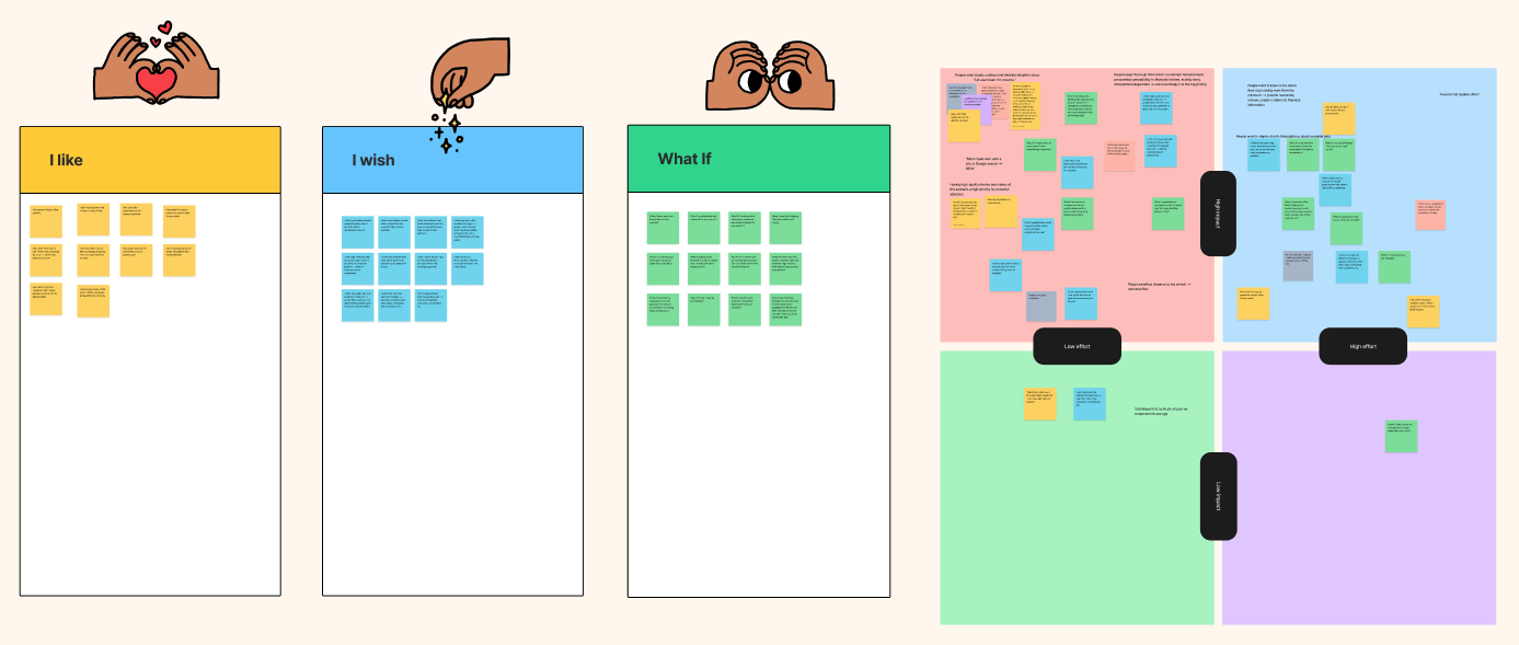
Ideation Exercises
“I like.., I wish.., What if…” Ideation
-
![]()
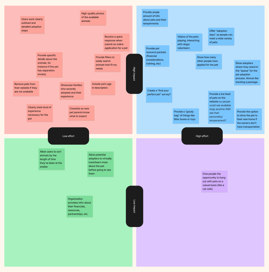
Feature Prioritization
Balancing feasibility with priority
-
![]()
Value Proposition
Customer pains & gains
-
![]()
Storyboard
Illustrating potential benefits and pitfalls
-
![]()
IA Audit
Card sorting analysis
-
![]()
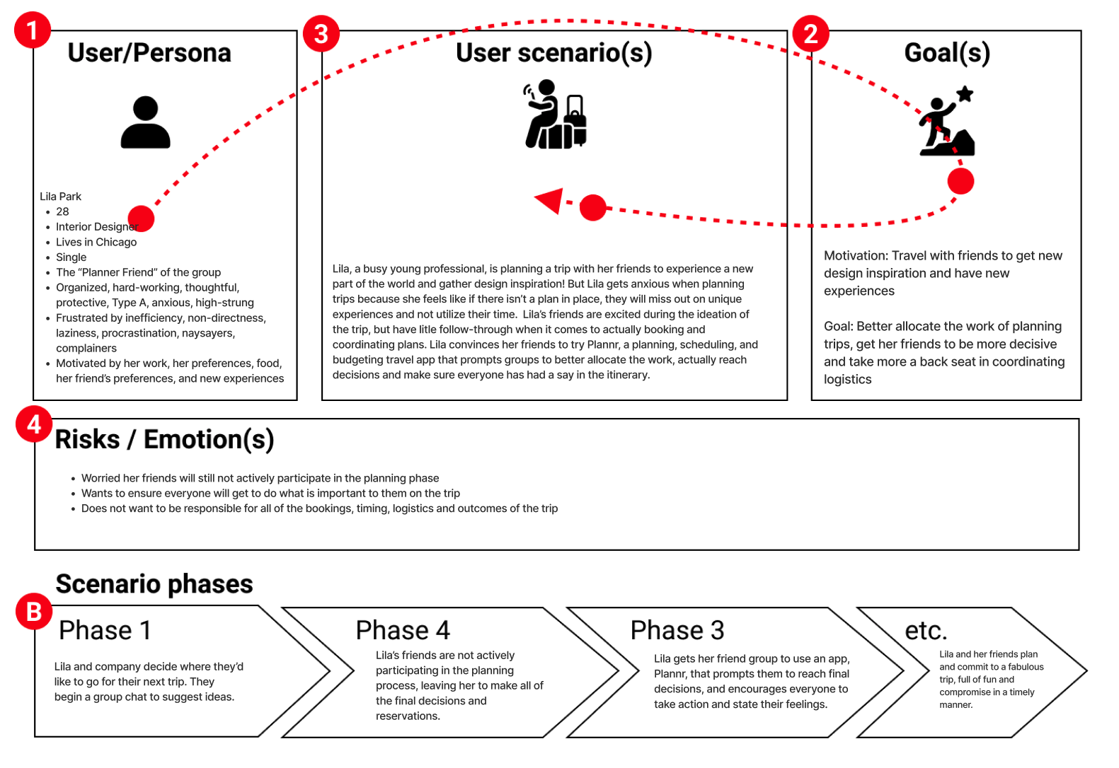
User Scenario
illustrate what benefits and pitfalls may present
-
![]()
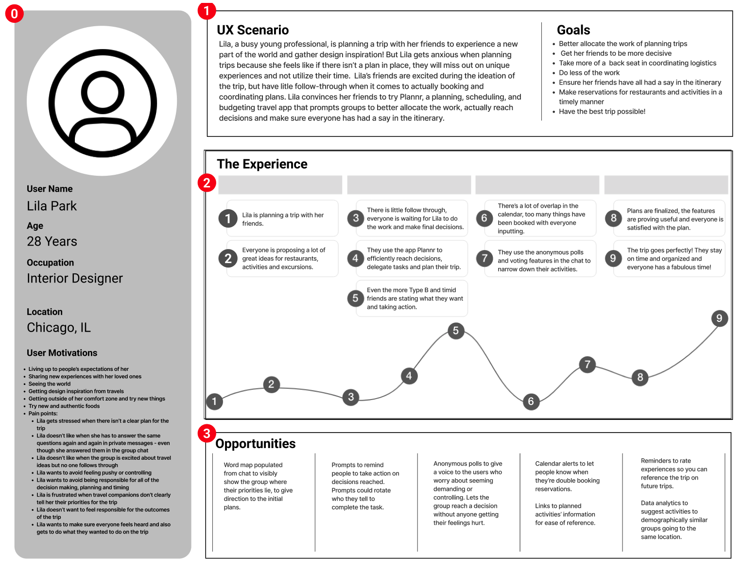
Journey Map
illustrating potential benefits and pitfalls


PROTOTYPE & TEST &
PROTOTYPE & TEST &
With our ultimate goal being: more animals adopted and kept, we focused our designs on moving users through the specific pages involved in the adoption process.
Through iterative design techniques, we aimed to refine the user experience, test functionality, and validate our design decisions.
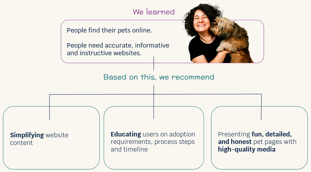
User Flow
After paper prototyping we were still at odds as a group, with one member wanting to steer away from typical UI conventions and tinker with eccentric layouts. After some debate and two rounds of low-fidelity prototype testing and iterations, we settled on proceeding with a simple and straightforward layout. We recognized that users prioritize clear information and regularly updated content when selecting a pet, rather than groundbreaking design elements. Nevertheless, we embraced creativity in designing interactive elements to generate intrigue and guide users intentionally through our key pages.
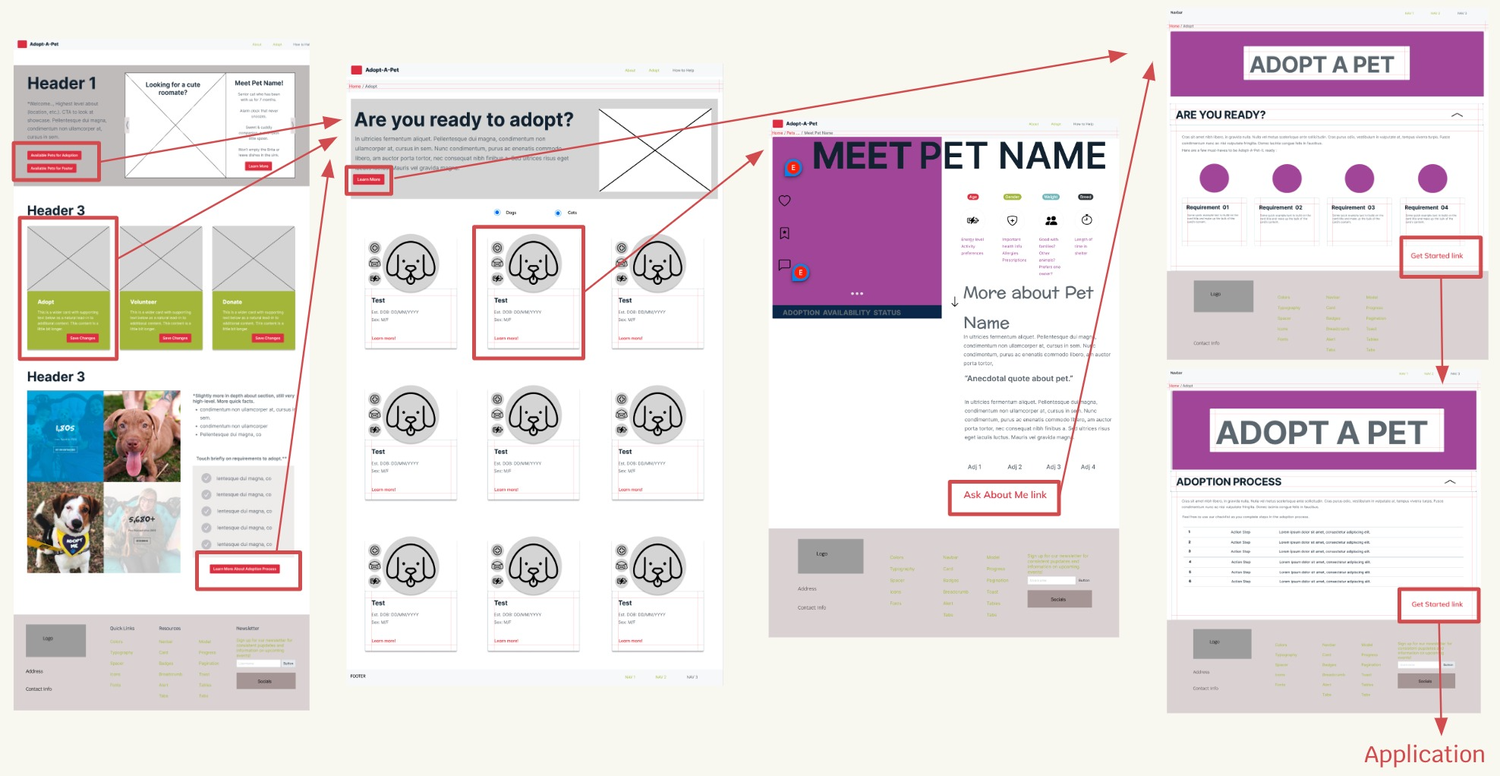
Branding & Style Guide
Our navigation system embodies the same principles, featuring only the most frequently accessed pages. Responding to user feedback, we incorporated more shortcuts in the footer, prioritizing quick-links to essential CTA pages and resources that we believe Adopt-A-Pet should provide.
The design style and tone was chosen to evoke warmth, happiness and a fresh youthful feel. We wanted to walk the line of playful but not childish, bright but not forceful, simple yet engaging.
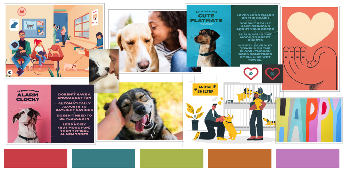
Homepage Iterations
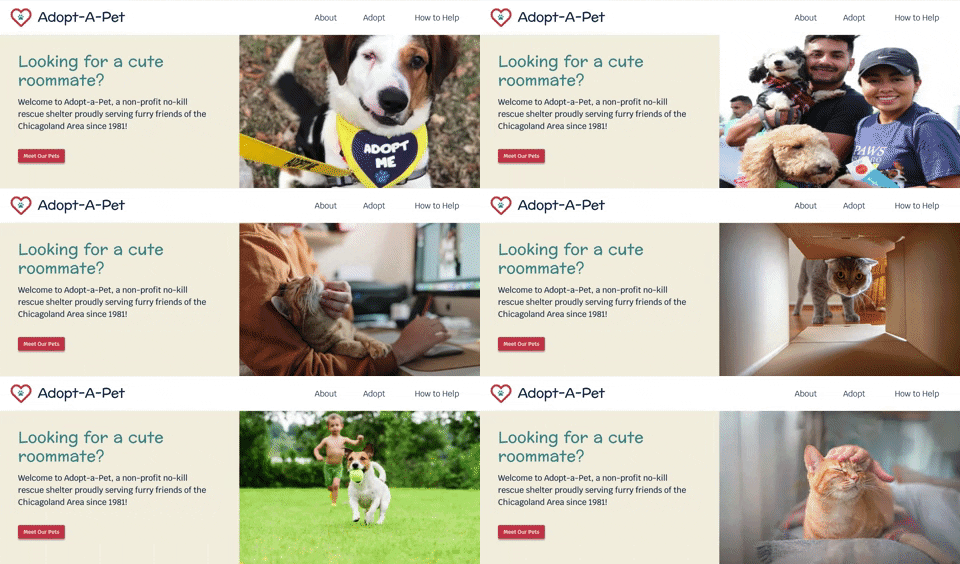
Throughout the testing and iterations, we focused on refining the hero space. Initially, we explored showcasing long-term shelter pets in a humorous way, but it resulted in a crowded and text-heavy section with competing headers. User testing confirmed the fun aspect but highlighted the need for improvement. We also considered the practicality of consistently creating new graphics for the shelter. As a result, we transitioned to a carousel format. This change allowed us to showcase more pets and fulfill the users' request for more adorable pet photos.
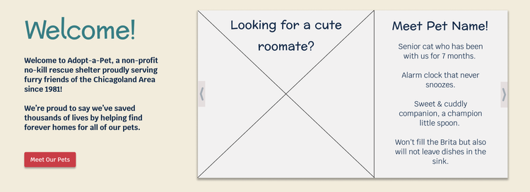
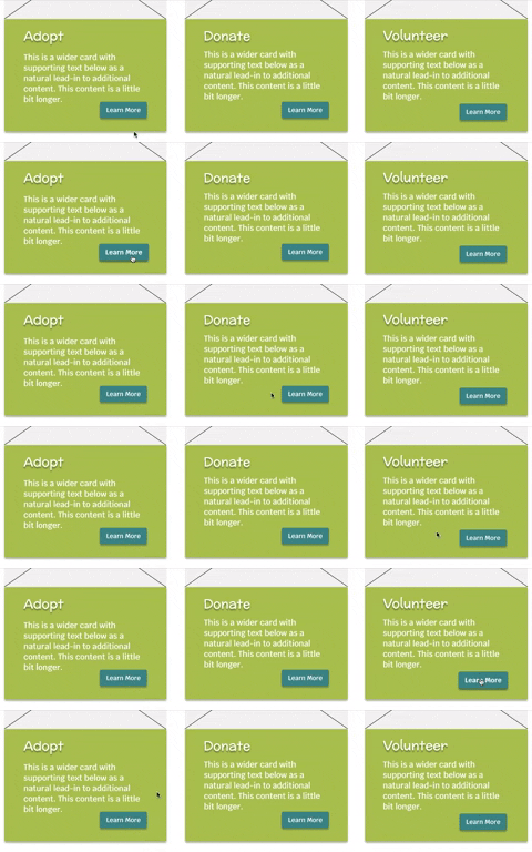
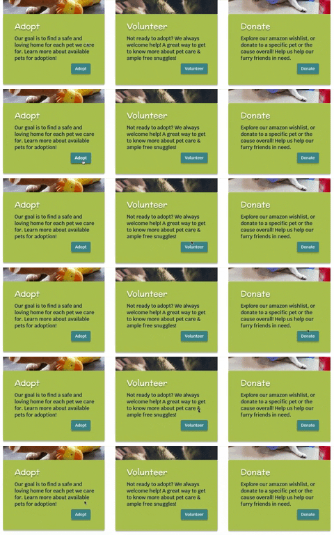
Accessibility testing revealed issues with contrast in some of our text and button colors, which we promptly addressed to ensure better readability for all users. To enhance usability for individuals relying on screen readers, we made improvements to the wording on our action cards. The repeated use of "learn more" was adjusted to provide clearer indications of the specific actions users would be taking.
In response to user feedback, we also prioritized the display of essential adoption requirements on the homepage. This sought-after information was made easily accessible, along with quick facts about Adopt-A-Pet, to establish immediate credibility and trust.
“All pets” page Iterations
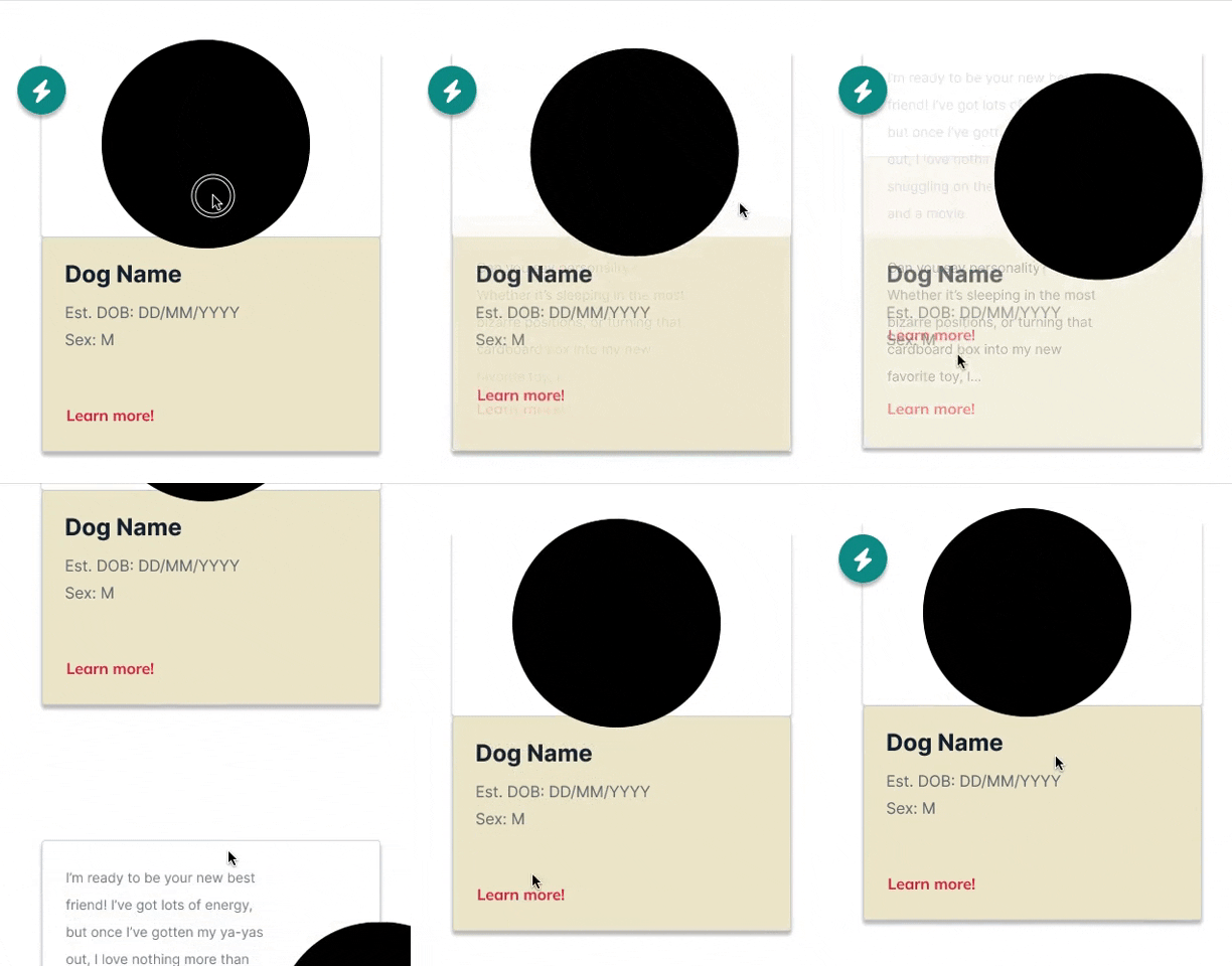
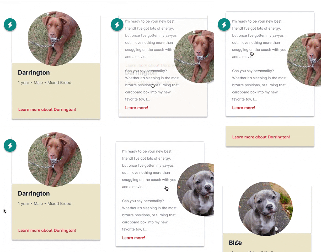
Usability testing brought attention to issues with the interactivity of our individual pet cards. Users found the transitions to be abrupt, which hindered their scrolling and interaction with the moving elements. To maintain simplicity and a clear information hierarchy while incorporating interactive elements, we made adjustments to soften the transitions, ensuring a smoother user experience.
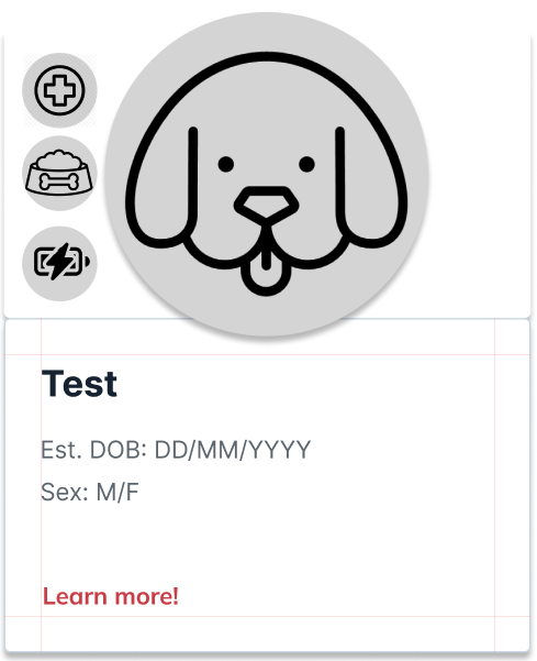
Iconography for pet characteristics underwent significant changes as well. We selected these specific characteristics to highlight based on secondary research, as they were identified as the top reasons for pet returns. It was crucial to us that the icons were easily recognizable to users. We also streamlined the content of the pet cards throughout iterations, focusing only on the key information that our interviews and survey identified as most important to users. This refinement aimed to provide a concise and relevant presentation of pets' details.
Adoption Process page Iterations
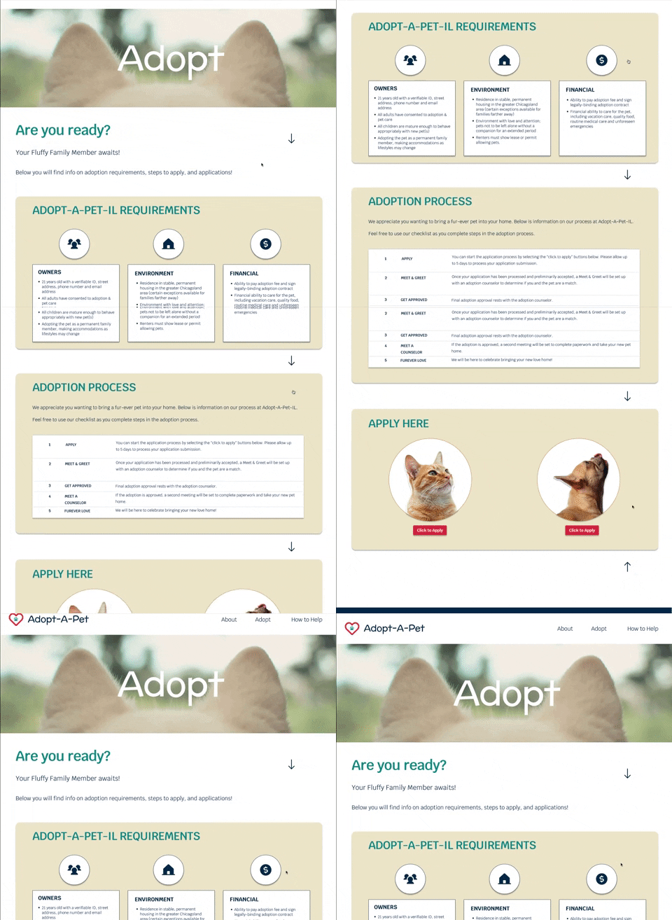
One of our main interview takeaways was that people want - clearly defined adoption process steps. However, testing uncovered issues with our accordion design:
Users struggled to open the accordion without the hotspot guides
Multiple tabs couldn't be kept open simultaneously
The initial landing page felt incomplete or lacking
To address these concerns, we redesigned the content to be displayed on a single page, with all the important information readily available and open for reading. This approach ensures that key adoption requirements are properly highlighted. To maintain user engagement, we reintroduced scrolling features to enhance the overall experience.

Pet “Profile” page Iterations
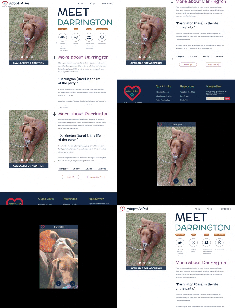
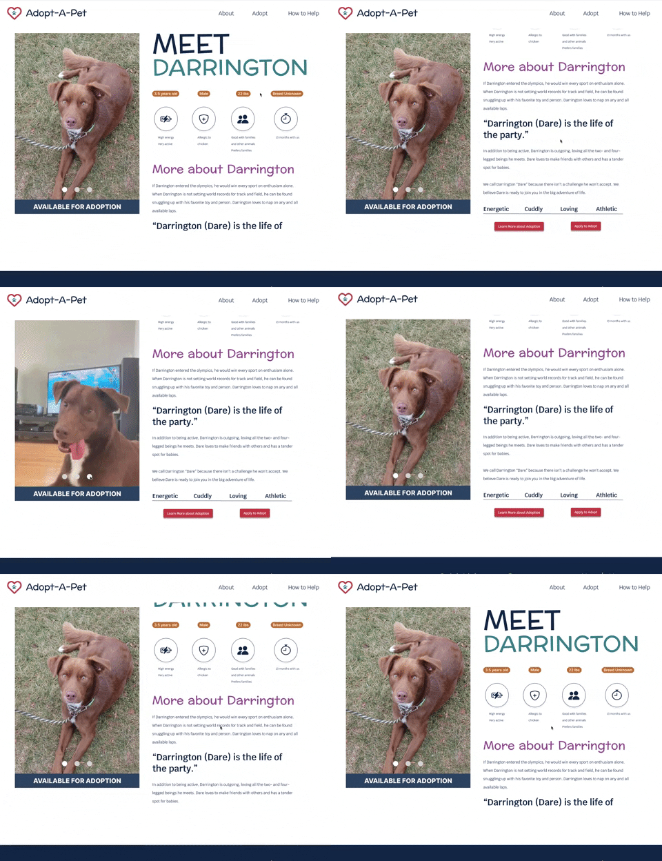
Our research highlighted that users spend a significant amount of time on individual pet pages. As a result, we focused on enhancing these profiles to better showcase each pet's unique personality, as well as provide comprehensive information on their cost and care requirements.
One significant change we made was to the format for viewing pet photos. We received feedback that the previous pop-up format was disruptive, so we introduced a carousel feature instead. This improvement allows users to conveniently access all the necessary tools in one place, empowering them to make informed decisions about expanding their family.
Addtl usability changes
Through multiple rounds of user testing, we identified several key usability changes to improve the overall user experience. These changes included prototyping the logo to redirect users to the homepage when clicked, simplifying the navigation design, and removing the breadcrumbs. All of these adjustments were guided by the design principle of simplicity, aiming to streamline the user journey and enhance the overall usability of the website.

TEST THE PROTOTYPE ~
TEST THE PROTOTYPE ~
We would love to hear your feedback! Your thoughts and input are invaluable to us as we strive to enhance our prototype. Give it a try and let us know your thoughts - your feedback is always appreciated.
What’s Next?
Although Adopt-A-Pet couldn't immediately implement website updates, they embraced our recommendations to simplify and streamline. In addition to the proposed changes, we suggest the following:
Add filters if the number of adoptable pets exceeds 30+ to enhance search capabilities
Conduct user testing on the navigation bar terminology, especially for "shop," to ensure clarity and ease of use
Conduct A/B split testing on the adoption process pages to optimize their effectiveness
-
Users value transparency:
Our research highlighted the importance of providing users with full transparency, even if the information is not always positive.
Users appreciate honest and upfront communication, and they prefer to receive information sooner rather than later.
Balanced interactivity:
While interactivity can inspire engagement, we discovered that excessive movement and shifting elements can be disruptive to the user experience.
Striking a balance between interactivity and usability is crucial for maintaining a seamless and enjoyable browsing experience.
Iconography as a language:
We recognized that iconography serves as a means of communication rather than mere artistic expression.
The primary focus should be on creating icons that are easily identifiable and usable, ensuring that users can understand and interpret them intuitively.