


PLANNR
Group Travel Made Easy
project background
Through initial interviews, two undeniable truths emerged:
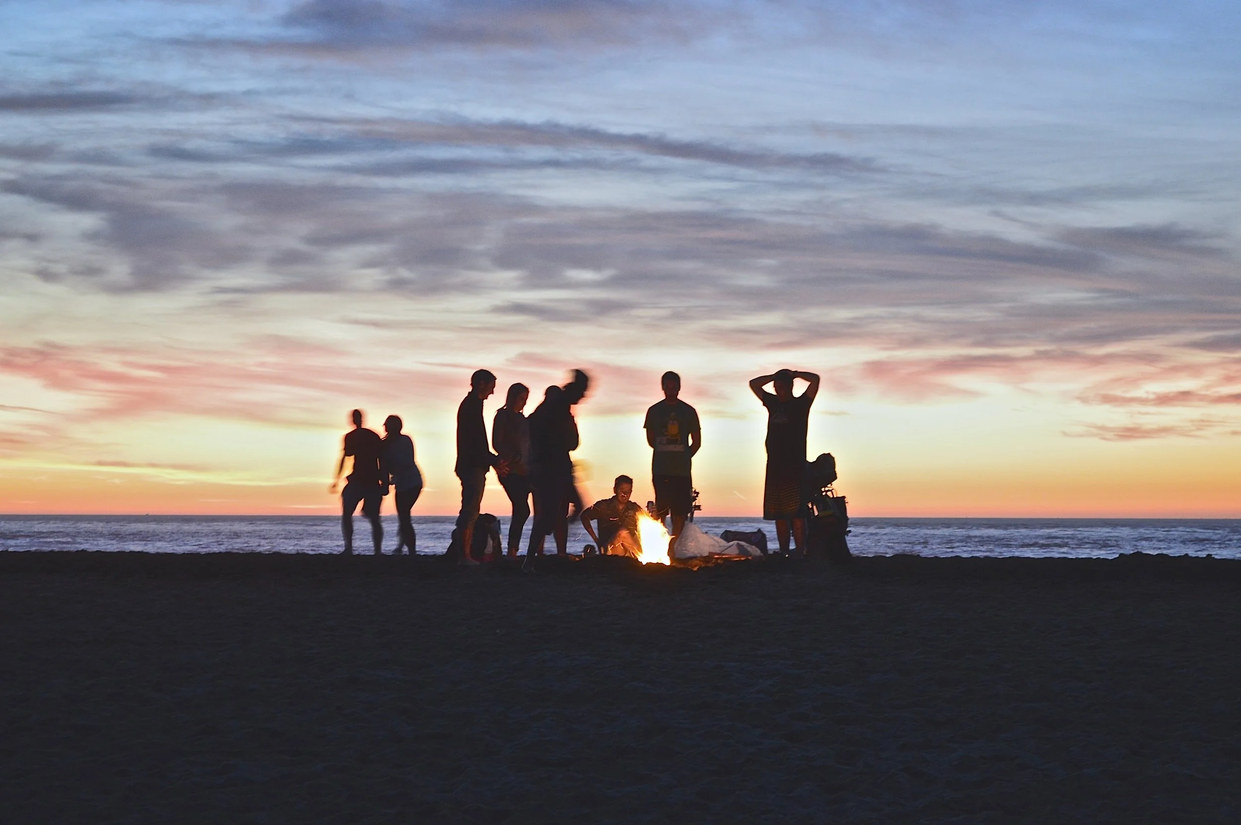
Group travel is common: most people prefer to embark on travels in the company of friends, family or colleagues.
Planning that travel is chaotic: valuable information goes astray, decisions remain unmade, and frustration mounts.
-
Introducing Plannr, designed to seamlessly solve the coordination and communication challenges that often arise when traveling in groups, be it for business or pleasure.
Plannr empowers users to make informed decisions, centralize travel information, manage expenses, create detailed itineraries, effortlessly share media, stay on schedule, and efficiently address any unexpected hiccups along the way.
-
Design an app that solves an issue relating to travel, 4-week design sprint, utilizing the double-diamond design thinking model.
-
Independently developed, from ideation to two fully functional high-fidelity prototypes.
Conducted user research, interviewed/tested 20+ users, created 50+ wireframes, created user flows, user journeys, storytelling visuals and 15+ other graphic artifacts.
Iterated on interfaces integrating user feedback and established a design system with reusable UI components.
Tools: Figma, Adobe Creative Cloud (Illustrator, XD, InDesign and Photoshop primarily)
why?
Recognizing the need for a streamlined and efficient solution, Plannr was designed to simplify the complexities of planning and coordinating group trips.
-
The goal is to alleviate the struggles that travelers face by providing a comprehensive toolkit that promotes collaboration, centralizes information, and facilitates decision-making.

how?
Ultimately, how can we improve the overall experience of traveling in a group, from ideation to execution and after?
-
What integrations would be advantageous?
What information needs to be prioritized?
What types of plans do people want to organize before the trip?
What types of users are we going to have?
What accessibility features need to be considered?
What apps are travelers already using?
-
Although a lot of these tools are already available to people, they’ve not yet been integrated into one platform, friendly to both iOS and android users.

who?
To humanize the issue, I first explored what our users say, do, think and feel.
-
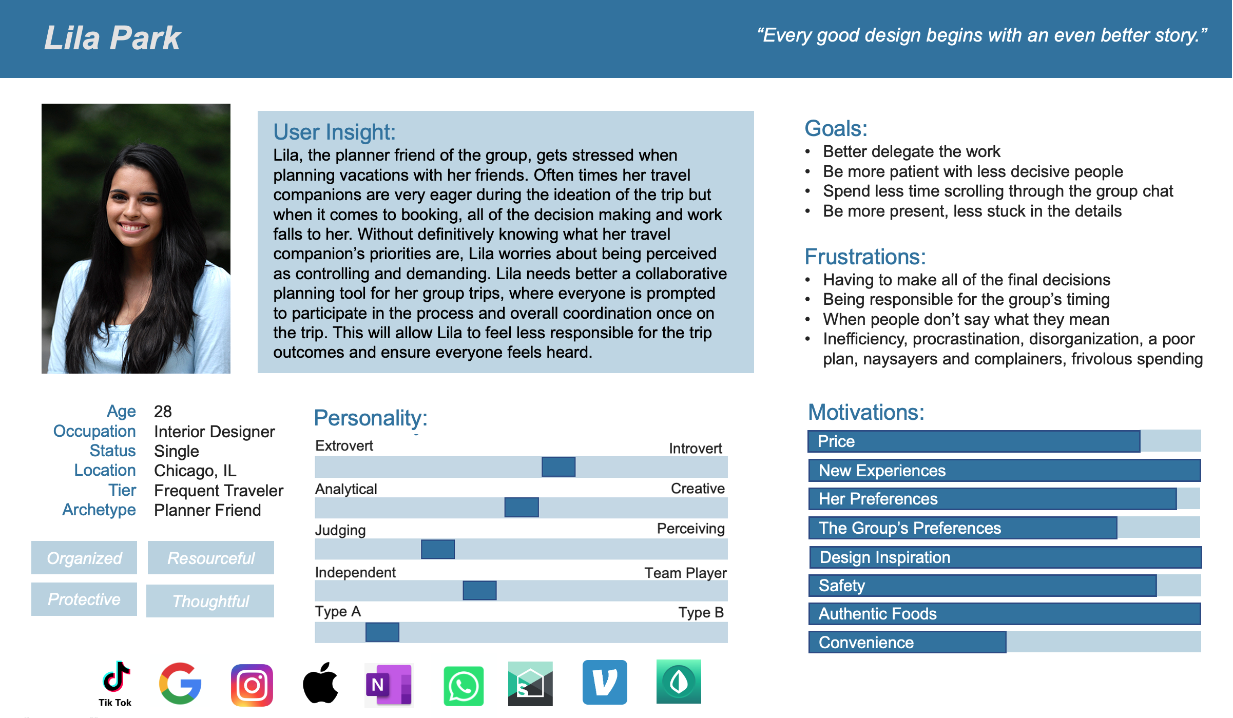
Adventure-Seeking Lila
Age: 28
Occupation: Interior Designer
Status: single, no children
-
Background & Goals
Lila is a passionate traveler who loves exploring new destinations and immersing herself in the culture.
Lila's goal is to make the most out of her travel experiences by planning well, creating memorable moments, and connecting with like-minded individuals.
She mostly travels with friends and her sisters.
-
Frustrated when others procrastinate decisions, complain and lack follow-through.
Doesn’t like frivolous spending, inefficiency, laziness, and “winging it.”
Wants a well-planned trip, but doesn’t want all of the responsibility.

DEFINE & EMPATHIZE &
DEFINE & EMPATHIZE &
Six user interviews and a survey with 73 participants was conducted. Key moments were then grouped to discern people’s most common travel habits, concerns and frustrations. During insight synthesis, a pattern emerged.
See Survey Results →
Three main archetypes emerged:

the commonalities:

What sets us apart?
No matter the archetype, everyone expressed some similar wants, hopes and needs. To synthesize these findings into one user persona, representing multiple users, I had to focus design solutions on our “planner friend archetype,” because they’re ultimately the ones doing the most work.
-
We believe that users need an efficient means of coordinating group travel, to better utilize their time on vacation and ensure everyone has had a say.
We observed that without an alternative, people rely on group chats where decisions don’t get made and the actual planning work falls to just a few.
-
Lila, the planner friend of the group, gets stressed organizing trips with her friends. She often faces the burden of decision-making and feels anxious about being perceived as controlling.
Lila seeks a collaborative planning tool that prompts everyone to participate in the process, easing her responsibility and ensuring everyone's input is valued. Such a tool would alleviate stress, foster coordination, and enhance the overall trip experience for everyone involved.
-
Says they want to be more organized, likes to plan and budget
Thinks the best way to plan is to have at least one thing planned per day, so they don’t miss the most important activities
Feels overwhelmed by decision making and long texting threads, and worries people aren’t saying what they really feel
Does take on a significant share of the travel planning responsibility, coordinating the timing and booking accommodations, restaurants, and excursions ahead of time
Is pained when people are non-committal and slow to reach decisions
Is happy when everyone is on the same page and enthusiastically involved in the planning
WHO, WHAT, WHERE, HOW, WHY?
We didn’t create what people theoretically need, we created what we needed.
This idea was born of a group of friends on vacation together. Our varied personality traits and travel habits, good and bad, spurred research into types of users and their specific feelings, frustrations, wants and needs for traveling in a group setting.
-
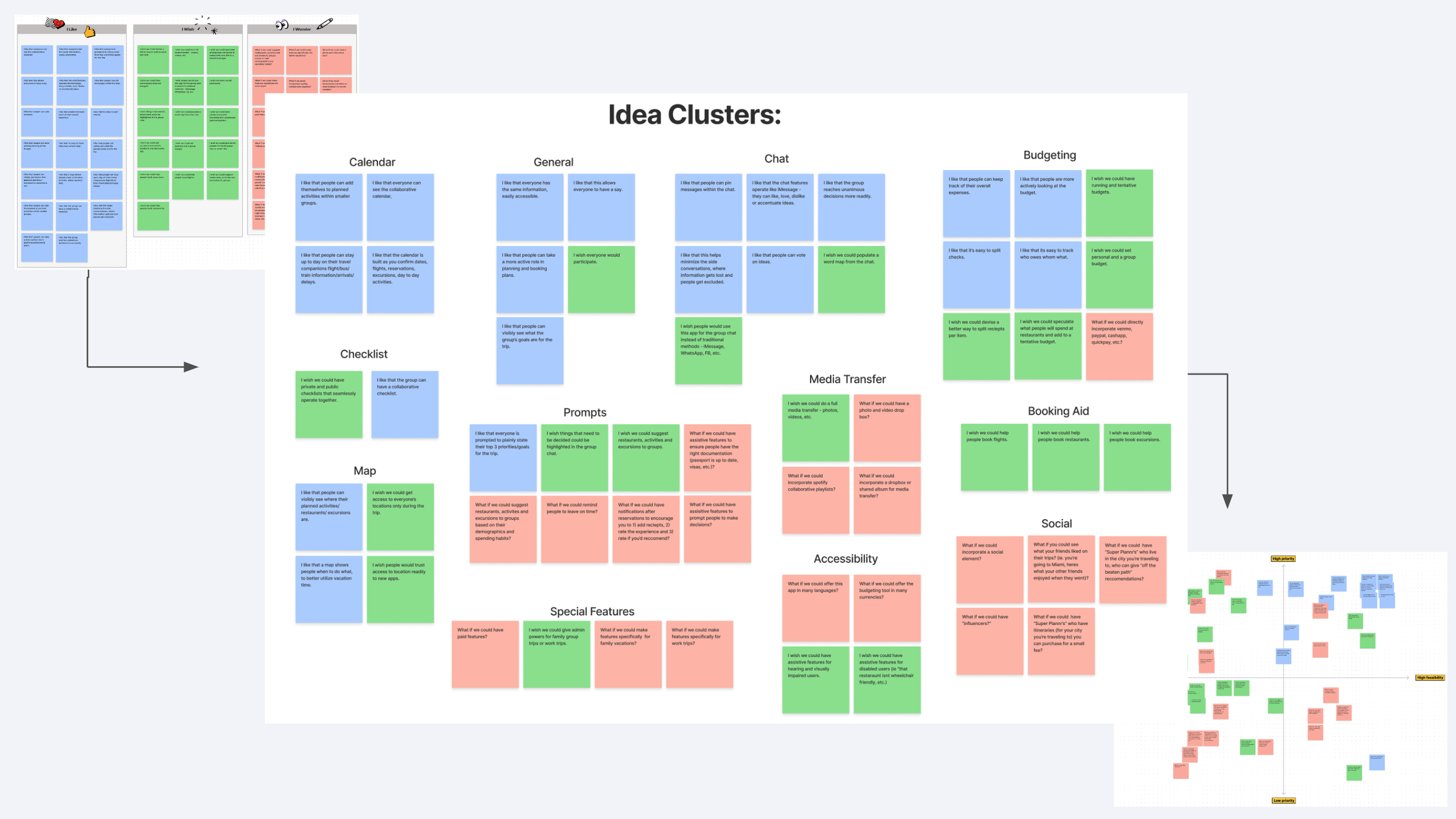
To prioritize features, I looked into users’ needs: past, present and future.
The idea clusters that formed from the “I Like.., I Wish.., What If…” ideation exercise ultimately defined the remaining research objectives to be answered: what integrations and accessibility features do people want?
-
Key Features:
Organized group travel information
Flight Tracker
Calendar and Itinerary
Collaborative Checklists
Group Chat
Budgeting Tool
Group voting and polls
A map and geo-location features
Media Transfer
-
I then used storytelling methods to explore how these solutions could solve those mutual issues expressed by users during research and illustrate what benefits and pitfalls may present.
Throughout these exercises I really wanted to focus on demonstrating how issues will still arise, Plannr isn’t the end all be all, but it can help!
-
Plannr, our all-in-one travel app, efficiently solves coordination and communication issues for groups traveling together. Plannr is a customizable platform with assistive features, prompts, and reminders to keep groups balanced, satisfied, and on schedule.
Plannr is grounded in real experiences, as it was born from the frustrations and insights of a group of friends on vacation. We set out to understand the unique needs and emotions of different types of travelers, creating a solution that addresses everyone’s unique needs.
-
![]()
Ideation Exercises
“I like.., I wish.., What if…” Ideation
-
![]()
Feature Prioritization
Balancing feasibility with priority
-
![]()
Value Proposition
Considered consider all three archetypes
-
![]()
Storyboard
illustrating potential benefits and pitfalls
-
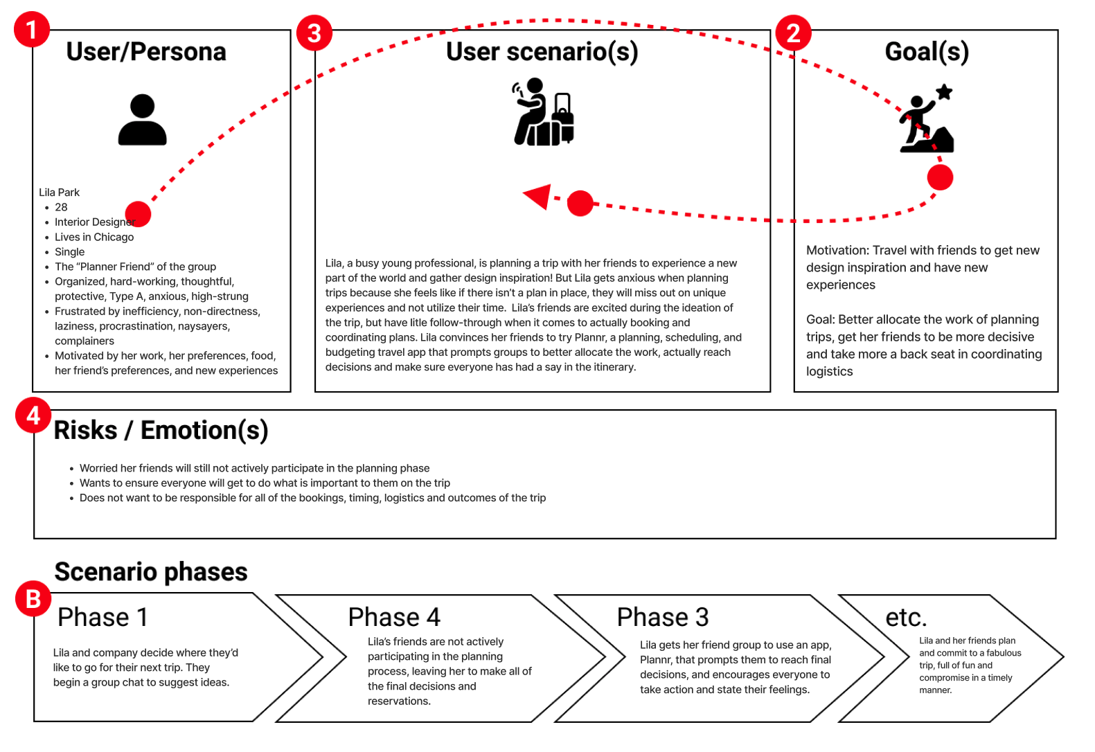
![]()
User Scenario
illustrate what benefits and pitfalls may present
-
![]()
Journey Map
illustrating potential benefits and pitfalls


Onboarding is crucial. If the app doesn’t grab people’s interest, show them what it’s about and make it easy for them to get started, even the best ideas can fall to the wayside.
I began my prototyping ideation with designing a task flow for the onboarding process.
PROTOTYPE & TEST &
PROTOTYPE & TEST &

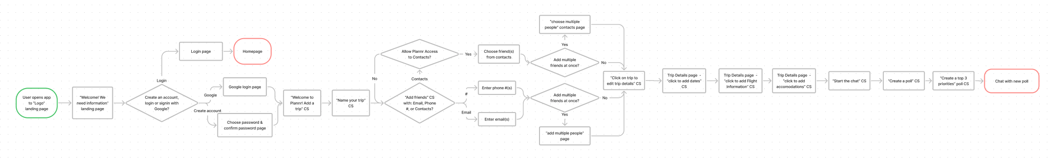
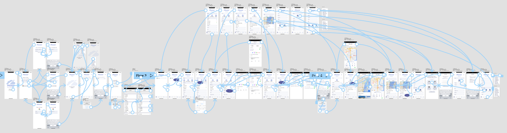
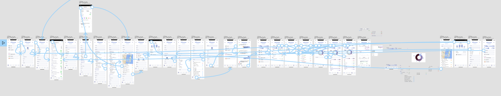
User Flow
Direct people through the key features
Research revealed that users are deterred by lengthy sign-up processes, so I streamlined login options to familiar contact points like Google accounts, phone numbers, or email addresses. After logging in, I designed a guided trip setup process that showcases secondary app features, complementing the primary ones already highlighted in the bottom navigation. This approach ensures a smooth onboarding experience while maximizing user engagement.
Paper Prototype
Develop the interface
The paper prototyping stage aimed to refine and enhance the user experience. Based on valuable feedback and the objective of simplification, an expansion/minimizing format was adopted to address user frustrations with endless scrolling. This format, familiar to users, allows for a more intuitive and efficient navigation experience. Through several rounds of feedback and 5 A/B tests, the paper prototype was iteratively improved to ensure a seamless and user-friendly interface design for the first digital prototype.
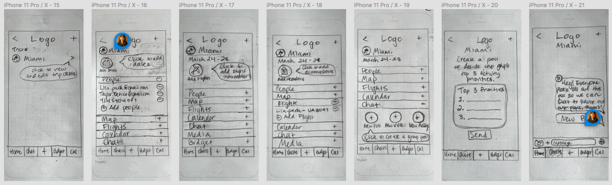
Lo-Fidelity Prototype
Test the interface
The lo-fidelity digital prototype was developed based on insights gathered from 3 additional usability tests, focusing on click-ability and flow. During this stage, the color scheme was introduced, considering the psychological associations of different colors. Blue was chosen to evoke a sense of purpose, productivity, responsibility, and action, commonly found in social apps. Purple, universally associated with royalty, conveyed feelings of luxury, wisdom, and power. To create a genderless feel, a muted blue-based periwinkle was selected as the base color, which was expanded into a monochromatic palette for simplicity and ease on the eye.
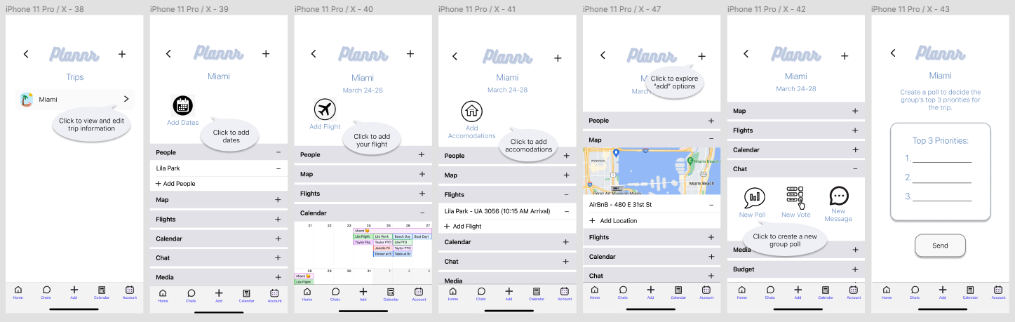
mid-Fidelity Prototype
Refine the interface
After conducting A/B, Tree, and Usability testing, the mid-fidelity prototype was developed as the next iteration to gather comprehensive user feedback. The refined user flow for the prototype includes the following steps:
Onboarding: Users are presented with three options to begin - as an existing user, signup, or sign in with Google.
Trip Initialization: Users are prompted to name their trip, add a representative photo, and invite friends to join.
Preliminary Trip Information: Coaching prompts guide users to input essential trip details such as dates, flight information, accommodations, and any existing reservations.
Solidifying Travel Plans: Lastly, users are prompted to send a poll to their travel companions, facilitating the process of finalizing and coordinating the travel plans.
This user flow aims to streamline the trip planning experience, ensuring users can efficiently initiate and organize their travel plans while incorporating valuable feedback from usability testing.
What works, what does not?
The mid-fi version of our prototype underwent rigorous usability and accessibility testing, consisting of four user tests. The primary objectives of these tests were to assess the usability of the prototype, gather valuable feedback to inform iterative improvements and ensure that our design meets the needs of a diverse range of users.

-
Simplification: Onboarding process and UI Design System
Evaluate the effectiveness and efficiency of the onboarding process, to streamline the user experience.
Assess the clarity and intuitiveness of the UI design system, aiming to simplify interactions and enhance overall usability.
Order of Operations:
Identify any gaps or issues in the user flow, ensuring a smooth and logical progression throughout the app.
Evaluate the order of operations within the app, verifying that tasks and actions are presented in a logical and intuitive manner.
Identification of Confusion Points:
Pinpoint specific moments in the user journey where users exhibit confusion or hesitation.
Understand the reasons behind these points of uncertainty and explore potential solutions to improve user understanding and confidence.
-
Users were guided through the steps outlined in the prototype, leading to an average task success rate of 87.5%. The feedback gathered from the tests was further analyzed using an affinity diagram and feature prioritization matrix, revealing several key takeaways:
Inclusion of business travel: User suggested, expanding the app's applicability beyond social trips.
Addition of "To-Do List": Feedback highlighted the need for a dedicated task management feature.
Separation of polls from chat: Ensures a clear distinction between communication and decision-making processes.
Enhanced button accessibility: Enlarge and darken certain buttons for improved visibility and ease of use.
Improving flight information prompt
Addressing missing iOS prompt screens
Addressing missing or non-continuous elements
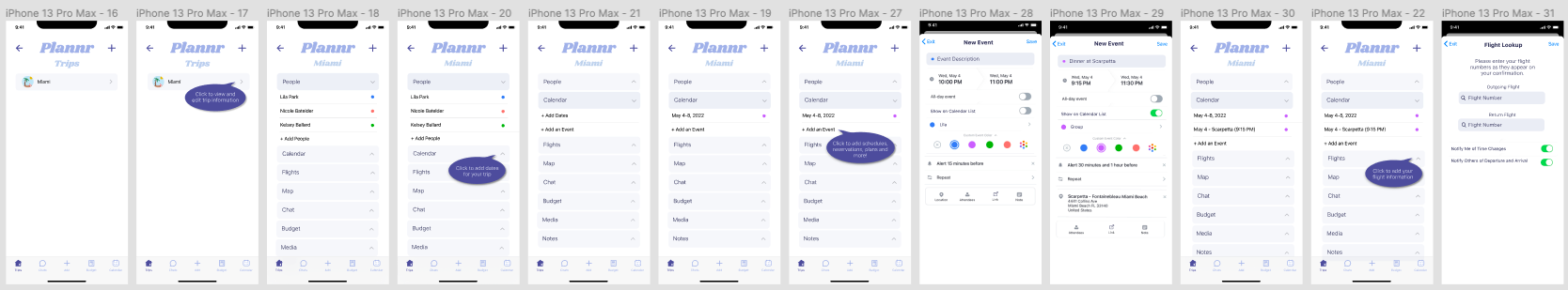
Plannr: Group Travel Made Easy
Hi-Fidelity Prototype
Onboarding Demo
Centralize travel information. Solve communication and coordination issues. Impartially reach decisions. Plan an itinerary. Track spending. Better delegate the work.
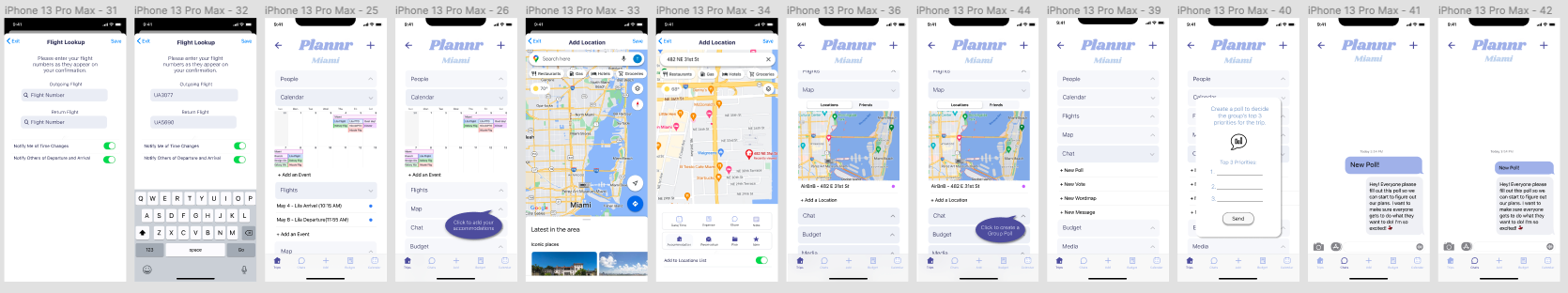
Post-Launch Problem
What Does the Plannr Look Like In-Use?
After gathering feedback by presenting Plannr to classmates, as well as conducting demos for family and friends, it became evident that relying solely on an onboarding demo did not effectively showcase the app's overall concept. In response, my post-graduation work focused on designing comprehensive pages that visually depict the app's functionality through past and upcoming trips. Through iterative testing, I refined the user experience to ensure a seamless and engaging journey for users exploring the app's features and capabilities. This approach allowed for a more immersive and informative presentation of Plannr's capabilities, emphasizing its value and enhancing the understanding of its full potential.
Key Features:
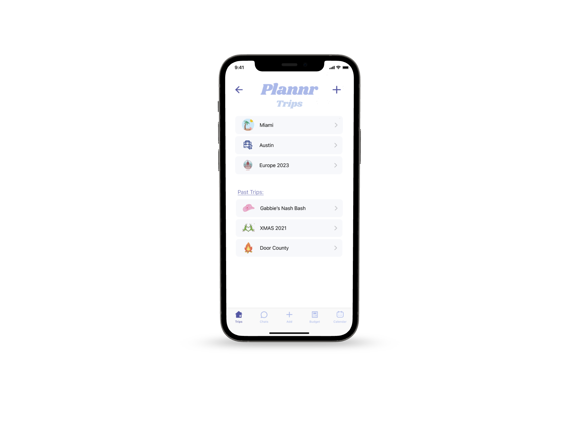
One place to keep all the essentials
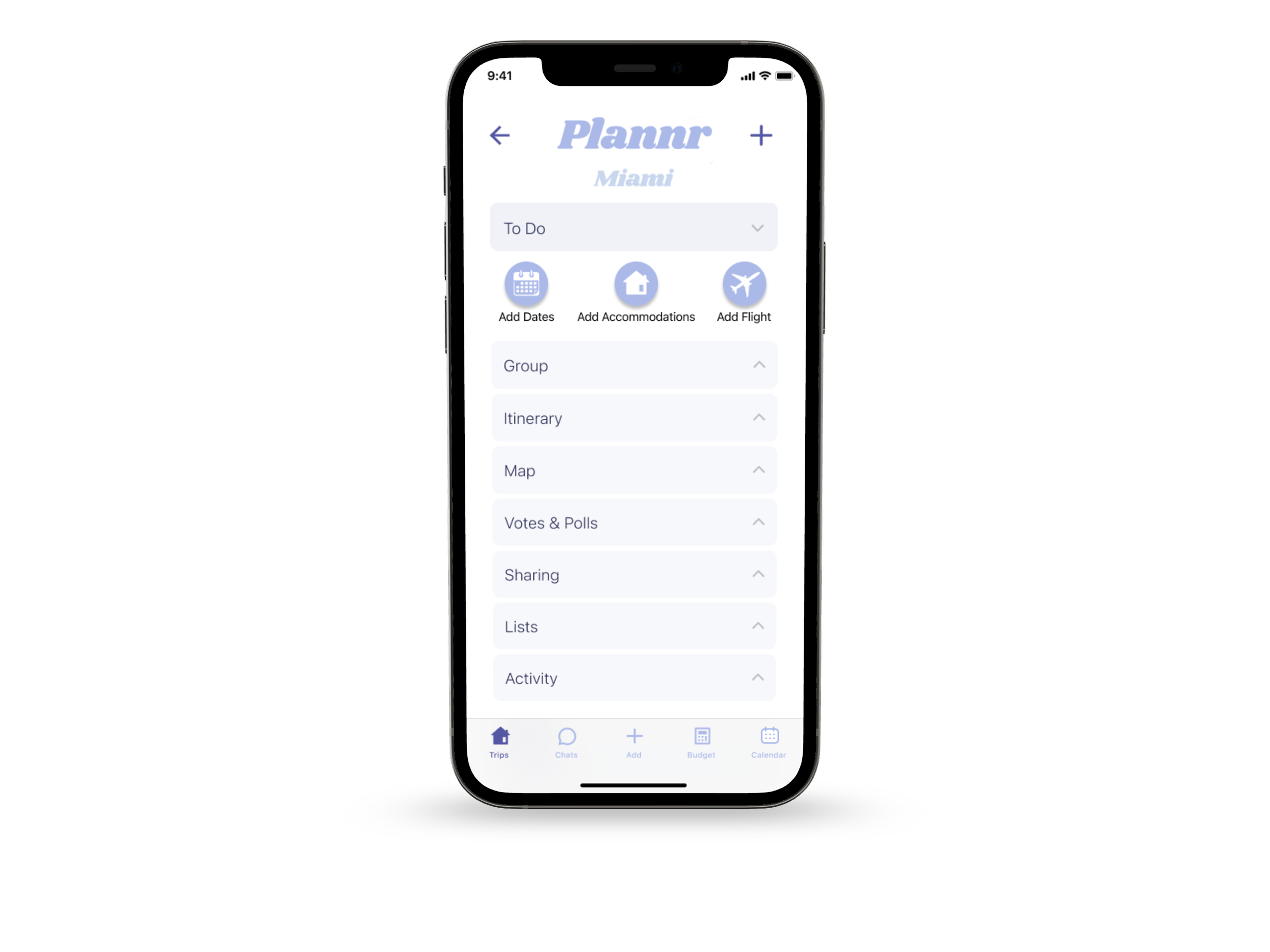
-
Stay on top of your to-do list, send reminders when action needs to be taken and keep the planning moving.
-
Anonymously gather feedback on proposed ideas. Give an equal opportunity to everyone to voice their opinions.
-
A tool for creating collaborative checklists and gathering notes.
-
Readily accessible contact information, color-coded for ease.
-
Map out your accommodations, reservations, even tentative plans. Utilize the location services to stay on time and easily find your travel companions’ live location.
-
Item description
-
One place for everyone to share photos, videos, playlists and more.
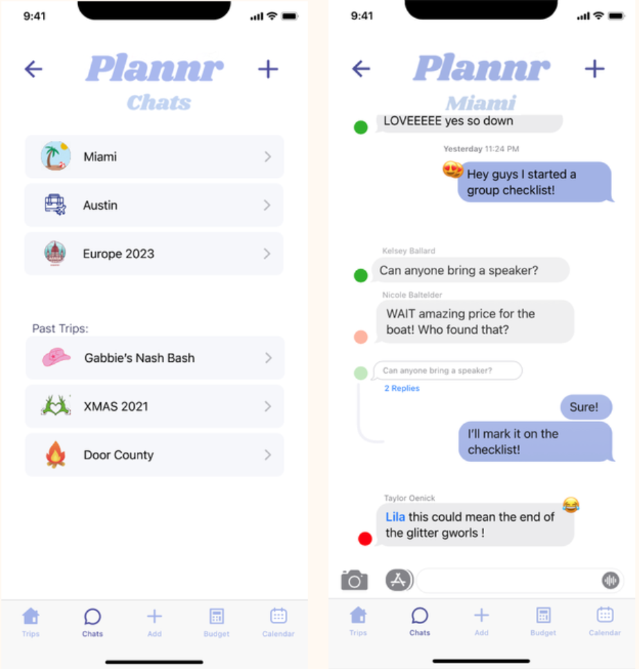
-
The same group chat features you know and love, but fully integrated.
Message reactions, direct reply, etc.
Voting, polling and word cloud generation
Can generate “To-Do” list items and set reminders
-
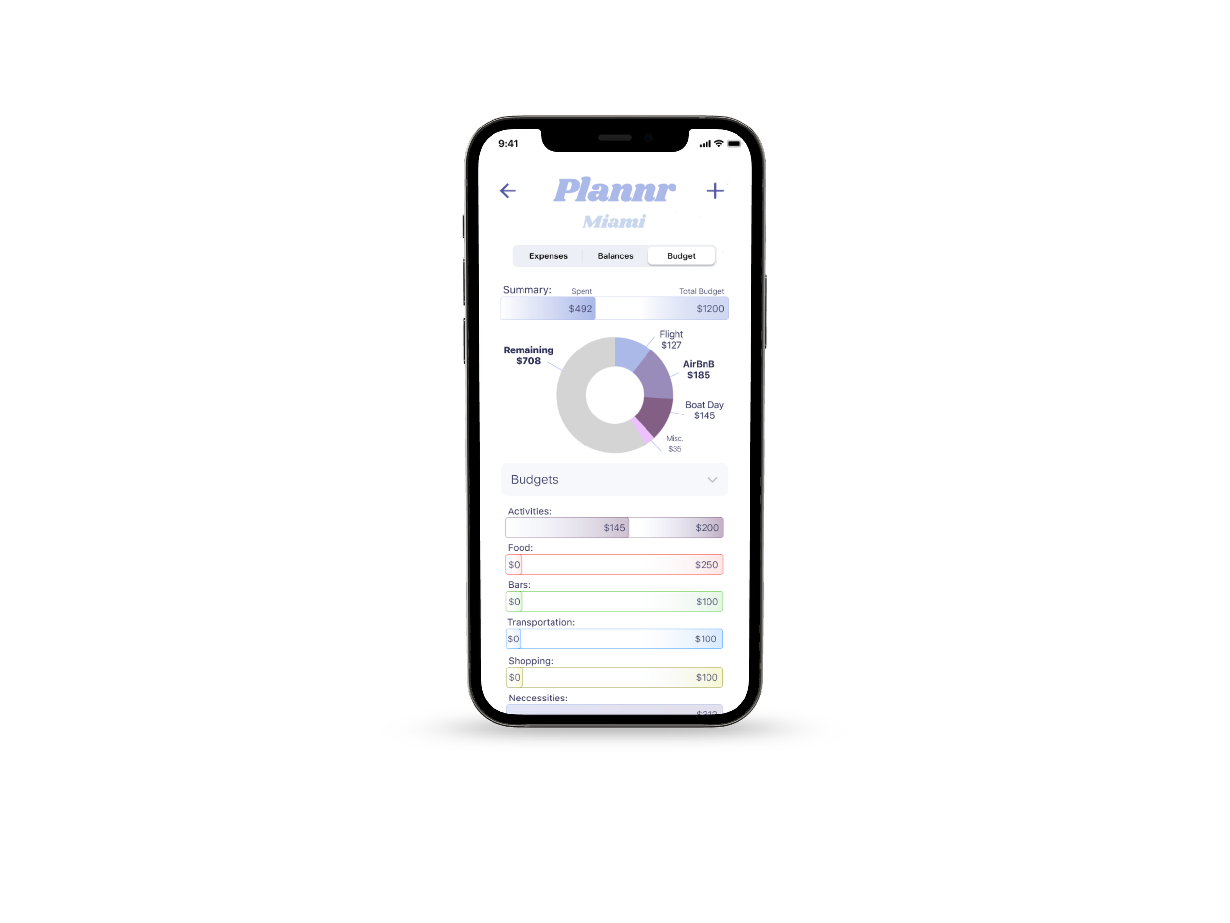
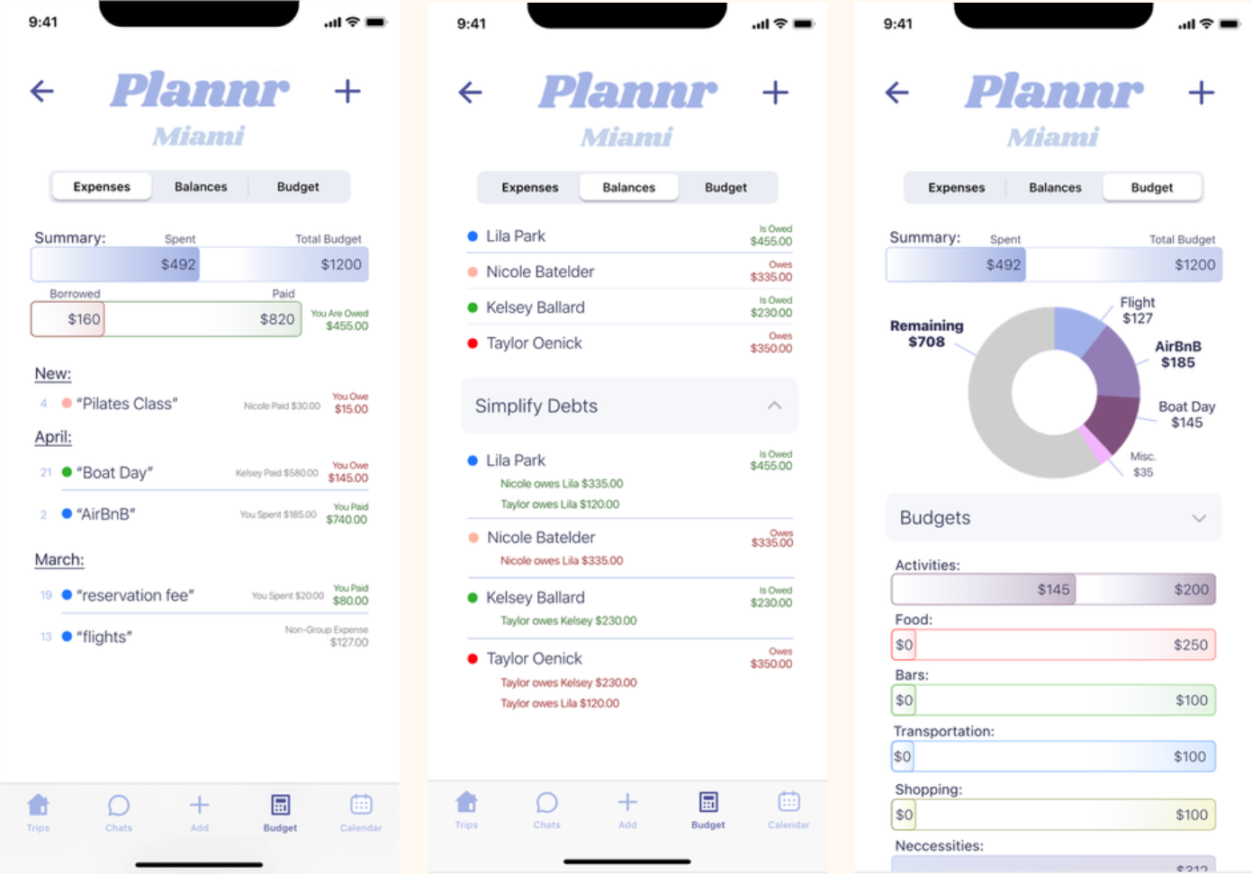
Traveling in a group with varied budgets and spending habits can be tricky. With Plannr you can:
Track spending, split payments, and simplify debts
Design and share your budget with your travel companions
Increase awareness of spending
-
Two ways to visibly see how the plans align, keep the information readily accessible and improve timing.
Itinerary - a quick snapshot of each day
Calendar - in depth look at everyone’s schedule
Foster inclusion and collaboration
TEST THE PROTOTYPE ~
TEST THE PROTOTYPE ~
We would love to hear your feedback! Your thoughts and input are invaluable to us as we strive to enhance our prototype. Give it a try and let us know your thoughts - your feedback is always appreciated.
What’s Next?
Moving forward, Plannr will prioritize ongoing testing and iterative improvements. There is still substantial work ahead as we strive to enhance the app's functionality and user experience. With each iteration, we are committed to uncovering new opportunities to expand on our original goal of efficiently organizing and storing travel information for groups. Through continuous refinement, we aim to deliver a robust and user-centric solution that exceeds expectations and truly simplifies the process of group travel coordination.
-
Embrace User Feedback:
User feedback proved to be invaluable, as what may seem logical to us may not be clear to others. Incorporating user perspectives and insights is crucial for creating a user-friendly experience.
Utilize Figma Components:
Leveraging Figma components proved to be highly beneficial, allowing for consistency and efficiency in design iterations. Reusable components streamline the design process and ensure visual coherence.
Simplify, Simplify, Simplify:
Simplifying the onboarding process became a key focus, as improving user retention was a primary goal. Minimizing complexity during initial user interactions helps facilitate a smooth and engaging onboarding experience.
Consider Everyone:
While designing with the user persona in mind is important, it is equally essential to consider the needs and preferences of other potential users. Balancing personalization and inclusivity leads to a more versatile and user-centric design.
Embrace Redoing and Removal:
Embracing the flexibility to redo or remove entire parts of the design was crucial. Recognizing that sometimes less is more allowed for a more refined and streamlined user experience, ensuring that the interface is not cluttered or overwhelming.
-
Ultimately I want Plannr to improve the entire experience of traveling in a group. User interviews made it clear - the main issue is not a lack of information organization. It is a varied group of people successfully communicating their needs and feelings, keeping the same schedule, fairly reaching decisions and then acting on those decisions.
Plannr will be an all-in-one tool for solving the problems that inevitably arise as all different types of people: planners, procrastinators and everyone in between, travel together.