

Clarity
Clean. Clear. Conscious.
project background
Due to a lack of transparency in the skincare industry, the sheer volume of options, and information that is often contradictory, users have a hard time finding the right products for them.
-
Introducing Clarity, an app that simplifies finding skincare products that meet our specific needs within our personal lifestyle, access and cost constraints.
Clarity helps users narrow their search by providing information in layman’s terms on the benefits, ingredients, safety and packaging.
Users can scan their product’s barcode to get instant feedback.
The app provides personalized recommendations from a database of cruelty-free and sustainable brands with straightforward products and clean formulas.
-
In a 4-week design sprint, research, prototype, test, and validate an idea for a brand-new mobile application that solves a real, clearly identified need in users’ everyday lives.
-
Served as project manager, leading a team of 3, defining product look and feel, providing feedback and managing product timeline and deliverables.
Responsible for the onboarding, the skin-type survey and results screens, and product pages, as well as style specification, branding and copy.
Facilitated user research by completing 15+ user interviews, 10+ usability and accessibility tests, 5+ user flow tests and 5+ focus groups.
Developed 30+ wireframes, and 37 lo-, mid- and hi-fidelity prototype screens and analyzed 123 survey results with data visualization tools.
Designed all of our internal graphics and did all of the secondary research about skincare and cognitive biases.
Tools: Figma, Adobe Creative Cloud (Illustrator, XD, InDesign and Photoshop primarily)
why?
While achieving 100% organic, sustainable, and clean products may not be feasible, we believe that balance can be achieved by everyday actions towards the goal.
-
Considerations like cost, access and lifestyle dictate what products we use and how to get them. But there doesn’t need to be so much guilt surrounding wellness, nor excuses: it’s not all or nothing.
The goal is to empower users to adopt more sustainable and healthy habits, taking small steps towards improving both their lives and the environment.
-
Our initial concept was to create an app that promotes sustainable living across various aspects of users' lives - from food and health items to skincare and beauty products. A combination of an online marketplace and an in-store shopping companion, users could conveniently scan or enter any product and return personalized recommendations for healthier alternatives that better align with their specific needs and values.
After careful consideration of context and scope, we decided to focus on skincare because it is our primary area of expertise within the wellness sector.

how?
Why does this issue persist despite so many great resources, and what matters to our users on their skincare journey?
-
We compared four direct and indirect competitors to discern which features are popular and what people do & don’t like:
Popular Features:
Users appreciate the inclusion of barcode scanners across all four products.
The ability to track liked and disliked products is widely liked.
Personalized care and customization options is liked by most.
Users prefer the availability of filters and the ability to set preferences.
Community feedback is valued in decision-making.
Areas for Improvement:
Users find long surveys cumbersome.
Lack of alternative options in the recommendations is a pain point.
-
Assess the stage of the skincare journey for most individuals.
Gauge the general level of skincare knowledge among participants.
Understand the current decision-making processes for skincare.
Determine the willingness of individuals to modify their skincare habits.

who?
To humanize the issue, I first explored what our users say, do, think and feel.
-
Eco-friendly Nola
Age: 26
Occupation: Buyer for Kohls, part-time yoga instructor
Status: Single, no children
-
Nola is health-conscious, valuing wellness including physical, mental and spiritual.
Her goal is to live more sustainably, and expose herself to less forever chemicals.
-
Nola is frustrated by the abundance of waste and absence of regulations in the skincare industry.
She encounters challenges in finding solutions that align with her cost, access, and lifestyle requirements.

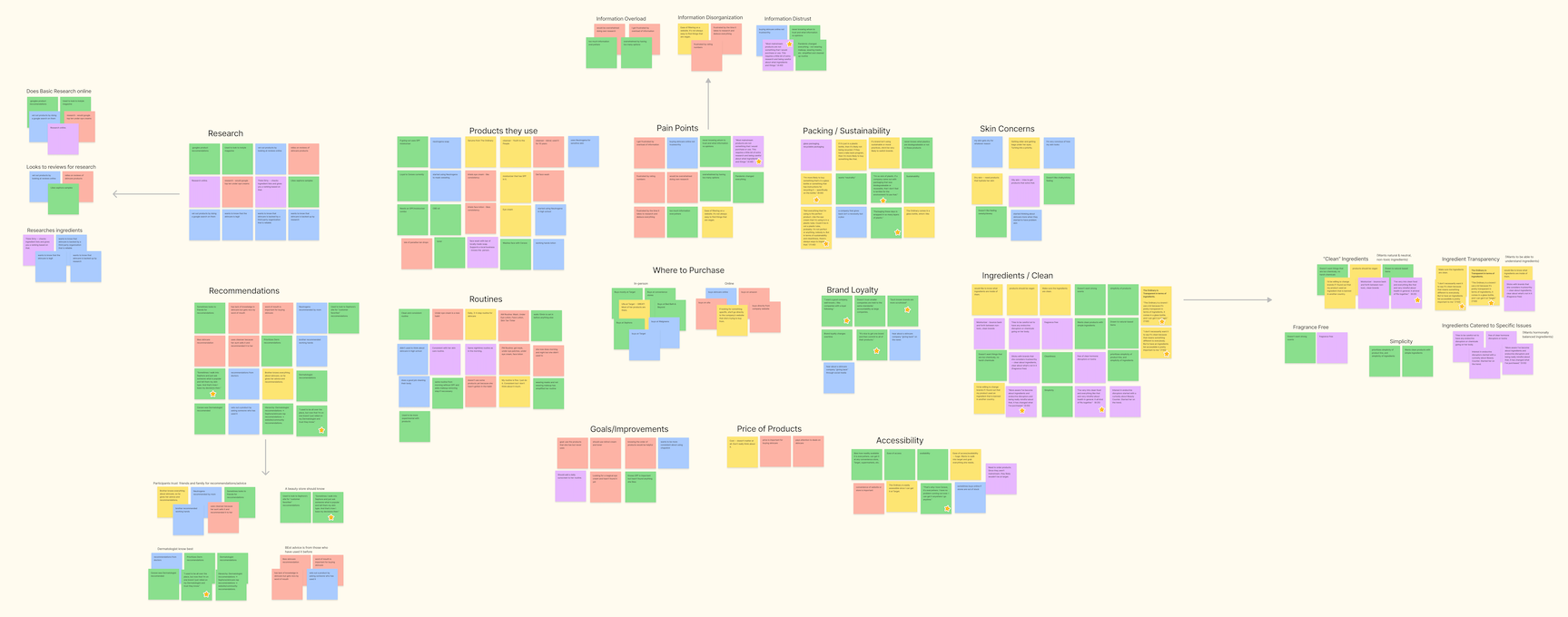
To gain valuable insights into the solution, we conducted 5 in-depth interviews and received 59 survey responses. This research not only provided us with initial insights, but also prompted us to conduct further ethnographic research. This deep dive into the social contexts of our users' natural environments yielded key insights that strongly influenced our development process.
DEFINE & EMPATHIZE &
DEFINE & EMPATHIZE &
Current habits

-
Most people wash their face and moisturize
Most people use body, lip & hand products also
-
“I don’t know where to start.”
“I don’t know what to focus my efforts and resources on, and in what order to apply products.”
“I don’t know what ingredients I should be using.”
Priorities & Decision Factors
-
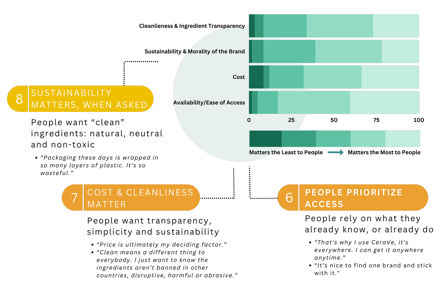
Most people prioritize access, liking popular and widely stocked products People prioritize cost
People prefer simple and clean products, with ingredients they understand
Sustainability matters to people when asked about it directly
Search Methods
-
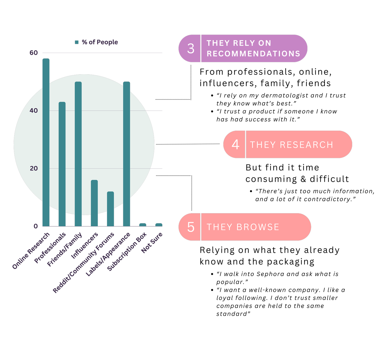
People prioritize cost and access
People primarily rely on recommendations: professional, personal and online
People rely on what they’re told, or what they already know and do – with little to no further research
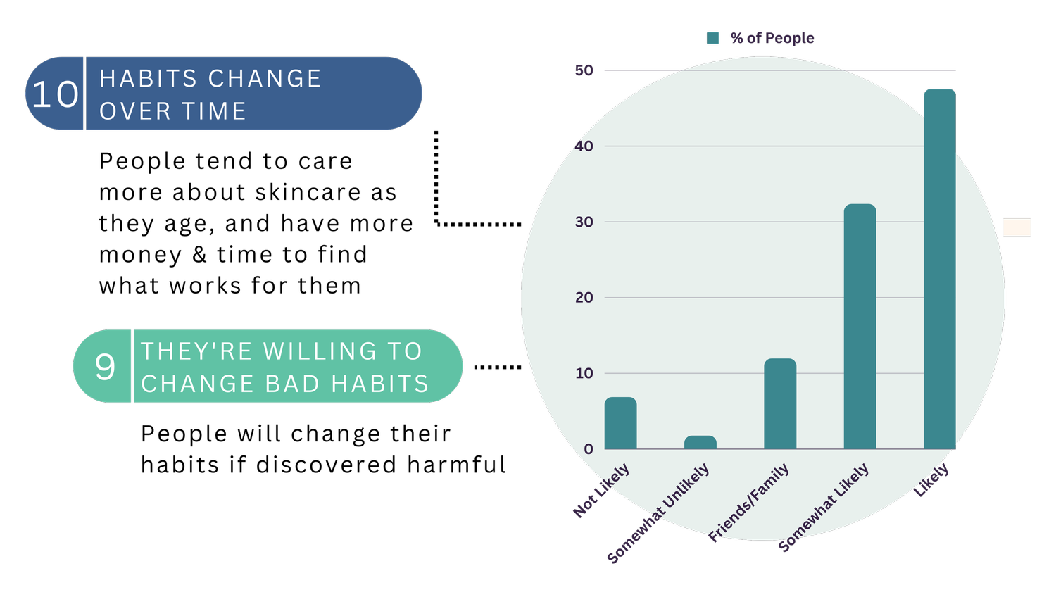
Willingness to change
-
People are willing to change, but don’t have the resources or time
-
People tend to prioritize skincare more as they age, due to becoming more conscious of their health and appearance overall
As people age, they tend to devote more time and resources to finding effective skincare solutions, because they finally have more time and resources.
secondary research
Why does this issue persist? Cognitive biases. Despite the wide range of resources available, people still report trouble finding the skincare products that best.

What sets us apart?
People often experience choice overload when searching for skincare solutions, and either do what they’ve always done or rely on the first piece of information presented. But skincare is not “one size fits all” and good enough is not the best fit!
Clarity will simplify the search process, simplify personalized feedback and simplify balancing needs with ethical considerations.
-
We observed that users feel overwhelmed by the abundance of skincare information and often rely on recommendations that may not align with their individual needs.
Clarity aims to simplify the process of choosing skincare products by providing personalized recommendations from sustainable and cruelty-free brands with clean and simple formulas. Our goal is to empower users to make informed decisions by simplifying: the search process, personalized feedback, and balancing skincare goals, lifestyle, and ethical considerations.
-
Nola is overwhelmed by the volume of skincare information available, so she resorts to continuing to use popular brands that friends & family recommend. She’s unsure which sources to trust, worried about the ingredients used and wants to start prioritizing the sustainability and morality of the brands she uses.
Nola needs a user-friendly solution that can assist her in pinpointing her unique skincare needs and discovering brands that align with her values. By providing transparency on ingredients, sustainable practices, and research-backed recommendations, Nola can confidently select clean and straightforward products that support her skincare goals and align with her lifestyle choices.

WHO, WHAT, WHERE, HOW, WHY?
To continue empathizing with our user on their skincare search, we explored the highs and lows of the user experience.
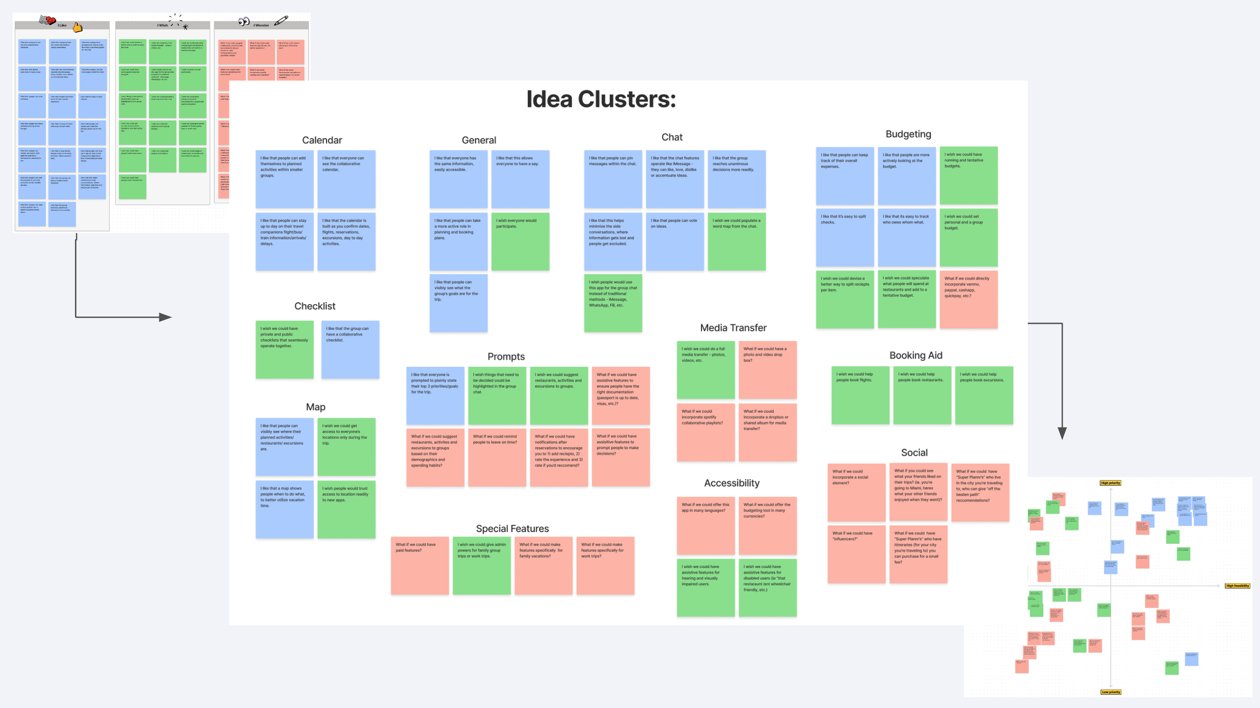
Using the “I like…",”I wish…,” “What if…” ideation method and a feature prioritization matrix, Clarity’s key features were defined:
-
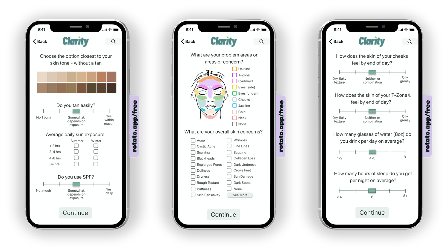
Pinpoint the user's precise skincare needs by considering factors such as skin type, skin conditions, lifestyle, location, and goals.
Filter options based on categories like price, packaging, and skin type compatibility.
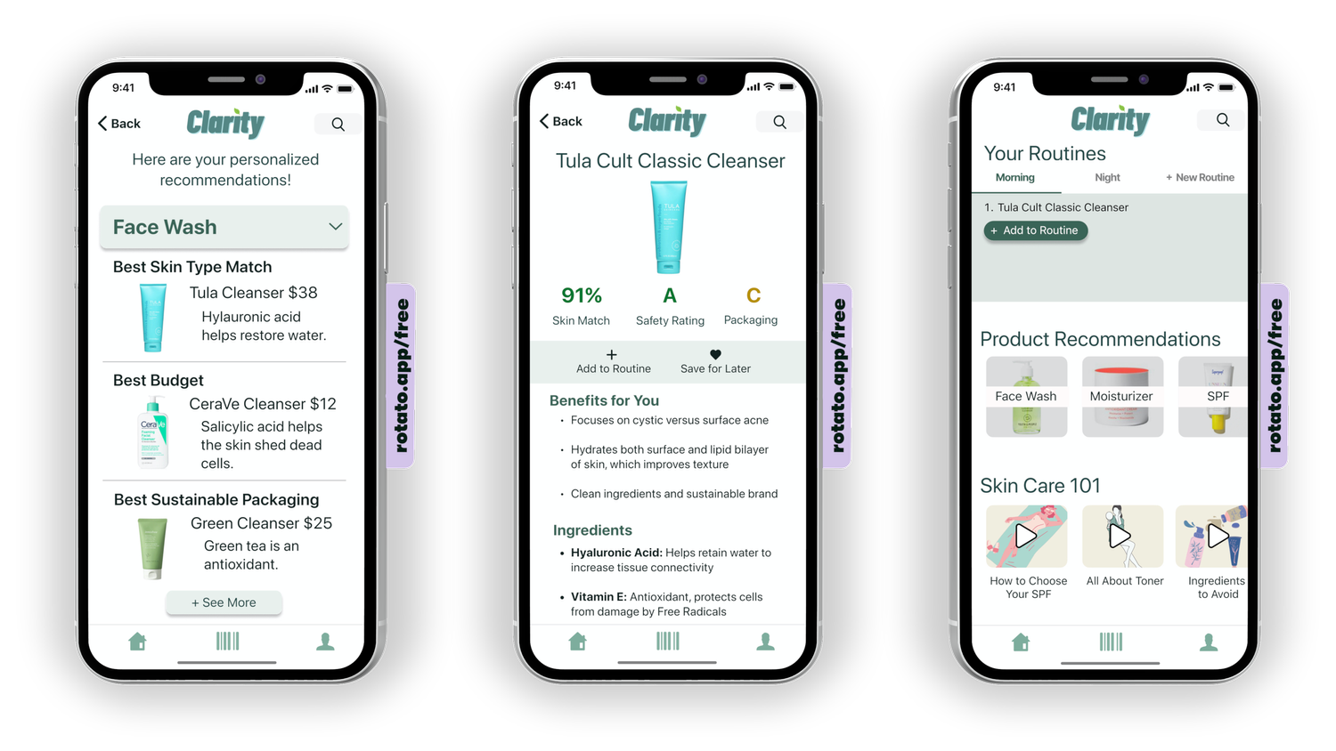
Three recommendations for each type of product: best overall match, best budget-friendly match, best eco-friendly match; from a comprehensive database of "clean" brands.
Detailed information on product ingredients, their intended benefits, and usage instructions.
Sign up to save products and enhance their skincare routine over time.
Barcode scanner for quick access to ingredient and product information.
-
Considering complexity and scope of this project, we had to scale back some additional features we intend to develop later:
Scan face to determine skin type and concerns.
Direct purchasing and sample requests
Social features for creating profiles, reviewing products, and connecting with others with similar skin types and concerns.
Recycling takeback program.
Cheaper alternatives to expensive, popular products.
-
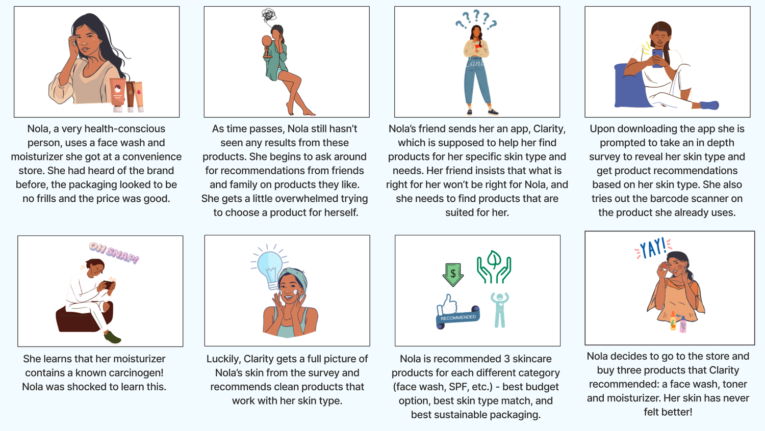
To explore how well these design solutions solve the challenges Nola faces, and illustrate what benefits and pitfalls may present, we utilized storytelling methods.
-
Clarity was designed to simplify finding skincare solutions, empowering you to efficiently make informed decisions, saving you the time and resources. With personalized recommendations from a database of clean and sustainable brands, ingredient breakdowns, and transparent information on the benefits and pitfalls of each product, Clarity streamlines the process of finding skincare solutions that align with your unique needs, values, and goals.
Join a community of skincare enthusiasts, united by a shared passion for holistic wellness and a sustainable future. Experience the clarity of radiant skin and a conscious approach to self-care, accessible to all.
-
![]()
Ideation Exercises
“I like.., I wish.., What if…” Ideation
-
![]()
Feature Prioritization
Balancing feasibility with priority
-
![]()
Storyboard
illustrating potential benefits and pitfalls
-
![]()
Journey Map
illustrating potential benefits and pitfalls


Onboarding is crucial. If the app doesn’t grab people’s interest, show them what it’s about and make it easy for them to get started, even the best ideas can fall to the wayside.
With our goal being direct users through the main features and onto scanning a product they use – we focused on streamlining & simplifying the onboarding task flow.
PROTOTYPE & TEST &
PROTOTYPE & TEST &
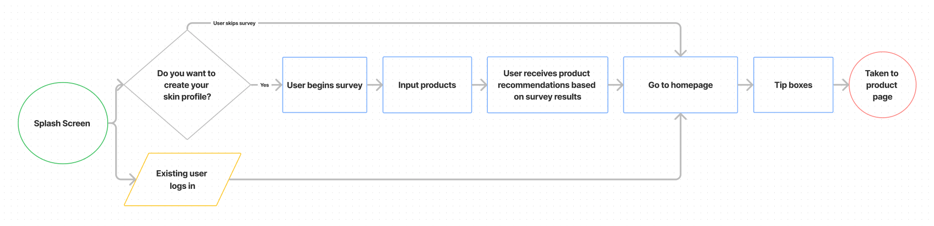
User Flow
Direct people through the key features
In our initial iteration, we offered users the option to take the skin-type survey or skip it. We integrated the barcode scanner into the end of the survey, letting them go all the way through the product before being prompted to sign up. Our thought was to maximize user retention, by not asking too much of users too soon. We A/B tested it with few issues, and proceeded to paper prototype the concept.

Paper Prototype
Develop the interface
However, we discovered some usability issues during paper-prototype testing. One problem was the loss of survey results when users exited the app after obtaining their personalized feedback. Additionally, there was confusion about how to use the barcode scanner, and users who skipped the survey couldn't access it.
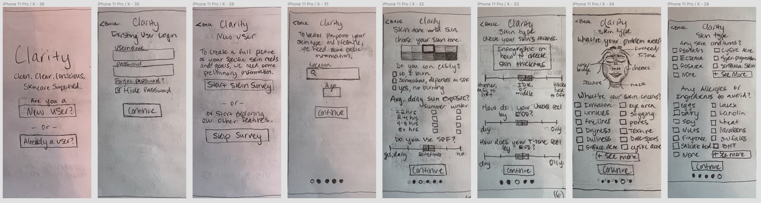
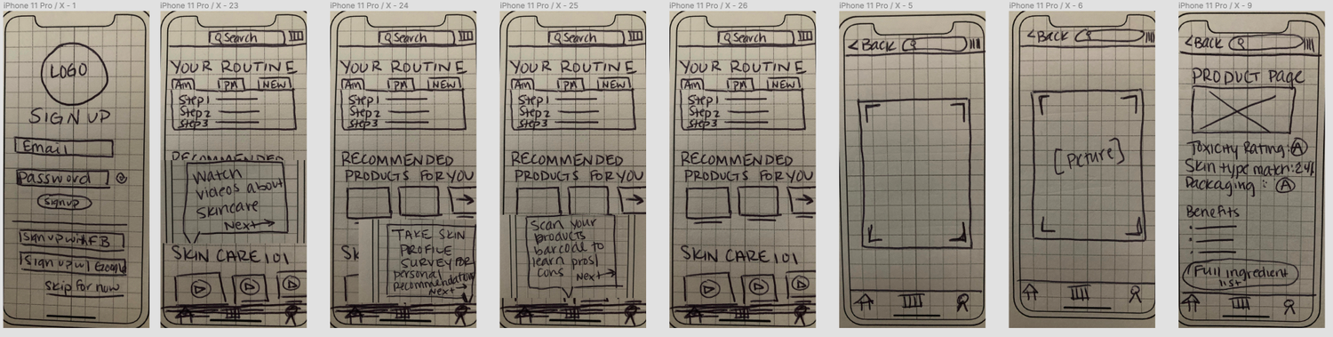
Lo-Fidelity Prototype
Test the interface
The next iteration began with asking users if they’re an existing user or new user, and then offering: sign up to take the survey for personalized recommendations, or continue as a guest to use the other features. Our aim was to integrate the signup process seamlessly into the survey, making it feel like a natural step rather than a separate task. We also streamlined the survey to make it quicker and more user-friendly.

mid-Fidelity Prototype
Refine the interface
To enhance usability, we relocated the barcode scanning feature to the homepage and added tool tips to guide users to it. Recognizing that product scanning is a core functionality desired by users, we made it a prominent feature on the homepage. This ensures easy and frequent access to the scanning feature, as it is a consistent element across competitors.
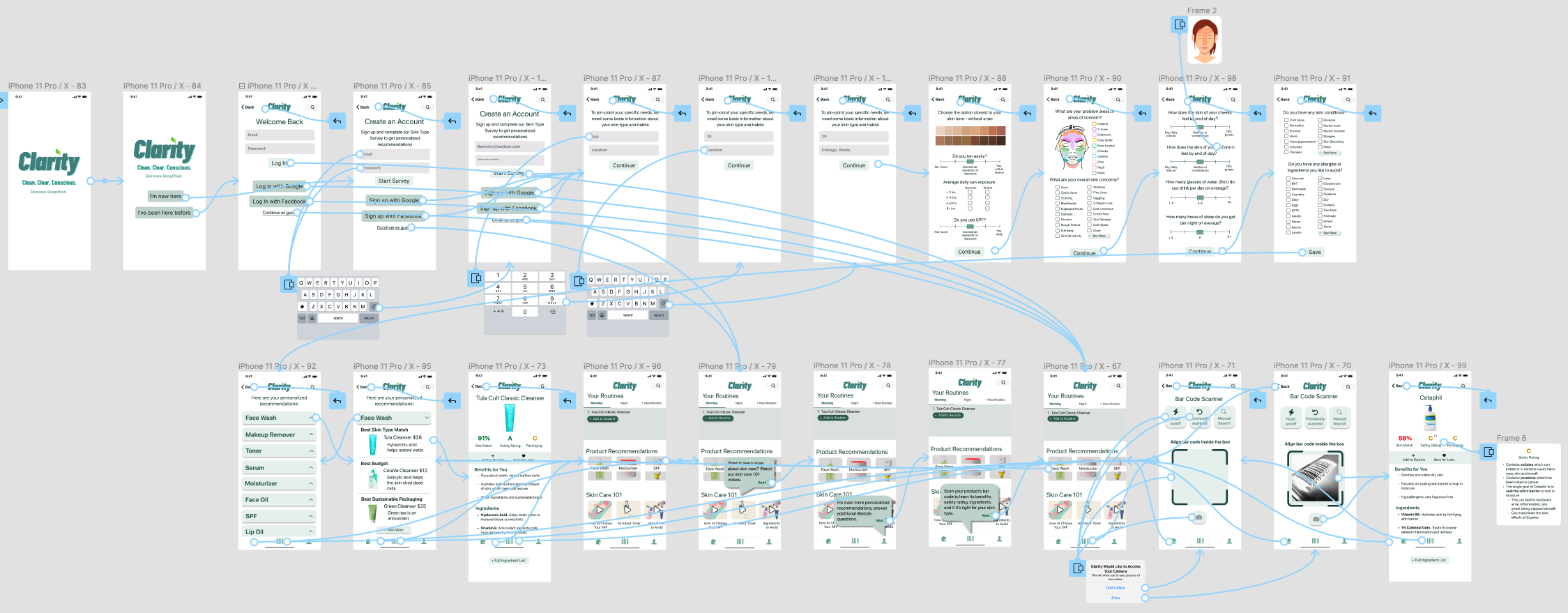
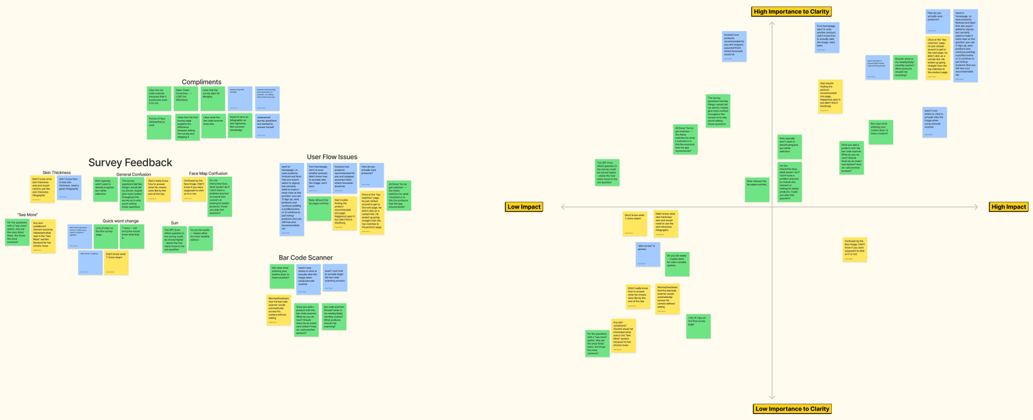
What works, what does not?
We then conducted 5 usability tests with the goal of discerning:
-
Assess the effectiveness of the onboarding and survey process.
Identify any gaps in the user flow.
Evaluate the ease of navigation of homepage features, especially finding the barcode scanning feature.
Determine the simplicity and clarity of the language and user interface.
-
Based on the analysis of user feedback, we identified the following key changes:
Enhance the user flow at critical junction points and ensure clarity in intermediate pages.
Revise the survey copy to use easily understandable language.
Introduce a feature to save recommended products, specifying whether user want to “save for later” reference or “save to routine” as they build their personalized routine.
Further clarify the barcode scanning page, particularly the functionality of the "take photo" button.
Provide clear explanations for why specific products are recommended as Best Match, Best Budget, and Best Sustainability.
Clarity: Clean. CLear. Conscious.
Hi-Fidelity Prototype
Onboarding Demo
Clarity begins by guiding users through a concise yet comprehensive survey to suggest three product recommendations: the Best Match, Best Budget, and Best Sustainability choices. These recommendations are drawn from a database of sustainable and cruelty-free brands offering clean and straightforward formulas.
More key features
Users can also scan their existing products for its benefits, ingredients in layman’s terms, and safety and packaging ratings.
The homepage design includes assistive features and quick educational videos to keep users progressing on their skincare journey.
TEST THE PROTOTYPE ~
TEST THE PROTOTYPE ~
We would love to hear your feedback! Your thoughts and input are invaluable to us as we strive to enhance our prototype. Give it a try and let us know your thoughts - your feedback is always appreciated.
-
Minimize the time and effort required for users to complete the survey to increase participation. Offer an option for a more detailed version of the survey on the profile page.
Prioritize a seamless onboarding experience by allowing users to create an account before taking the survey.
Use clear and easy-to-understand language in the copy to cater to users with varying levels of familiarity with skincare terms.
-
Develop and enhance the homepage features, including skincare 101 demos to educate users on the importance of different skincare products and techniques.
Implement the routines section, allowing users to track their current skincare routines, set reminders, and manage their ideal skincare products.
Conduct additional user tests with a focus on the homepage to gather feedback and make improvements.
Perform A/B split tests to determine the optimal length for a product page.
Create low-fidelity designs for the profile page and "add a new routine" process.
What’s Next?
Simplify the search process. Simplify the design. Simplify the survey. Simplify the feedback.